Treering
People want to look like designers without being one
Marketing design · Education / yearbooks · 2024 to 2026
Treering creates yearbook software for schools, PTAs, and parent volunteers. Most people who use Treering to make a yearbook have never designed anything before.
Between 2025 and 2026, I created seven marketing projects for Treering. These included conversion ads, a Pinterest content system, and a brand identity for Treering Memories, a separate product. For each project, I started by asking who would see it, what they needed to know, and what action they should take next.
Deliverables:
Treering Memories brand identity: Design for the viewer with the sound off
Yearbook theme style guides: Three formats for three buying stages
Instructional videos: Fix the two moments where first-timers fail
Ads: Conversion ads and ad performance
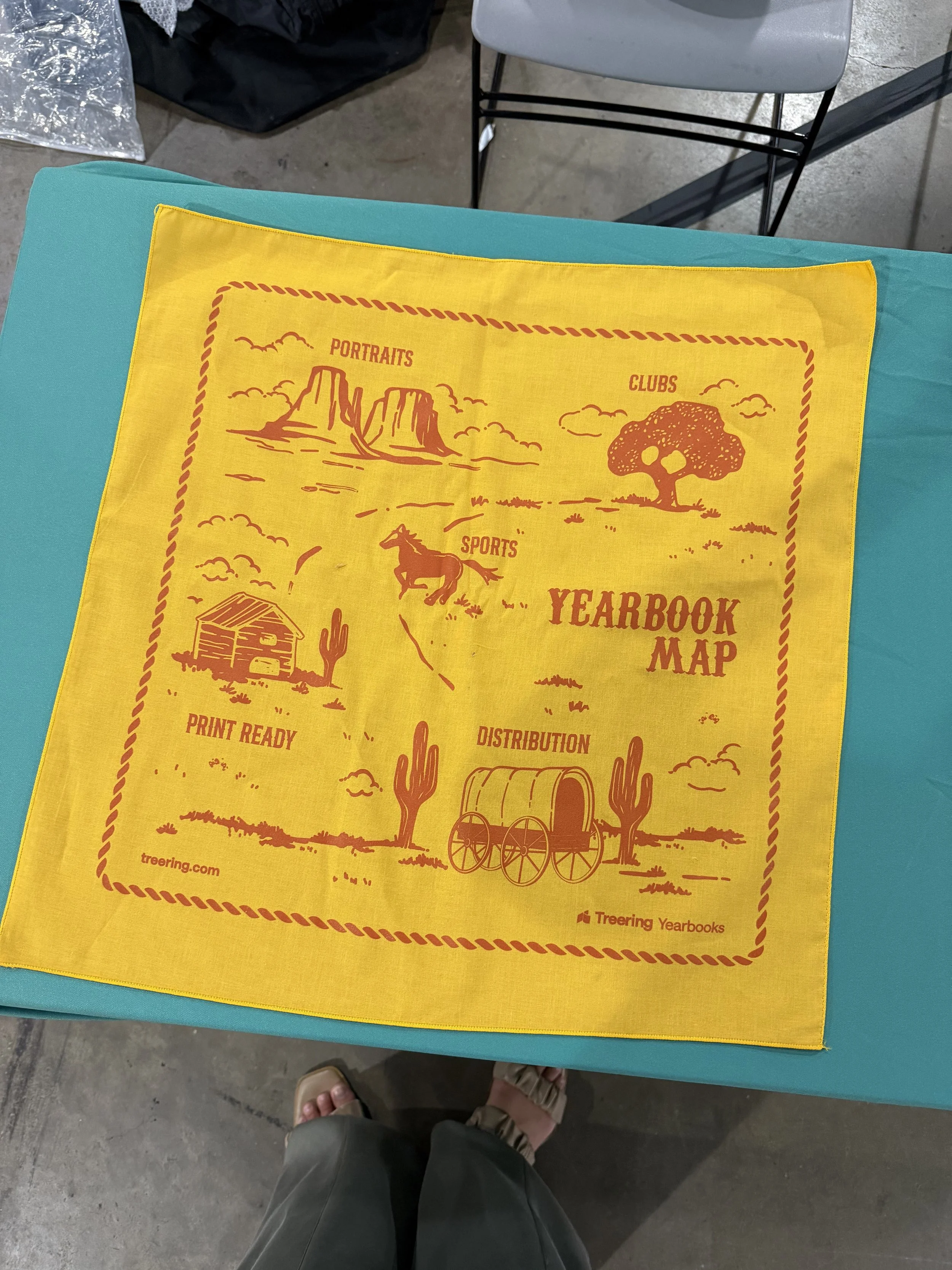
PTA conference bandanas: Make swag worth keeping
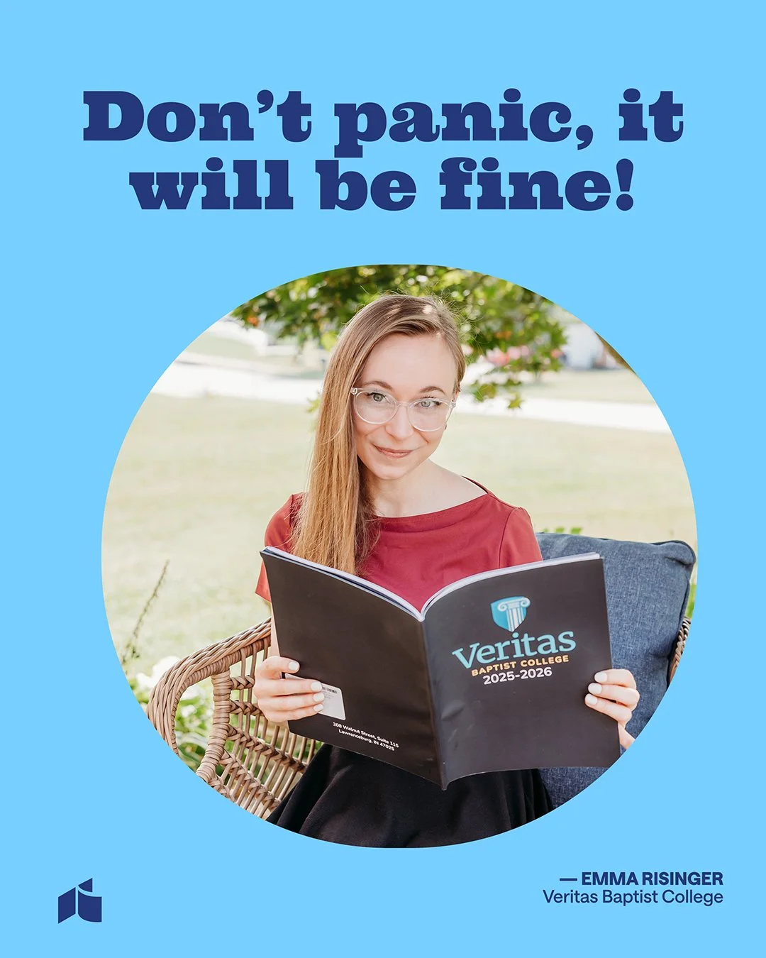
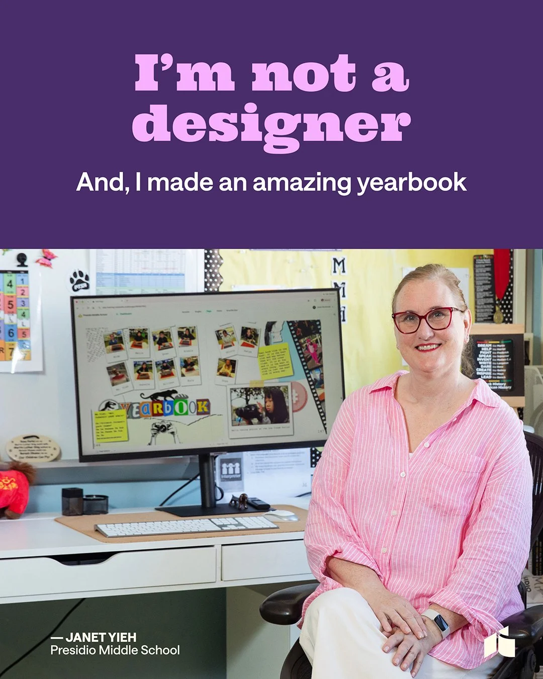
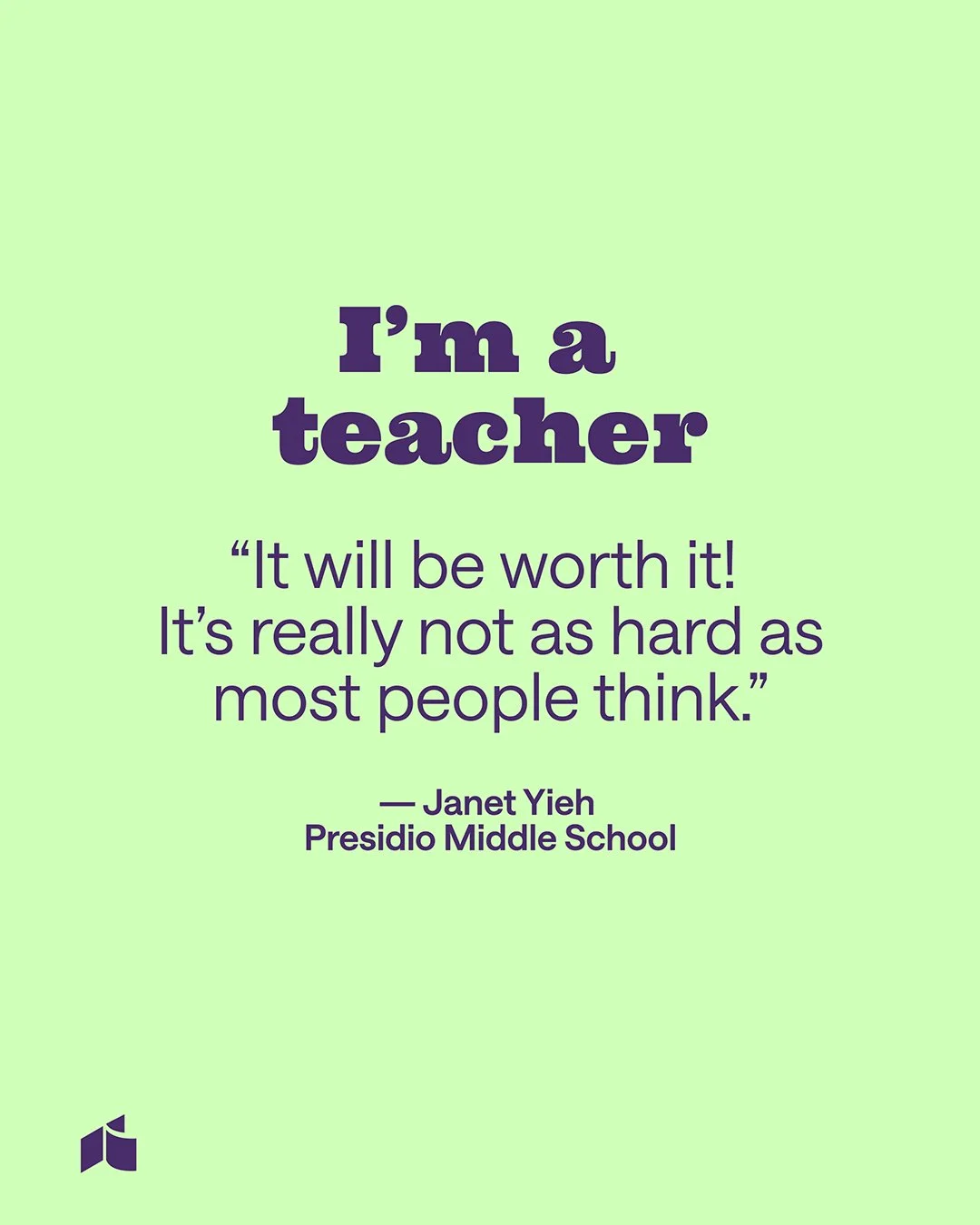
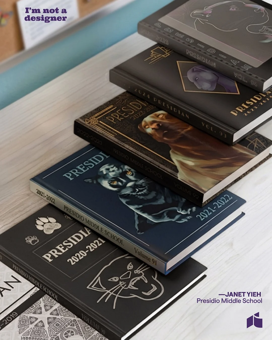
"I'm Not a Designer" campaign: Make what every customer says a hook, not a disclaimer
Thumbnail system: Build rules a team can repeat, not one-off thumbnails
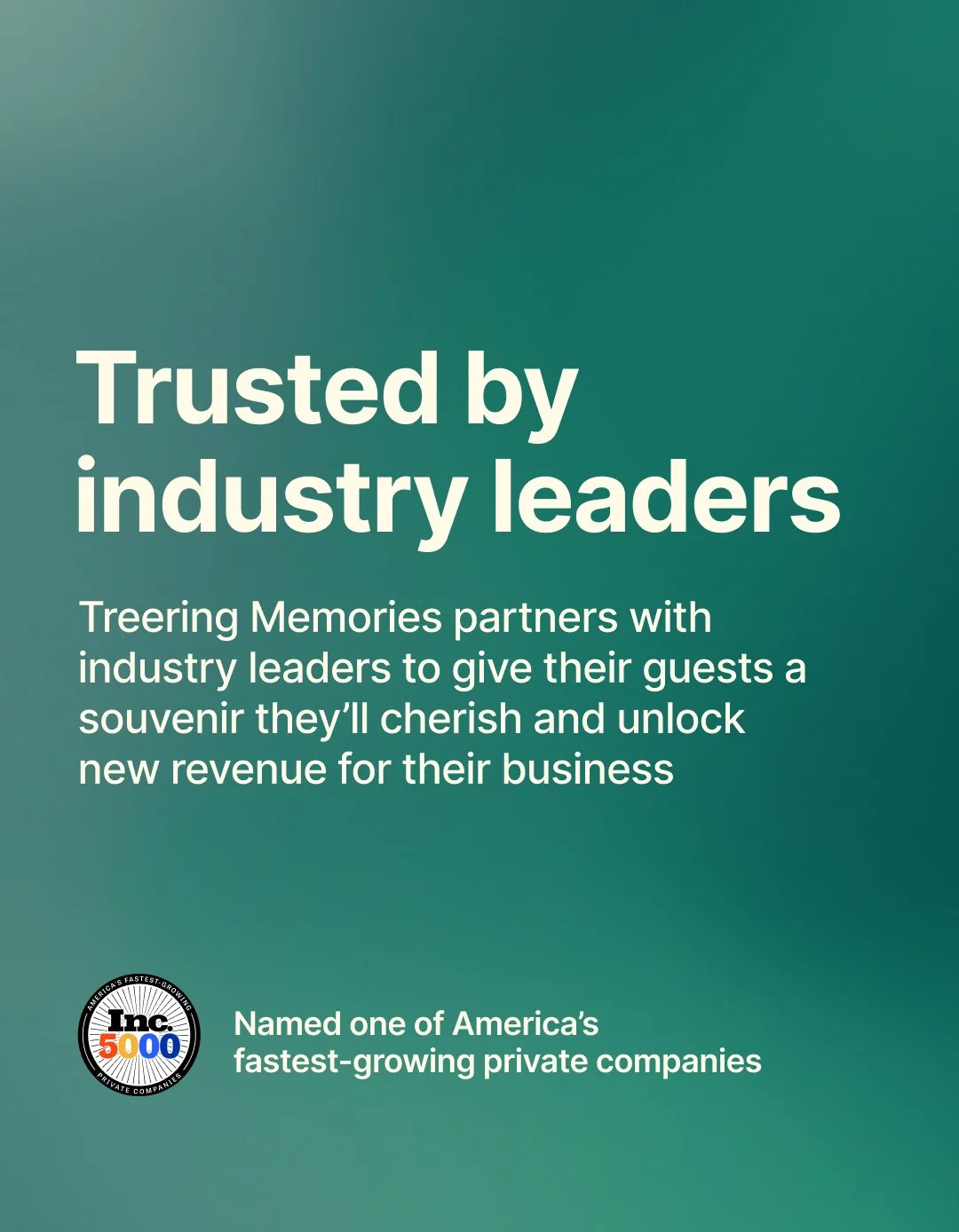
Brand identity: Treering Memories
We chose to design for the senses rather than focus on features.
Treering Memories is a separate product that uses AI to create travel memories. The challenge was to build a social presence for this tech product without making it feel overly technical.
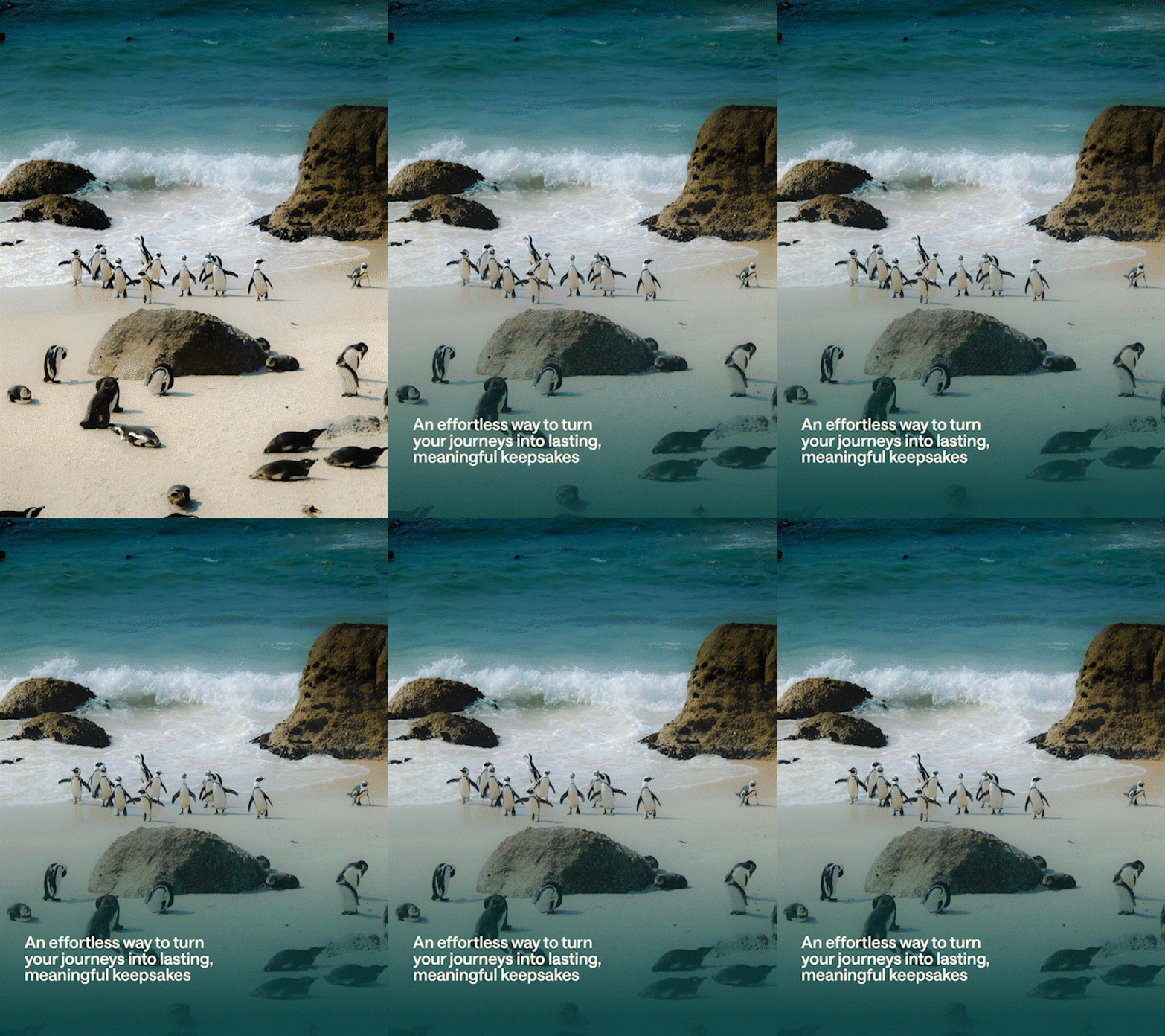
Since most Instagram Stories are watched without sound, I designed the brand with those viewers in mind first. I used gradient micro-animations that feel modern but not flashy, and added ambient audio like waves and travel sounds for those who listen with sound.
The creative idea started with a question: what if you could only see your vacation? How could visuals help you imagine the sounds? This led to a brand language that uses motion and color to trigger the senses usually reached by sound.
Focus on the main limitation: design for viewers who watch without sound. Treat sound as an extra feature.
Focus on the main idea: show what the AI inspires, not the technology itself.
Create a formula: gradient motion combined with sensory storytelling. While most AI brands look clean, literal, and cold, Treering Memories feels warm and atmospheric.
Keep it consistent. Every post uses the same approach: ambient gradients, motion that feels like memory, and layered sensory cues.



Pinterest style guides: one content system, three buying stages
The goal was to reach yearbook advisors while they’re browsing, so I created a format for each stage of their decision process.
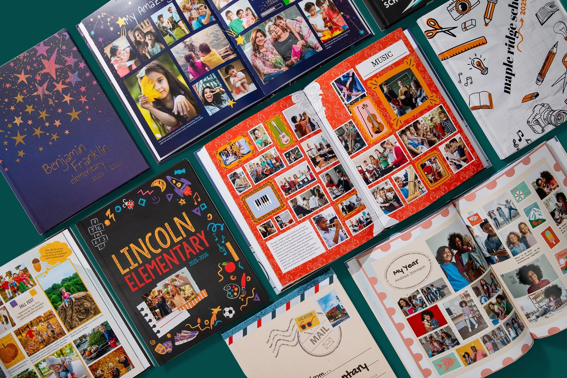
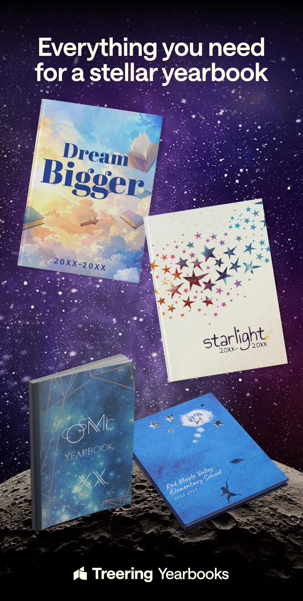
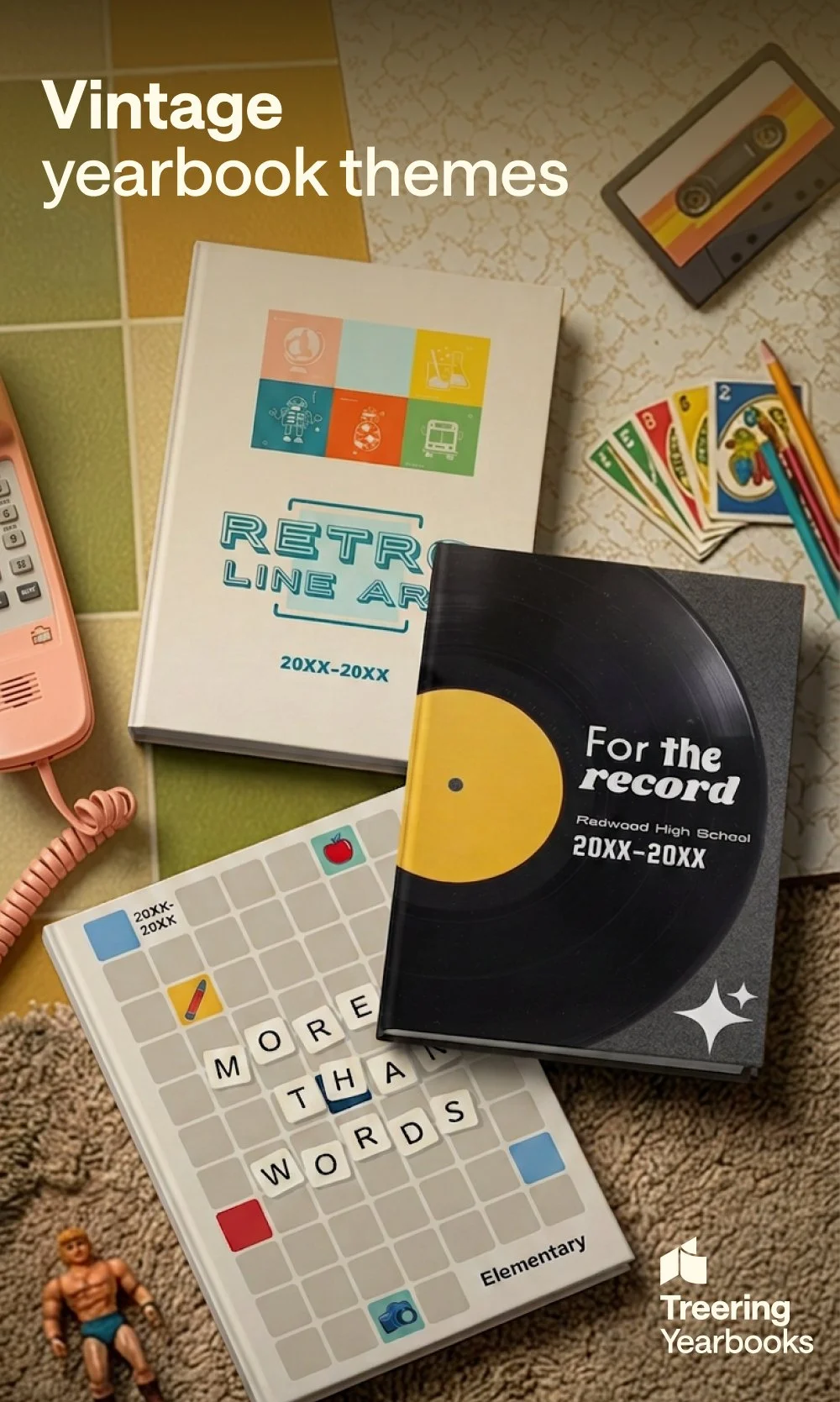
The Overview displays three to four theme covers, grouped by genre, such as retro, geometric, or nature. It’s meant for the discovery stage, when someone is still figuring out what feeling they want. The goal is recognition, not detail.
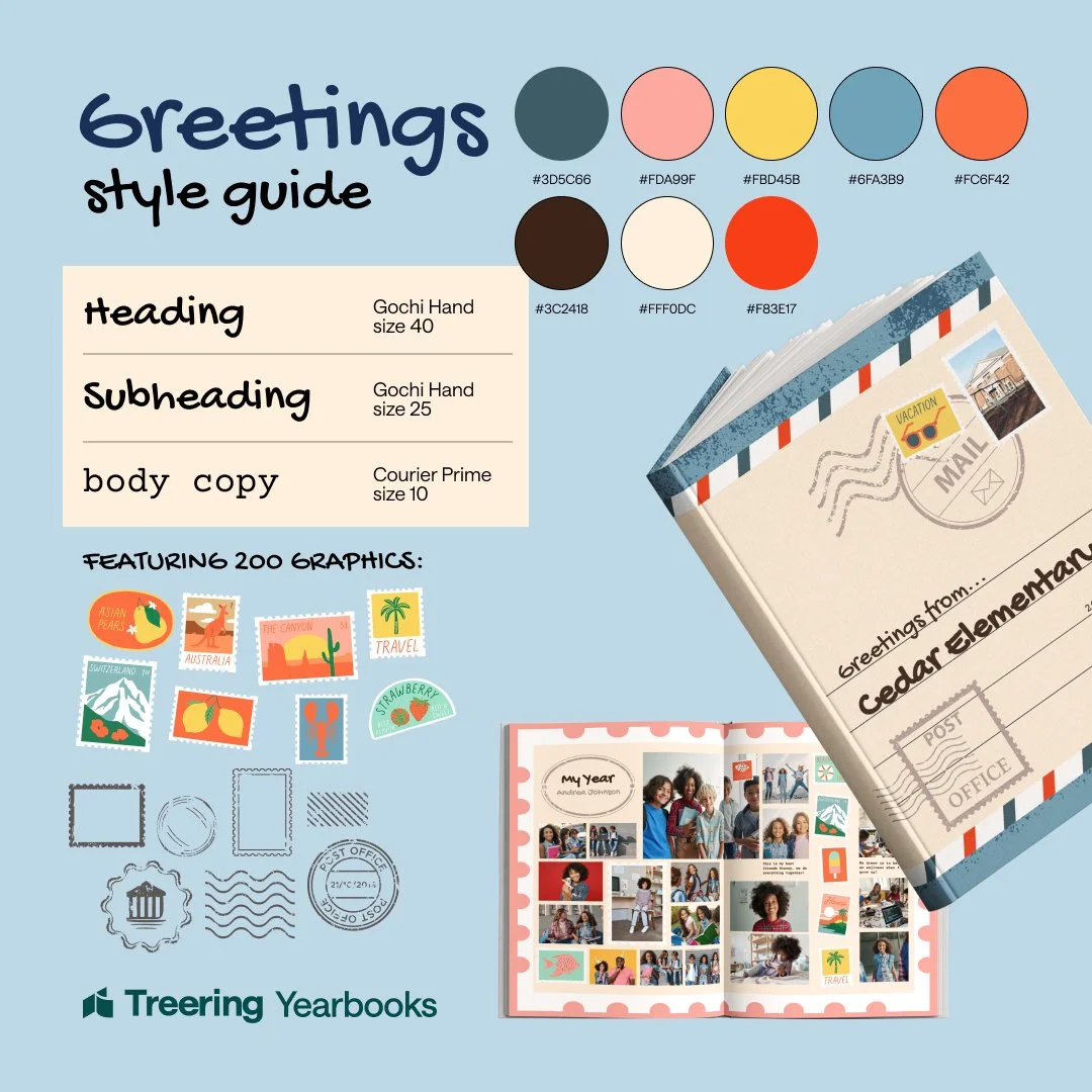
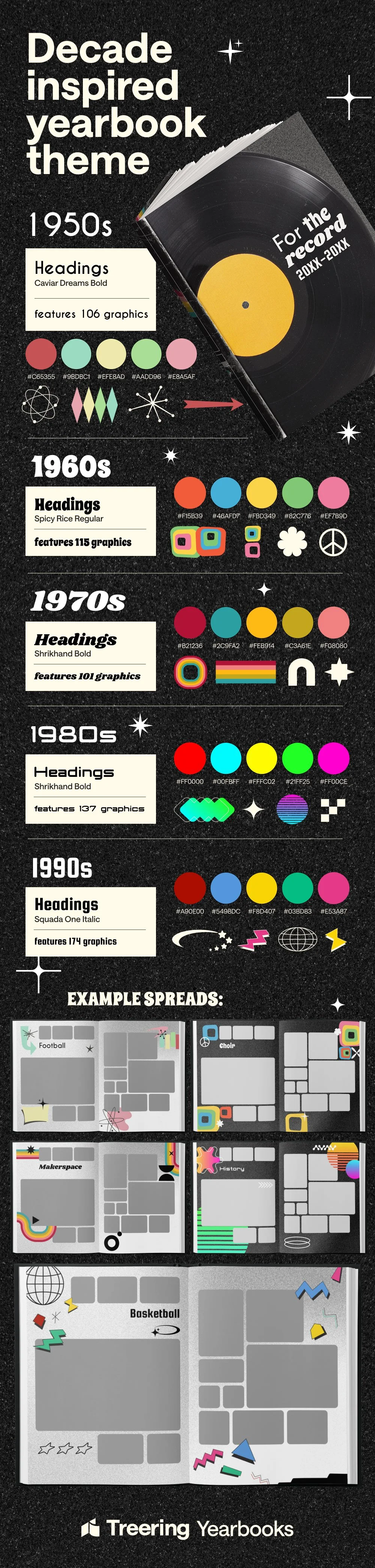
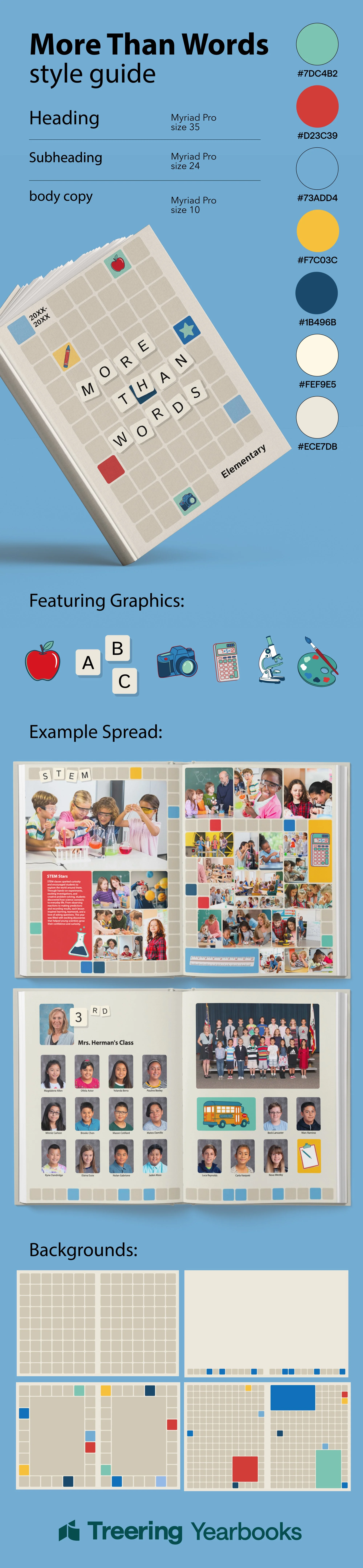
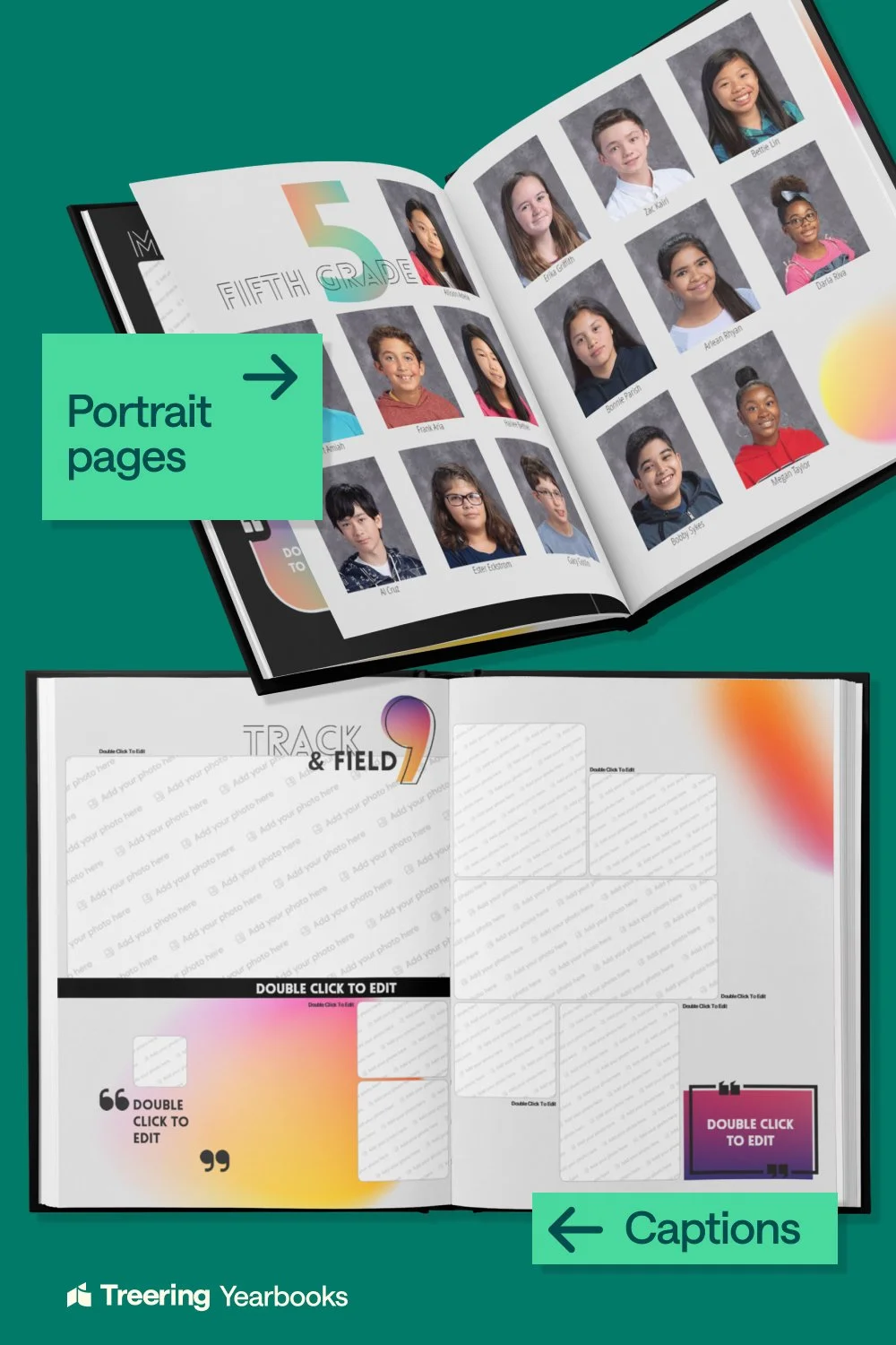
The Theme Kit Breakdown shows the cover, fonts, color palette, number of graphics, two sample layouts, and four backgrounds. It's for evaluation, when someone has picked a style and needs to know if the kit delivers enough.
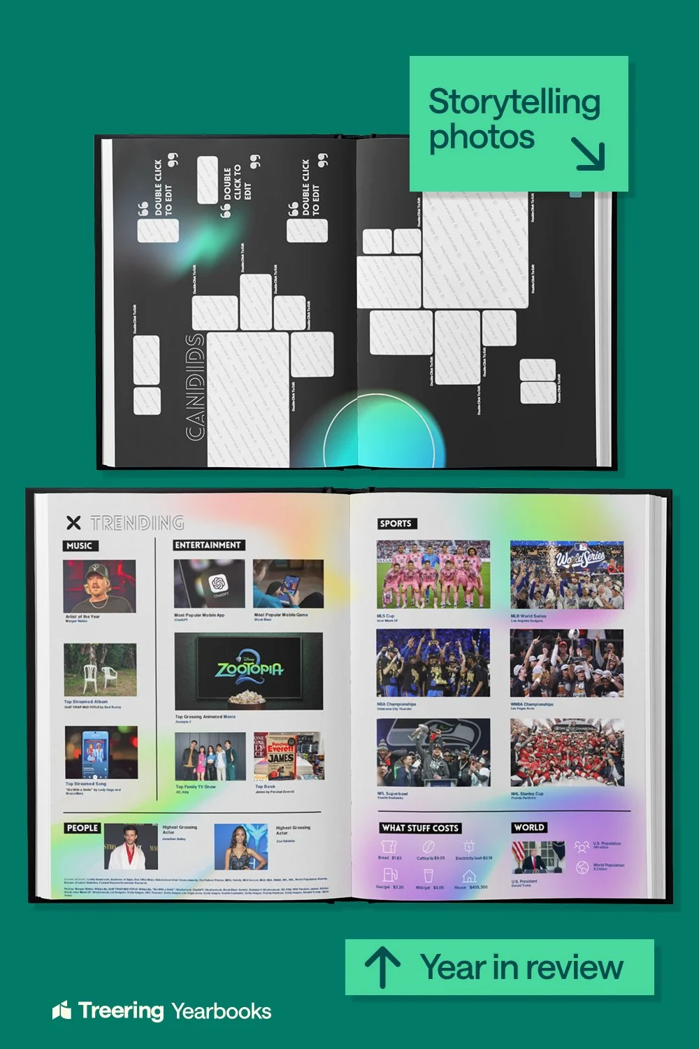
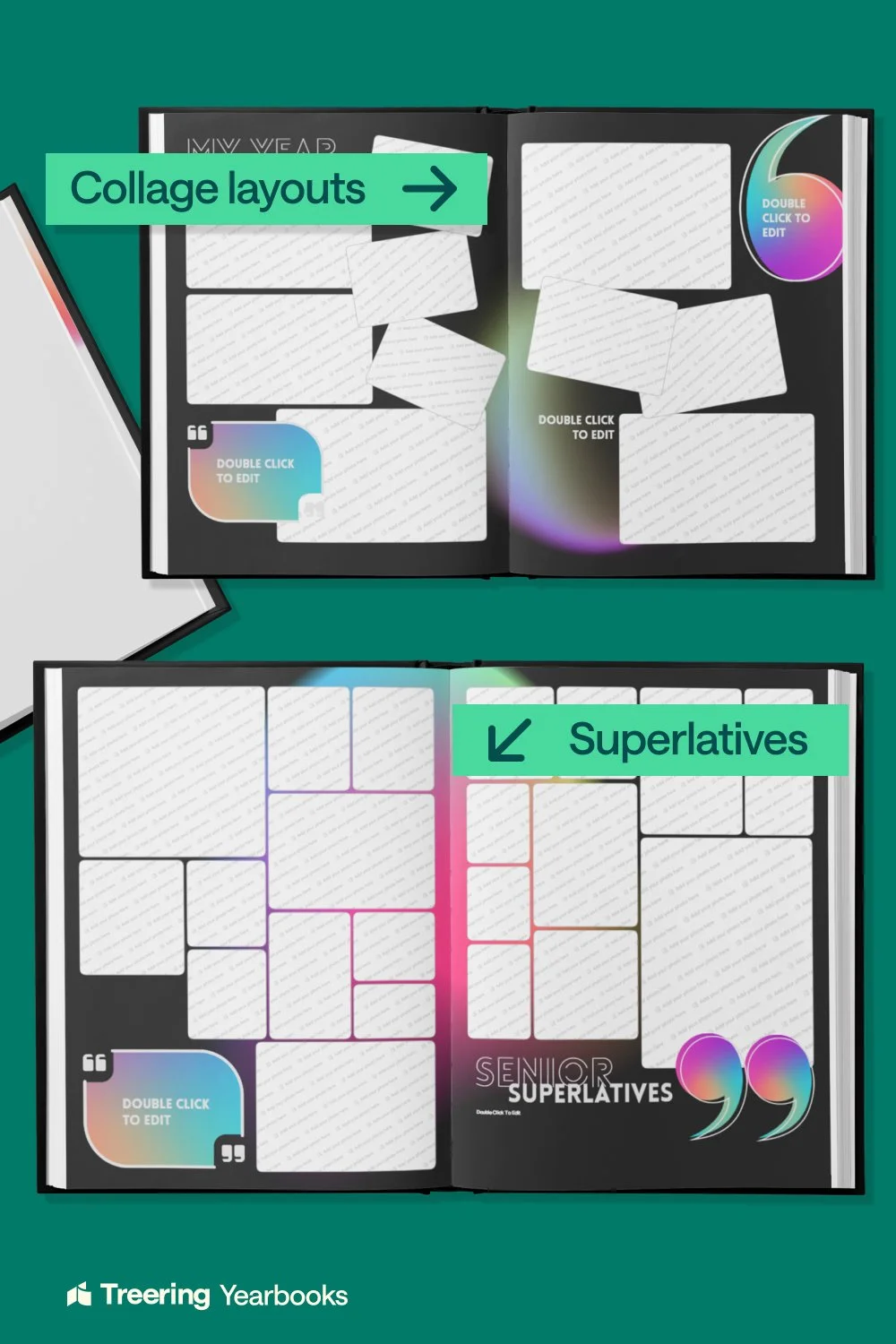
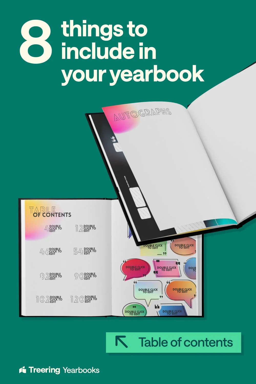
8 Things displays the eight layouts in a theme, like table of contents, collage, superlatives, year in review, and portrait pages. It’s for advisors who know what they need and want to check if this theme covers it.
Overview, Theme Kit, 8 Things maps to discover, evaluate, and decide. An advisor browsing Pinterest moves through all three without realizing they're being walked through a funnel.
Pinterest results: August 14 to November 12, 2026
I design the visuals for Treering’s pins based on creative requests. The numbers here are for the yearbook-themes board, which includes more than just the three formats mentioned above.
Impressions: 357,280 Saves: 689
Engagements: 7,329 Pin clicks: 6,366

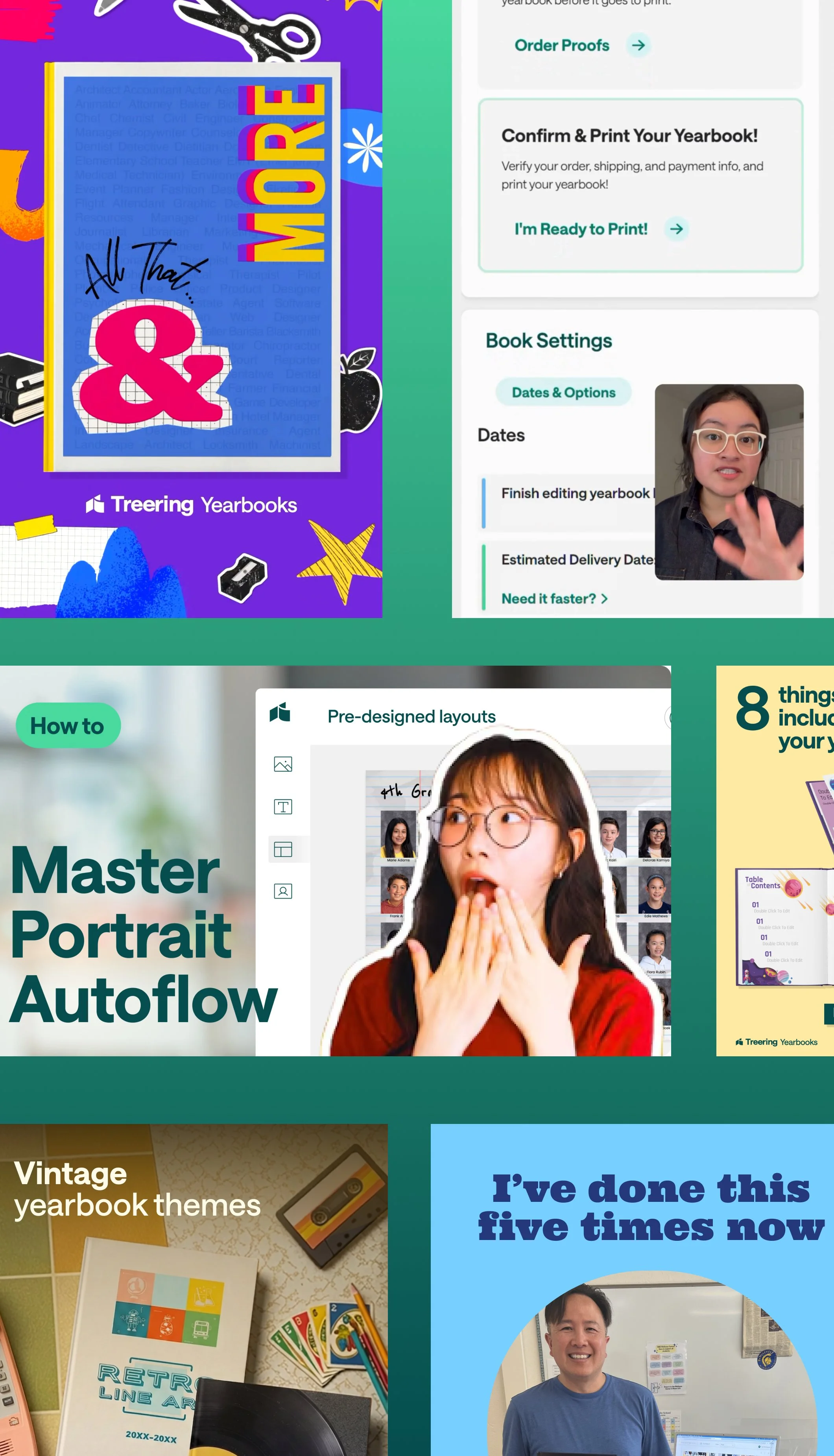
Instructional videos: friction removal, not feature tours
Most instructional content focuses on features. We decided to address the two main points where first-time customers struggle.
How to Upload Photos shows new users exactly where to upload, which is a common drop-off point. It also explains the difference between yellow folders (for everyone) and blue folders (for editors only).
Sending Your Book to Print addresses the most common confusion: users not knowing they need to press "I'm ready to print." This video is designed to prevent last-minute support tickets and missed deadlines.
The 18-second print script, written for slow, clear narration:
"Before you send your book to print, you'll want to do a quick final check. Review your pages, confirm your photos are properly cropped, and make sure you've submitted any missing content. When you're ready, click I'm Ready to Print. That's the step that sends your book to us. Don't skip it."
Conversion Ads
The goal was conversion. We created two ads for different stages of the funnel.
Both ads target school prospects like administrators, PTA leads, and teachers. They run as 1080x1920 animated vertical videos and end with the same call to action: Get a Demo.
ToFu, Son of Man is an aspirational ad for viewers who are close to making a decision. Inspired by Magritte, it features a faceless, iconic figure so viewers like admins, parents, or teachers can see themselves in the role. The yearbook is the focus, and the viewer becomes the creator. The ad aims for aspiration rather than demonstration.
BoFu, 100+ Theme Kits is a direct, content-focused ad for people seeing Treering for the first time. It starts with the value proposition, "100+ theme kits. Speed up content creation," and then shows three themes side by side, each with its cover, graphics, and layouts to quickly prove variety and depth.
Paid ads, September to October 2026
I also designed three paid ads that ran in the fall, using the brief and copy from our Digital Marketing Manager. My role was to turn their message into clear, on-brand designs that are easy to read at a glance. Here are the results from the team’s September-October 2026 ad review.
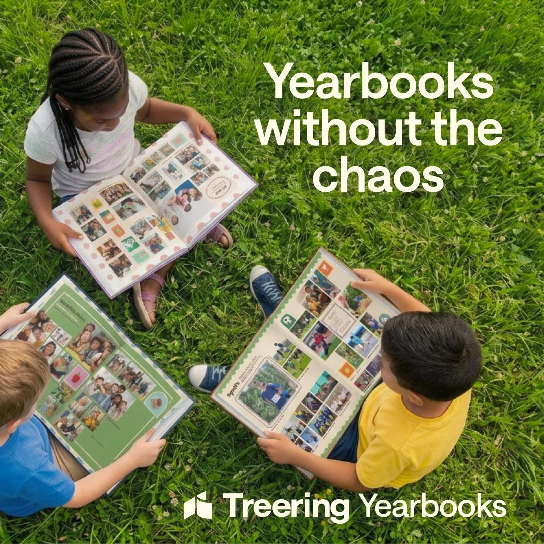
Yearbook without the chaos: 277,303 people reached, $1.57 CPM
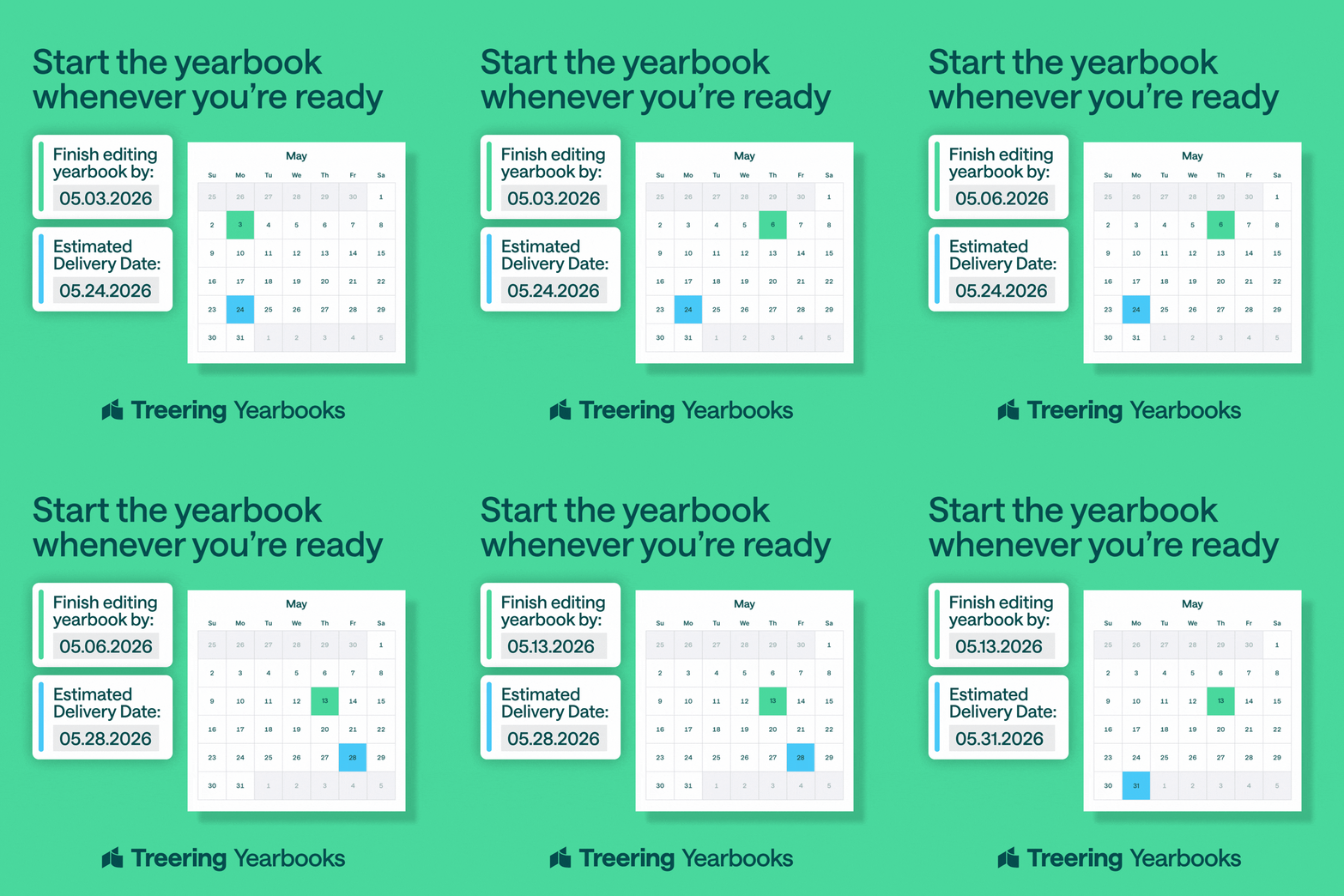
Start the yearbook whenever you’re ready: Best CTR, 7.26%, in the web traffic set
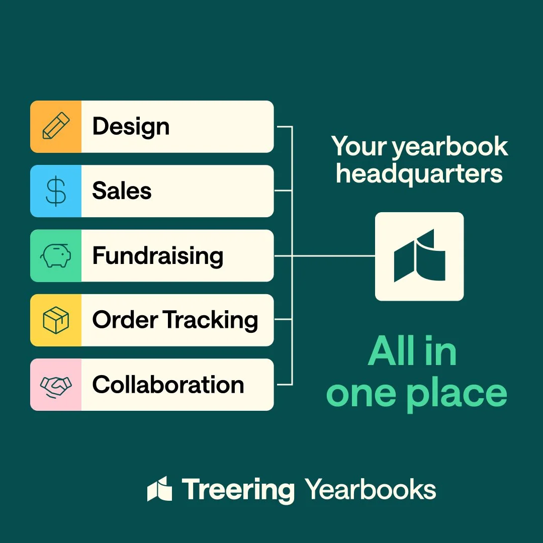
All in one place: Highest CTR, 5.73% CTR, in the conversions set
PTA conference bandanas: swag worth keeping
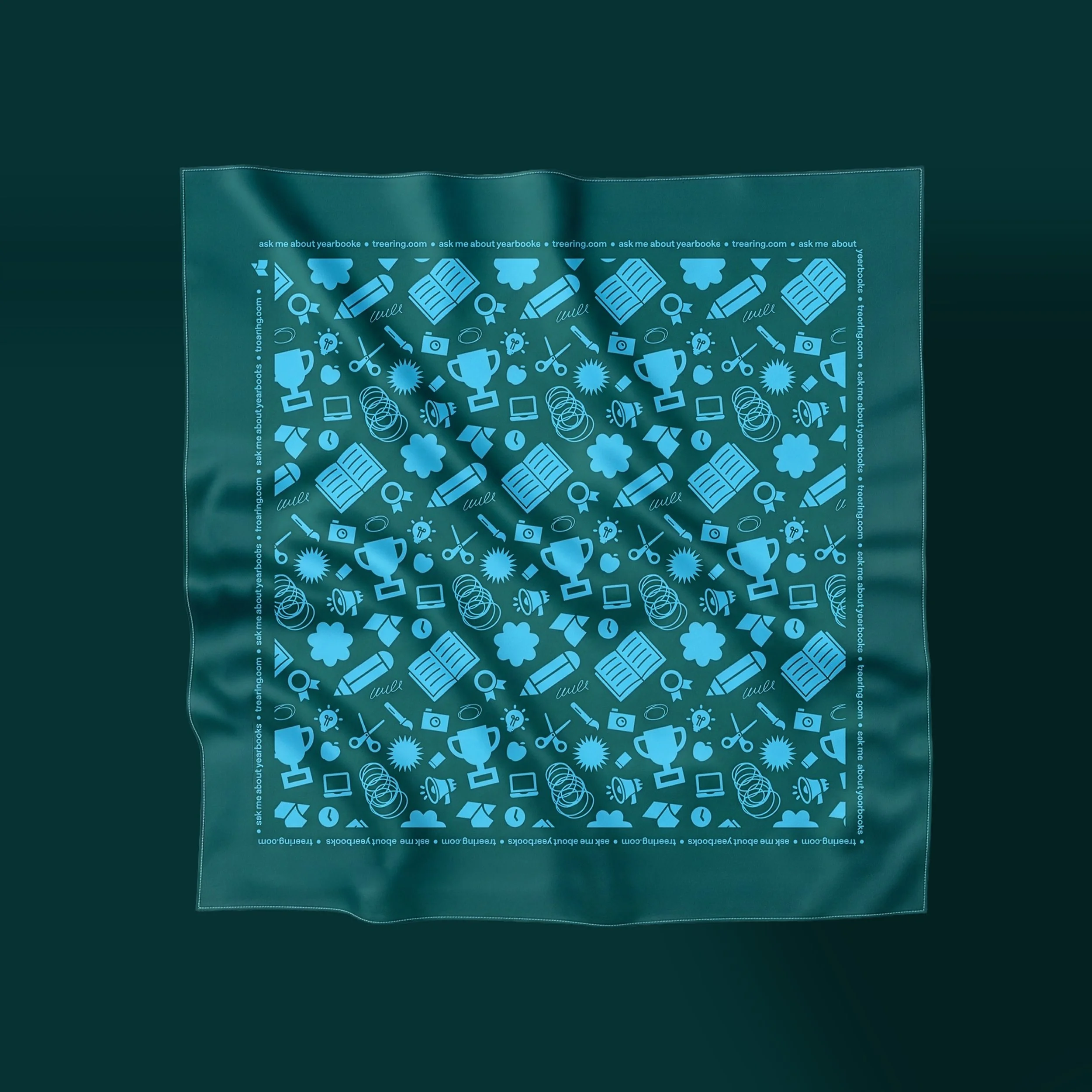
Most conference swag gets thrown away. We chose to make something handmade, so people would want to keep it.
For the Texas PTA Conference in Dallas, which is a key event for Treering’s target audience—school administrators, PTA officers, and community coordinators—I designed bandanas with hand-drawn Treering illustrations. Hand-drawn items at a trade event show the same care and craft Treering wants users to feel when they use the platform. The bandanas were gone within two hours.
The idea: "I'm Not a Designer"
Role: Design
Team: Jennifer Durrant, Erika Payne, Megan Puzen
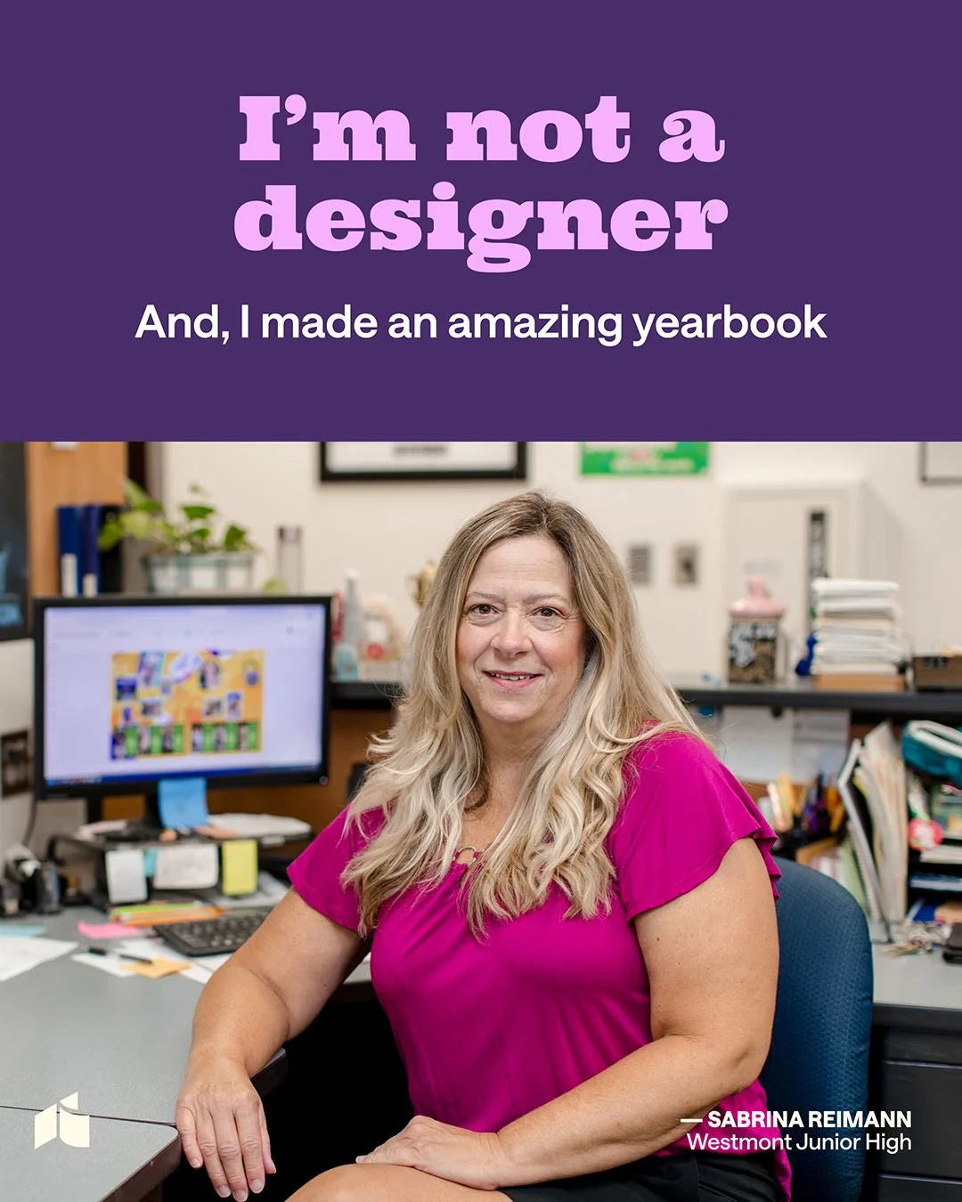
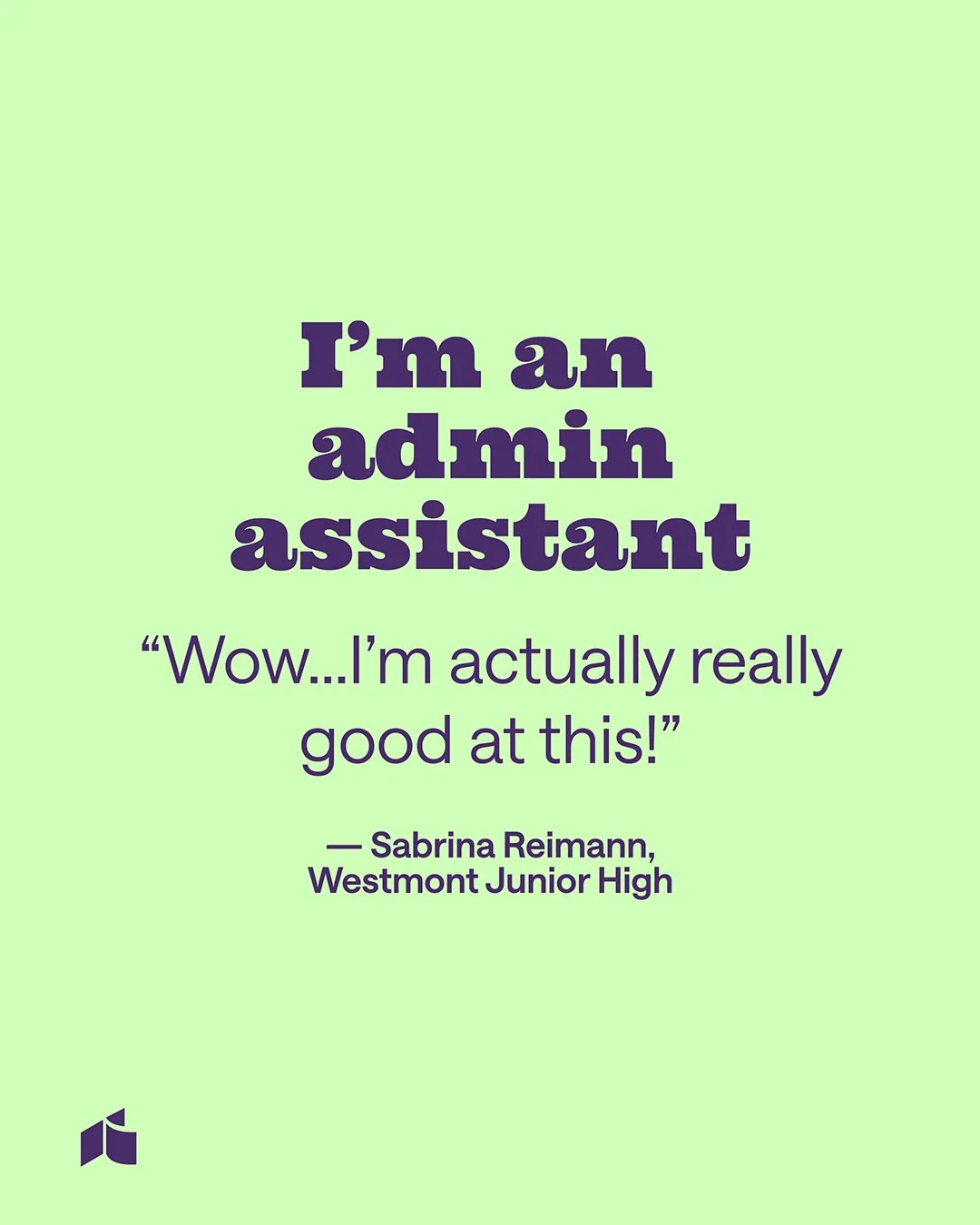
We decided to use the line that every customer says as the campaign hook.
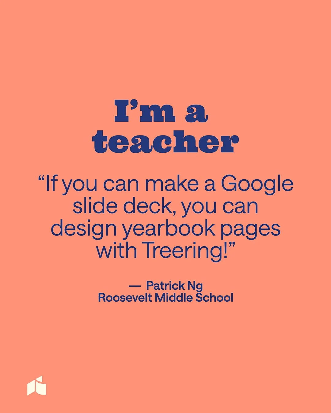
"People want to look and feel like designers, without being one." Core brand insight, Treering Yearbooks
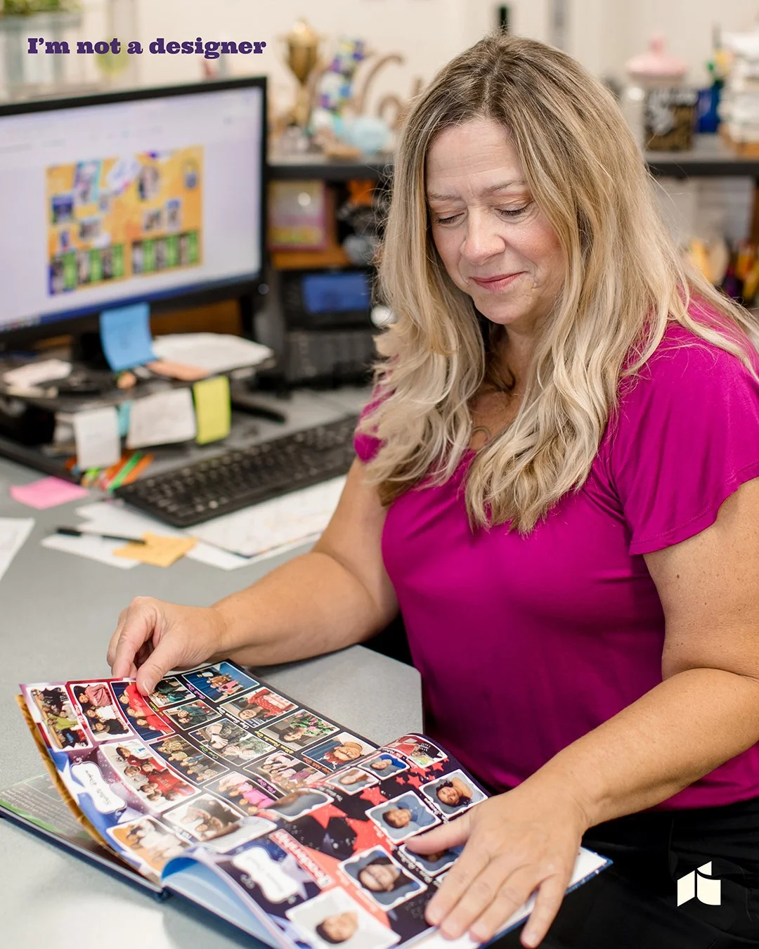
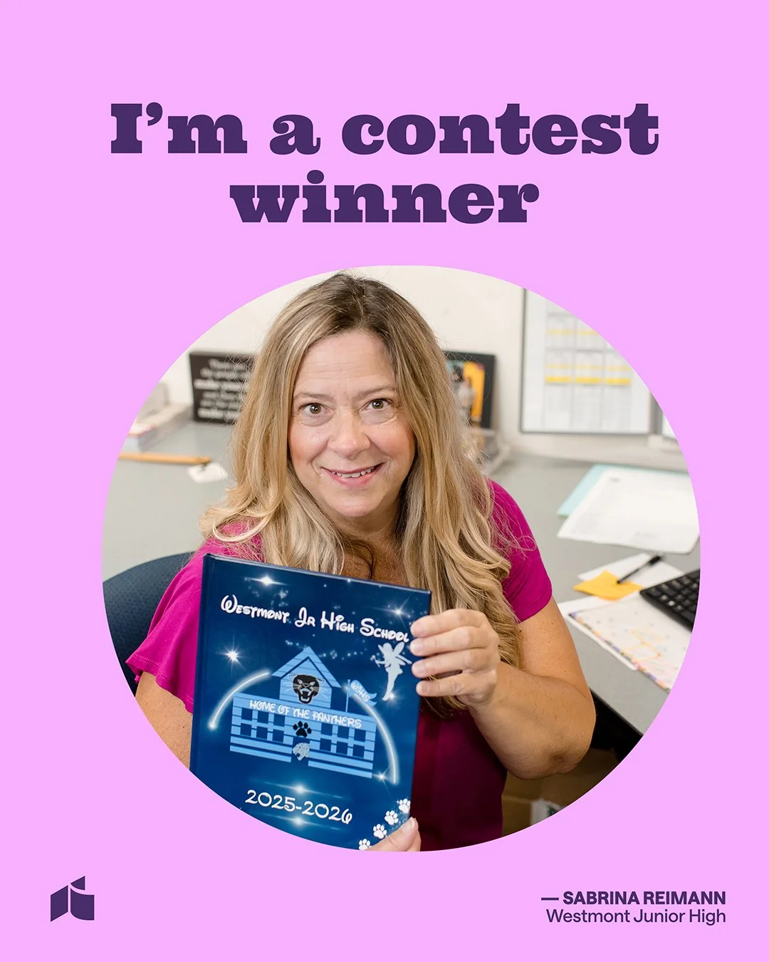
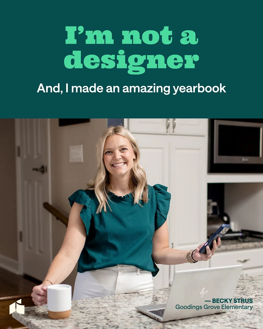
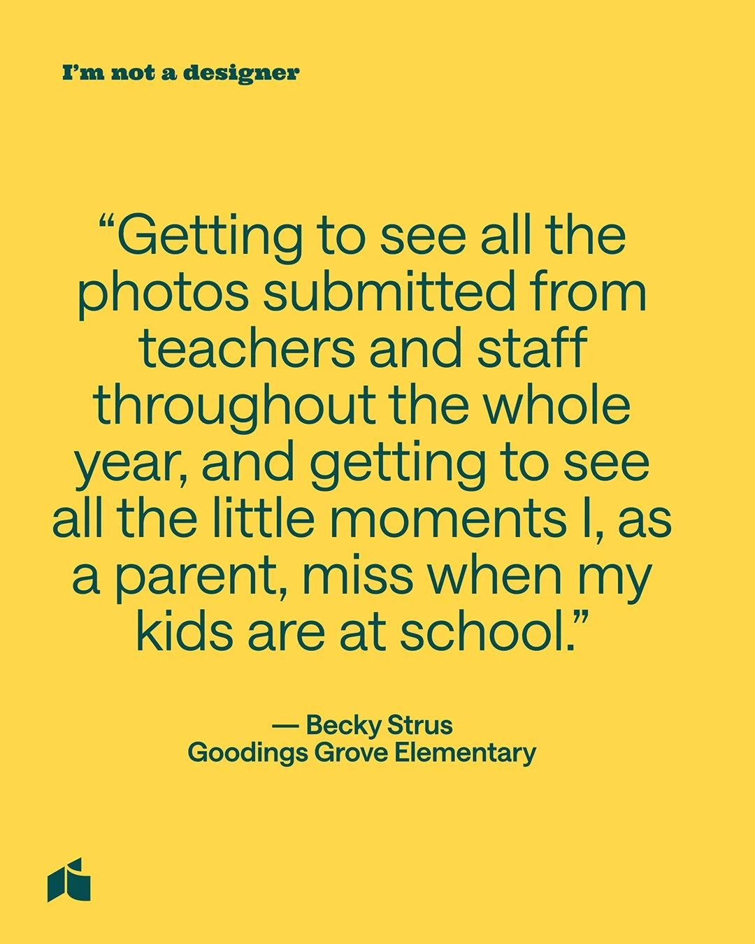
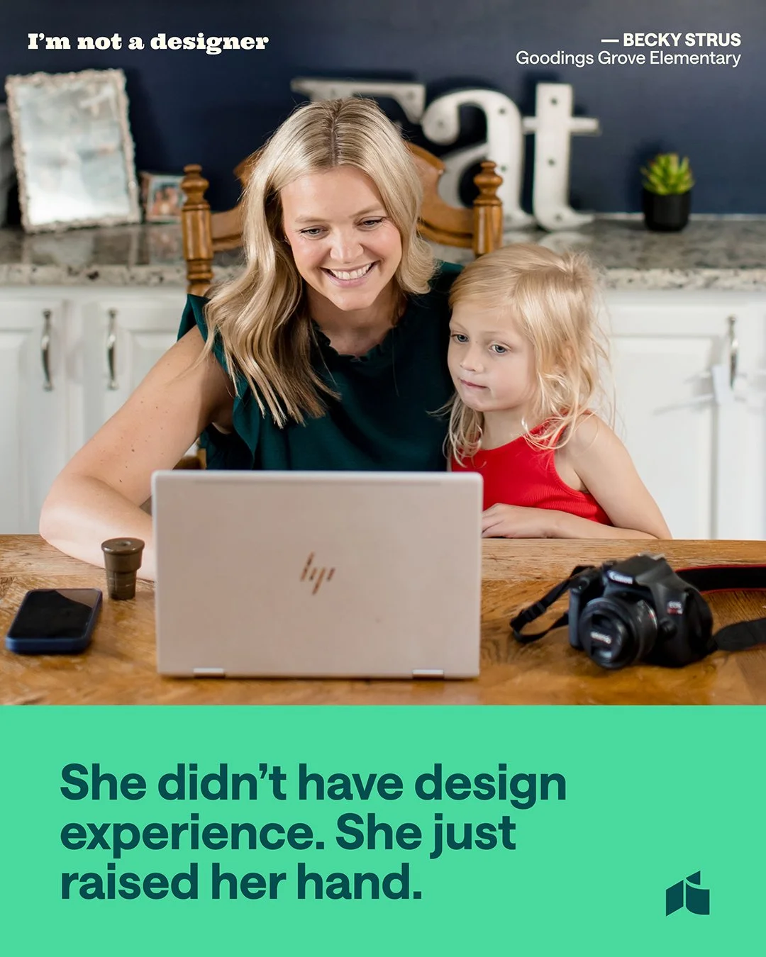
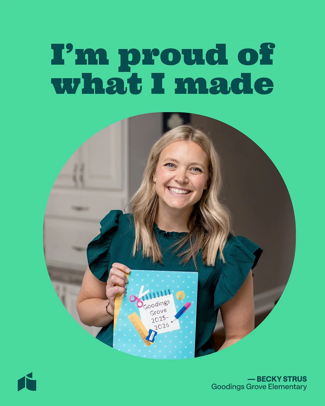
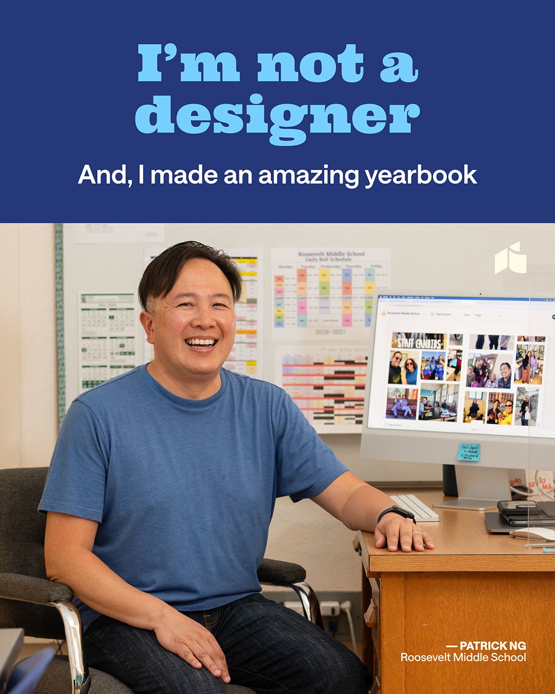
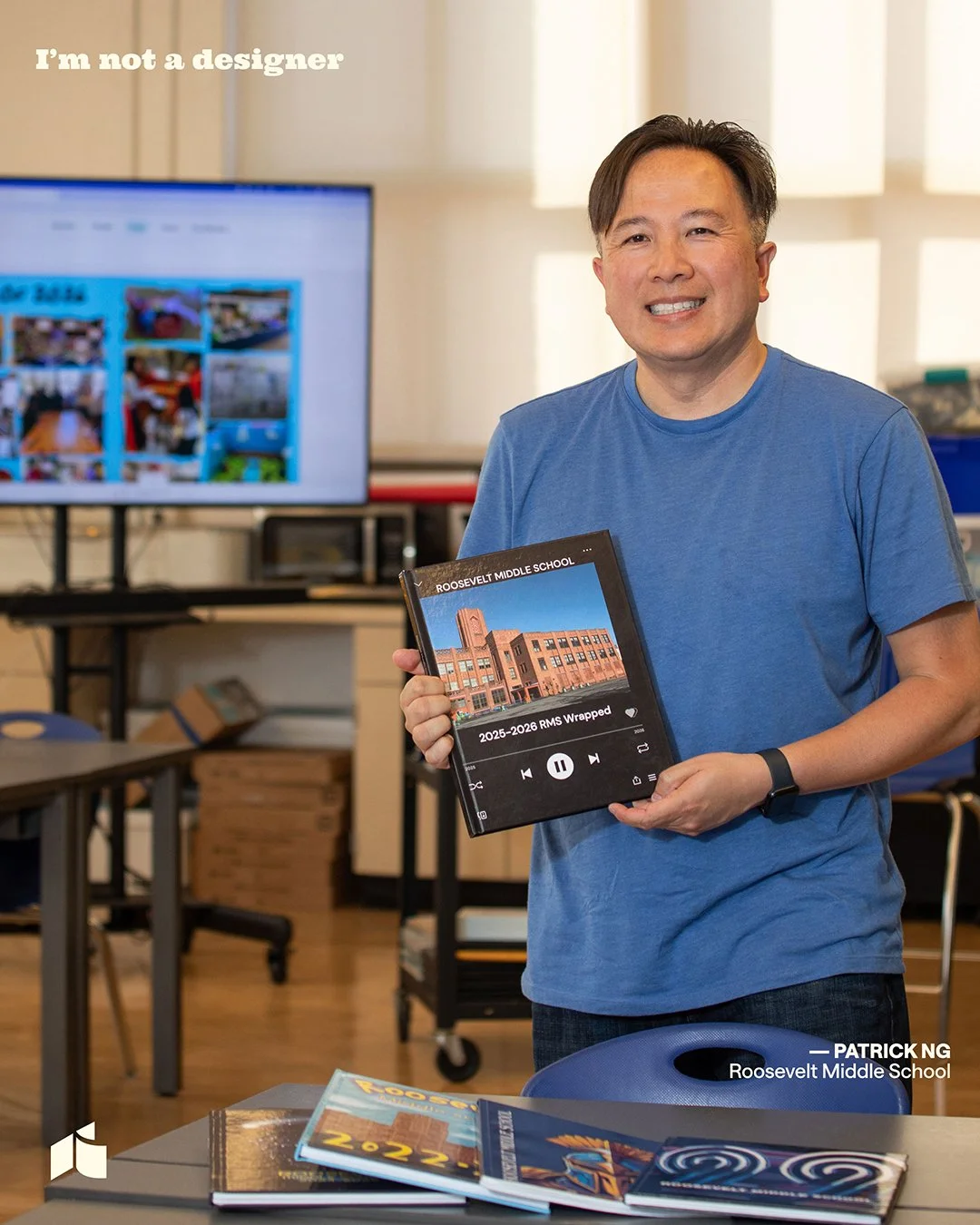
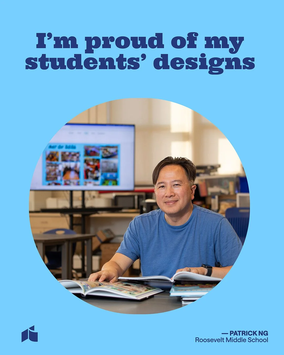
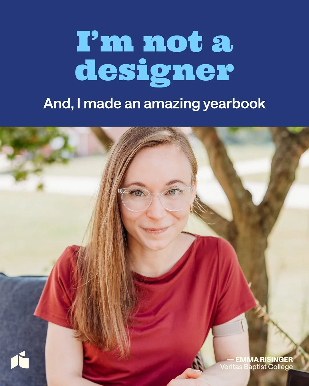
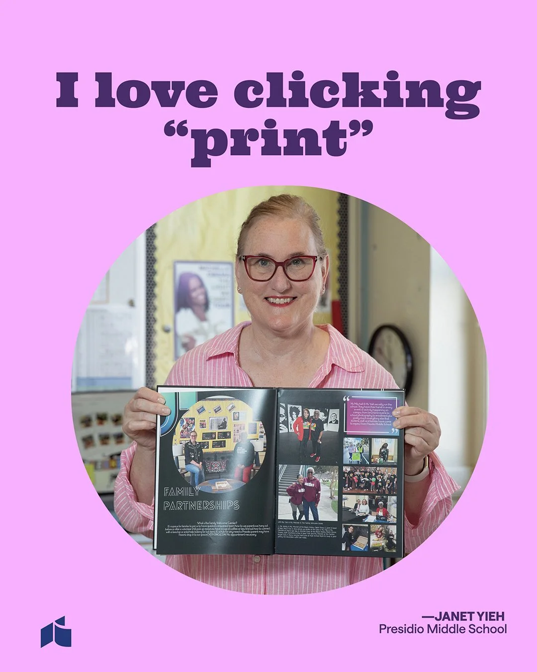
The campaign highlights seven real Treering customers who don’t see themselves as designers: an assistant principal’s assistant, a PTO volunteer, a media teacher, and a Treering CSM. Each story shows how Treering helps their work look professional, even if they aren’t designers.
These are real customers, not actors. They have different roles in schools, so everyone in the audience can relate to someone.
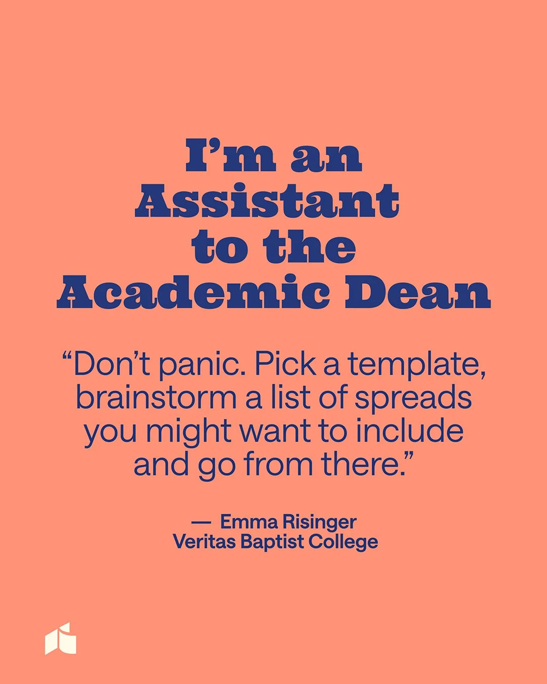
Call out the tension. People often say "I'm not a designer" before they begin. By saying it first, we take away the worry and show that Treering is the solution.
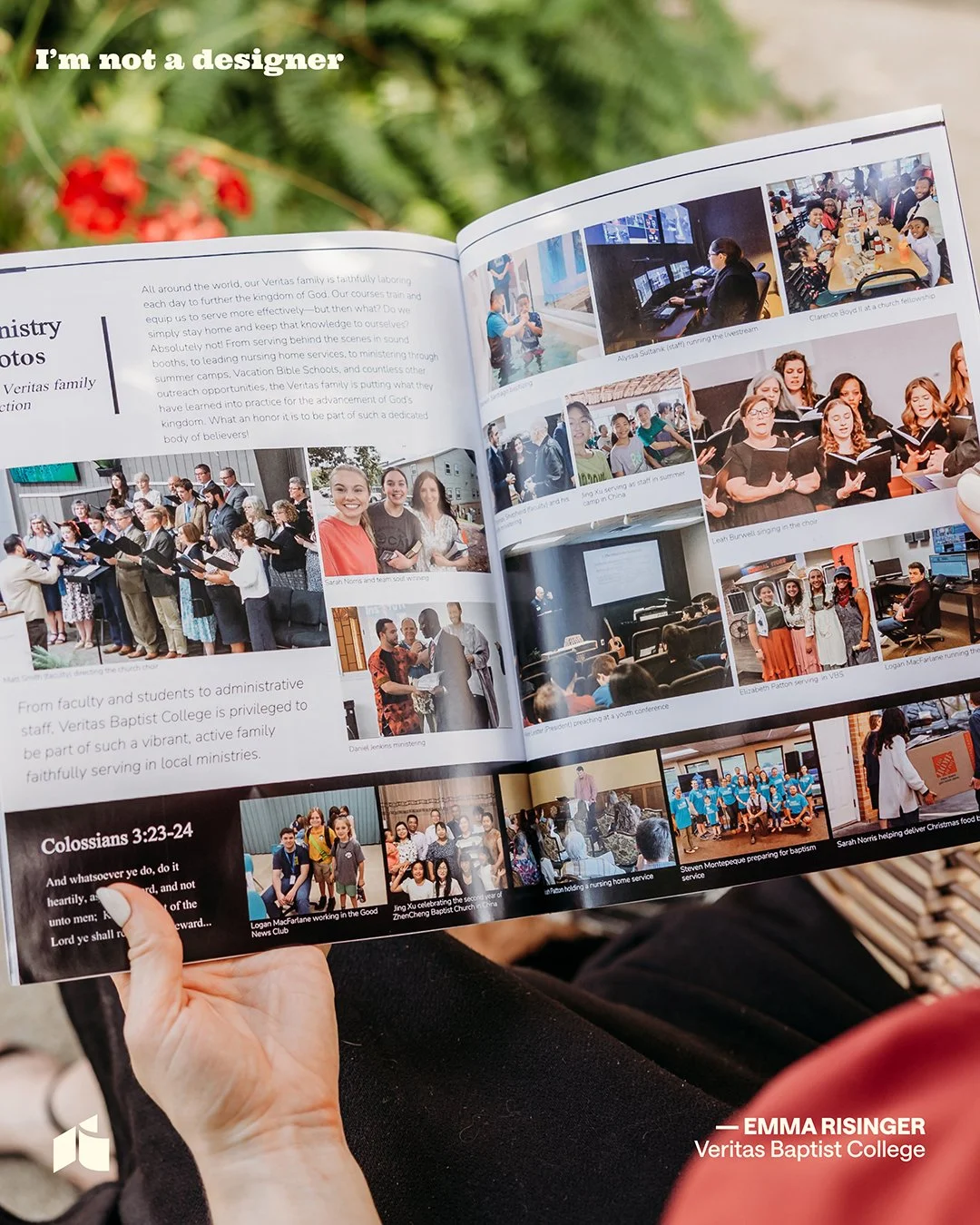
Show the outcome. Each post ends with the finished yearbook they created, which looks professionally designed. The product delivers on its promise.
A thumbnail system anyone on the team can repeat
The issue wasn’t with a single thumbnail. The real problem was the missing system.
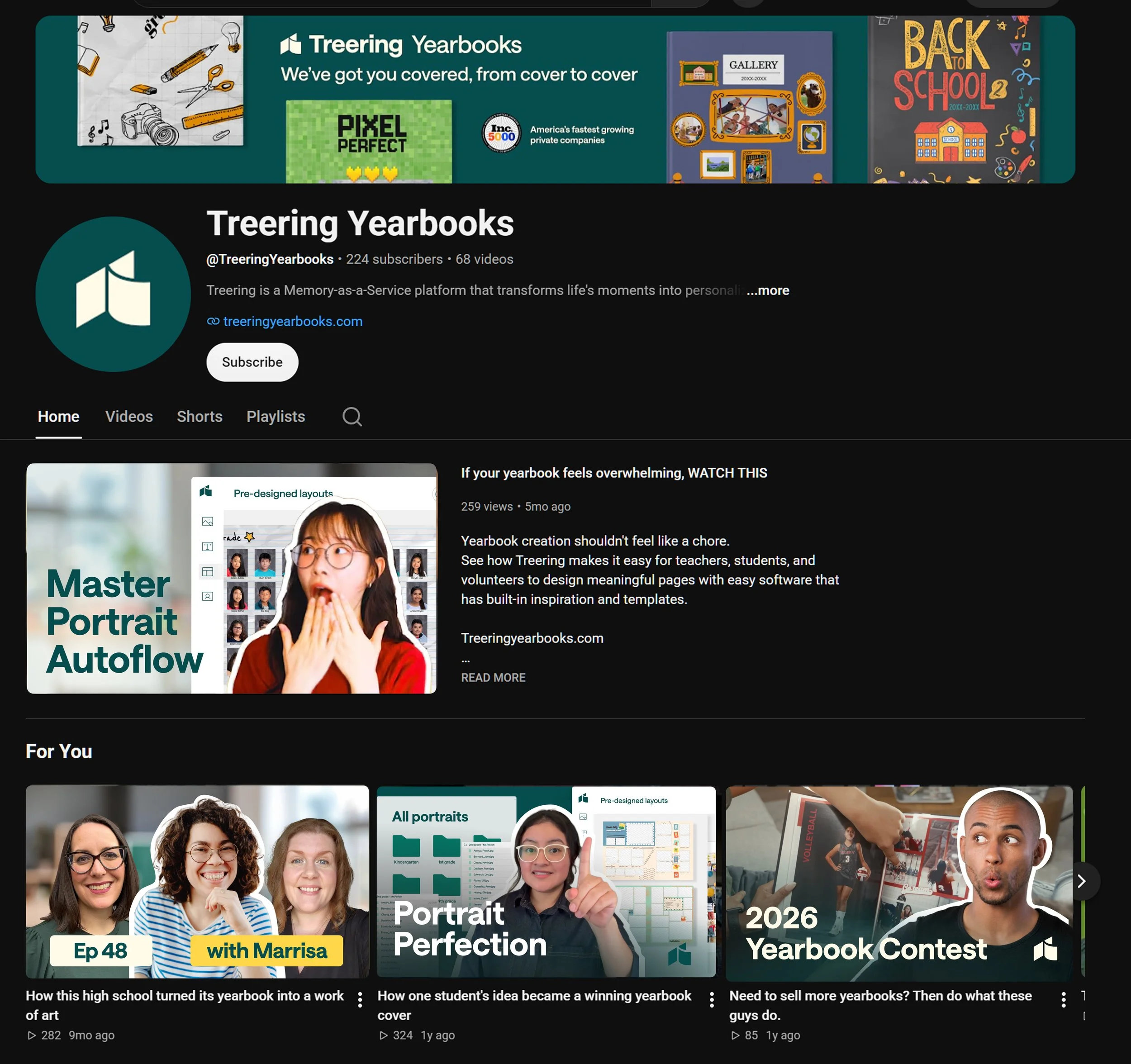
I created a single visual style for both the YouTube channel and the website: electric green glow, outlined people, and titles in set spots. A/B labels on webinar and how-to videos let the team test headlines without redesigning each thumbnail.
YouTube
The title sits at the bottom left. The exception is the Q&A sessions with Erika and Cassie, which get a more dynamic layout.
The green glow is always at the bottom, which keeps the title easy to read over the image.
People are cut out with a white or electric green outline.
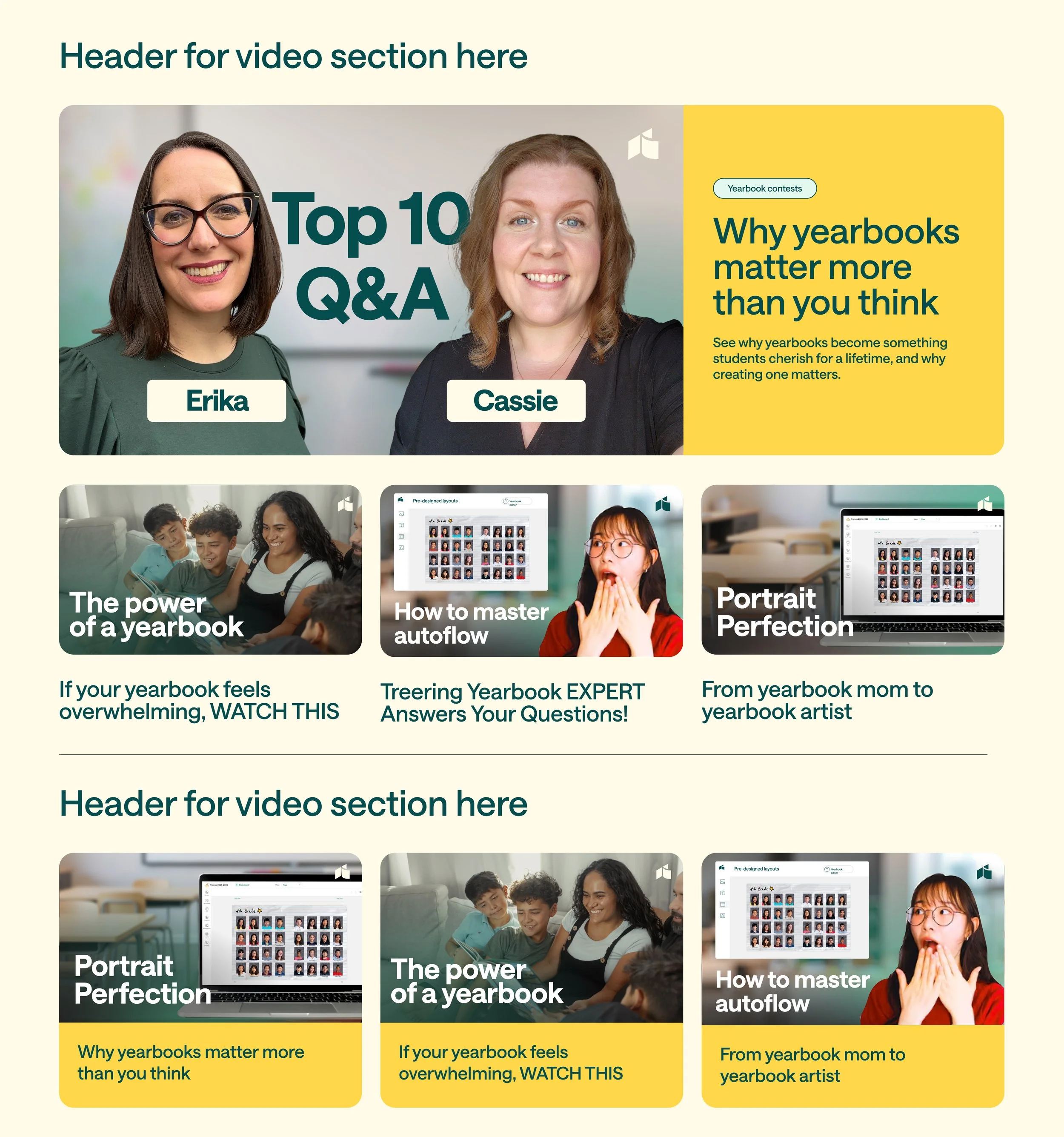
Website
Place the glow and cutout on the right. The cutout shows a person, the product, or the app, with the green behind it.
The title is on the left. If it needs more contrast, a dark gradient goes behind it.
When the cutout is a group of people, the green gradient moves to the left with the title. Groups take up more space, so a glow behind them wouldn’t stand out, and they don’t need as much highlighting.