Feelosophy
Simple enough for a child. Credible enough for a courtroom.
Brand positioning and website launch · 2026
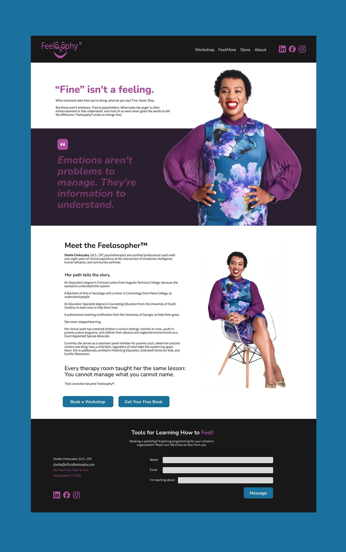
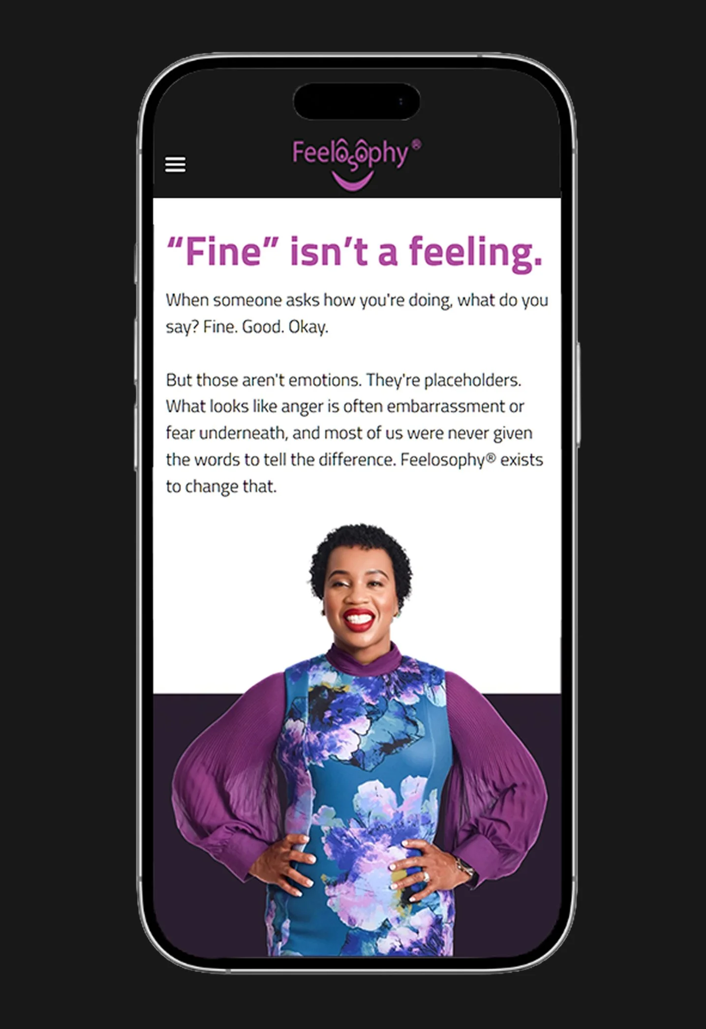
Feelosophy® helps kids, teens, and adults put their feelings into words. I took care of the positioning, messaging, visual direction, and SEO, then built and launched the site on Strikingly. It was a solo project: a two-page site, three lead-capture paths, and a trademarked logo that stayed unchanged.
Client:
Feelosophy®
My role:
Strategy, messaging, SEO, wireframes, and build
Deliverables:
Positioning and voice brief, full site copy, a published two-page site, Mailchimp lead capture
Tools:
Strikingly Pro, Figma, Mailchimp
Timeline:
July to August 2026
Live Site:
https://www.officialfeelosophy.com/
The Challenge
Feelosophy had a solid method but a weak first impression.
Shellie is a psychotherapist and certified coach. She noticed that clients of every age answered "how do you feel?" with "fine," so she built a program that teaches people to use more words.
The old site didn’t reflect that idea. Its title was just "Landing Page." The search description was empty. There were typos, placeholder products, and no way to capture leads. Plus, it needed to speak to two very different groups: families looking for tools, and schools, courts, and organizations reviewing the program.
Then came the constraints:
The logo is a registered trademark. It stays untouched.
No AI-generated imagery. Anywhere.
The eBook, podcast, and game were all at different stages of readiness.
One platform (Strikingly), a fixed scope, and a fixed timeline.
Working within limits shaped every decision I made.

Positioning
Two types of programs already exist in this space: clinical ones that are official but feel cold, and warm, relatable content that lacks structure. Feelosophy needed to fill the gap. The line that summed this up was: "Simple enough for a child. Credible enough for a courtroom."
One site served two audiences. Parents, teens, and women who learned to hide their feelings needed warmth and an easy first step. Schools, courts, and workplaces needed evidence.
Shellie picked three brand words: Effective, Educational, and Trustworthy, and made sure everything stayed balanced. The site couldn’t feel childish or clinical. Designing for the middle is hard, but that was the goal.
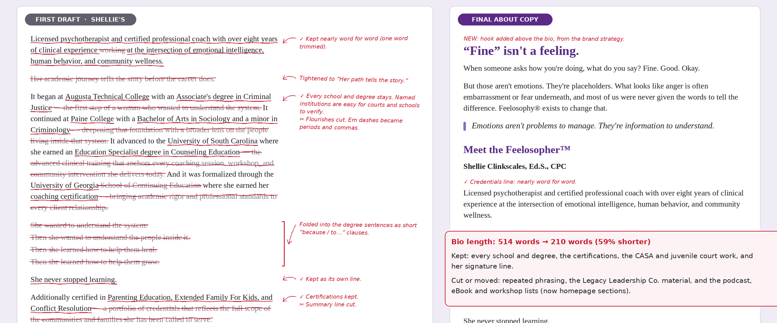
For messaging, I wrote all the site copy using Shellie’s questionnaire and two recorded strategy sessions. Then I cut it by about half so each section could be read quickly. Her signature line, "You cannot manage what you cannot name," became the main pull quote. I stuck to short sentences, plain words, and no jargon.
For search visibility, I made a keyword map for both audiences. For consumers, I used phrases like "how to name your feelings" and "feelings vocabulary." For institutions, I used terms like "emotional intelligence workshops" and "conflict resolution training." I updated the page title and search description with keywords, set up a clear heading structure, and fixed typos that hurt her credibility.
Messaging and search
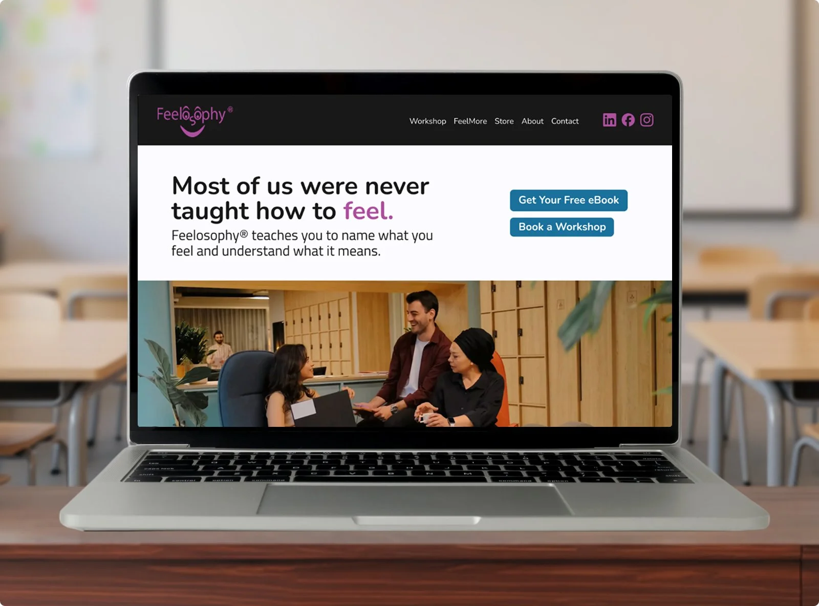
The homepage tells a clear story: the problem, the guide, the plan, and the next step. It starts with "Most of us were never taught how to feel," then explains what Feelosophy does in Shellie’s words: name it, understand it, work with it.
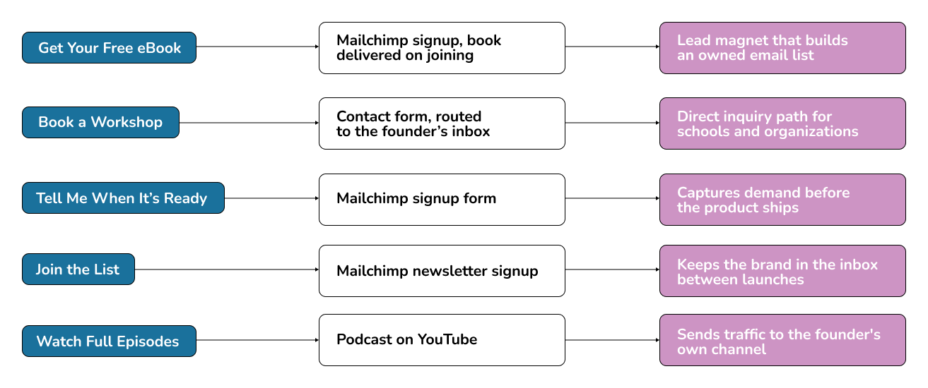
The main focus was building the list first. Since two of the three offers weren’t ready to sell, the site’s main job was to capture interest, not push sales. Every button either starts a conversation or helps someone join a list. Each one is clear, uses first-person language, and avoids guilt or fake urgency. A brand about emotional honesty shouldn’t use pressure tactics.
I used fewer buttons and clarified the paths. I removed the button under each workshop and kept one main action per section. Too many calls to action can make a wellness audience feel pressured.
Site structure
To build credibility for institutional buyers, I used proof from her bio that the old site missed: juvenile court volunteer panel service, work as a Court Appointed Special Advocate, and certifications in parenting education and conflict resolution. We listed her degrees and institutions on the About page so courts or schools can verify them, and repeated this proof near the workshops. workshops.
For design and review, I made three homepage wireframes and two About page versions in Figma. I added notes to each one explaining the purpose of every section and where each button leads, so a non-technical client could review them easily. I made the About page a separate page to keep the homepage focused on offers.
I built the site on Strikingly Pro, wrote custom HTML for the product cards, and set up three separate Mailchimp forms: one for the eBook, one for Bingo notifications, and one for the Hear it First newsletter. I compressed the homepage video so it loads on any device and recorded a walkthrough so Shellie can update the site herself.
Build and integrations
Outcome
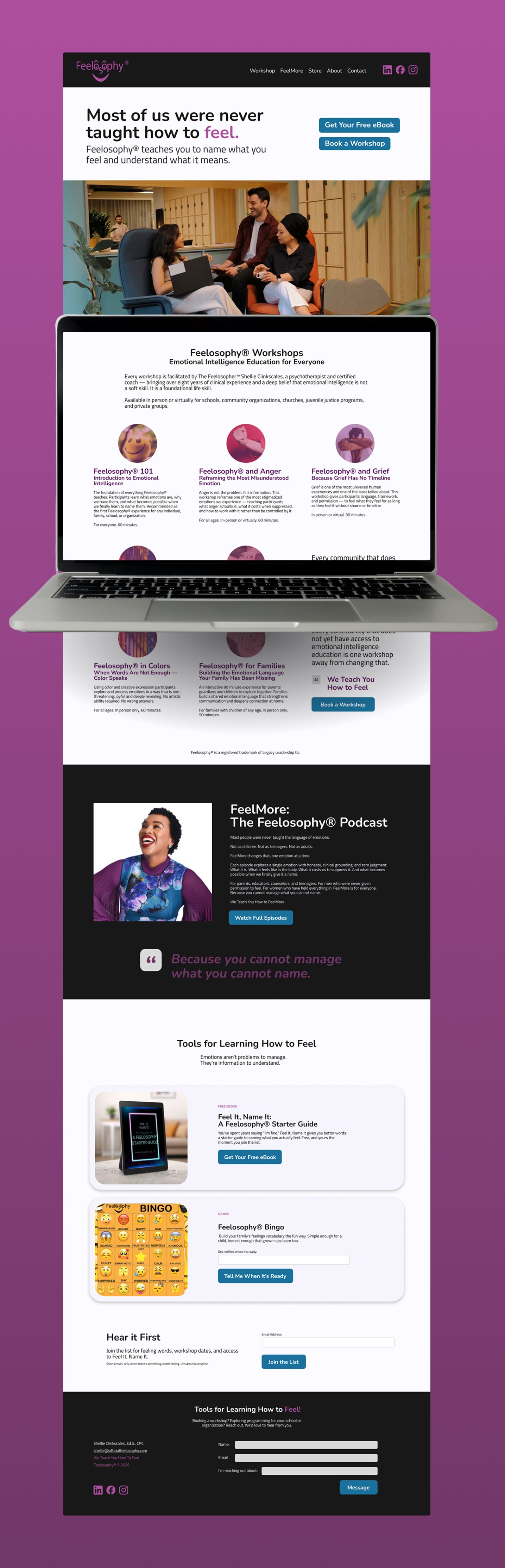
Feelosophy now has a home that matches its founder. The old "Landing Page" is now a two-page site with one clear story, credentials a court or school can check, and three ways to join in. Every button is tested and goes where it promises. Shellie can update it herself, with a walkthrough I recorded.
0 → 3 lead-capture paths. The old site had no way to capture a lead. Now there are three (eBook, Bingo notification, newsletter), each tested end-to-end.
~50% of the copy cut after the first draft, so every section reads in seconds.
2 search fields fixed. A title that read "Landing Page" and a blank description are now keyword-led.
1 trademarked logo, placed exactly as is.