


Freelance Graphic Designer
Social Media, Book Layout, Advertisement, UGC Video
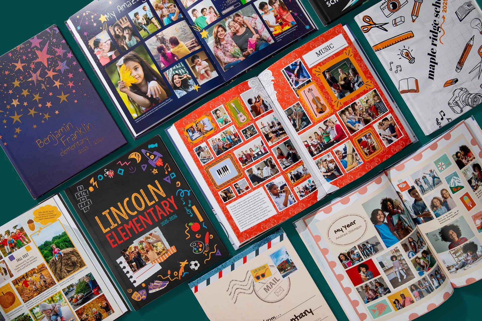
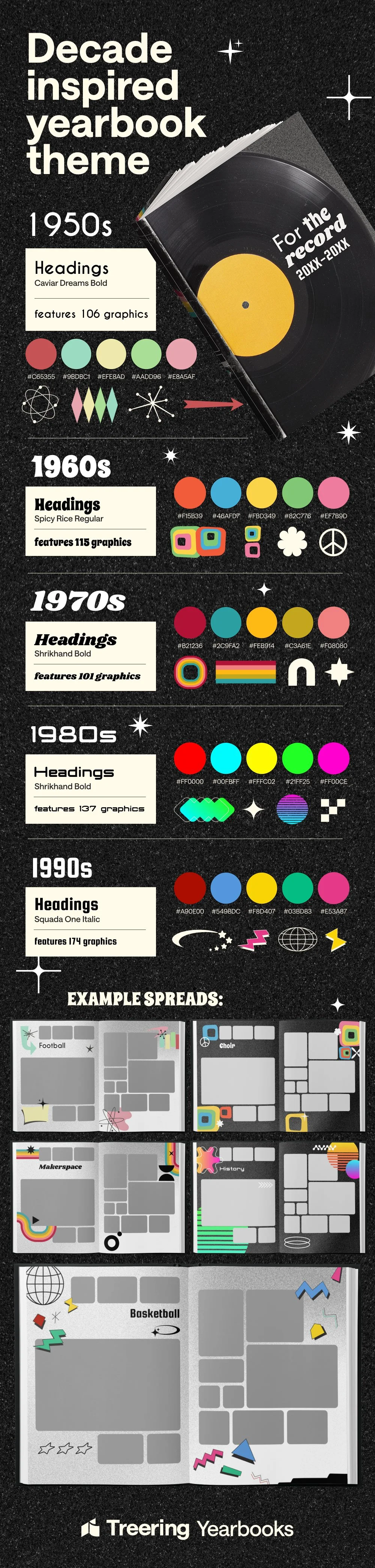
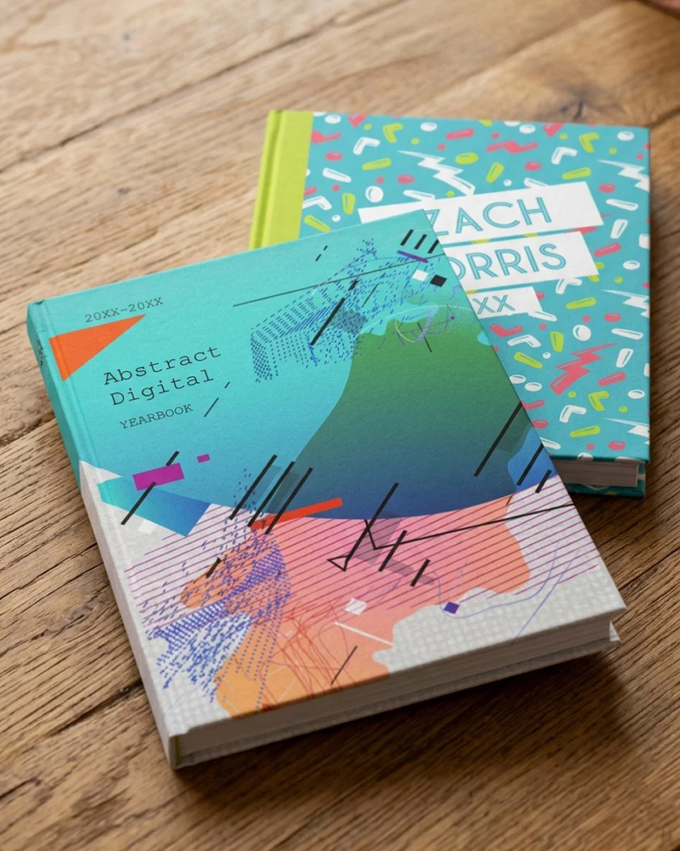
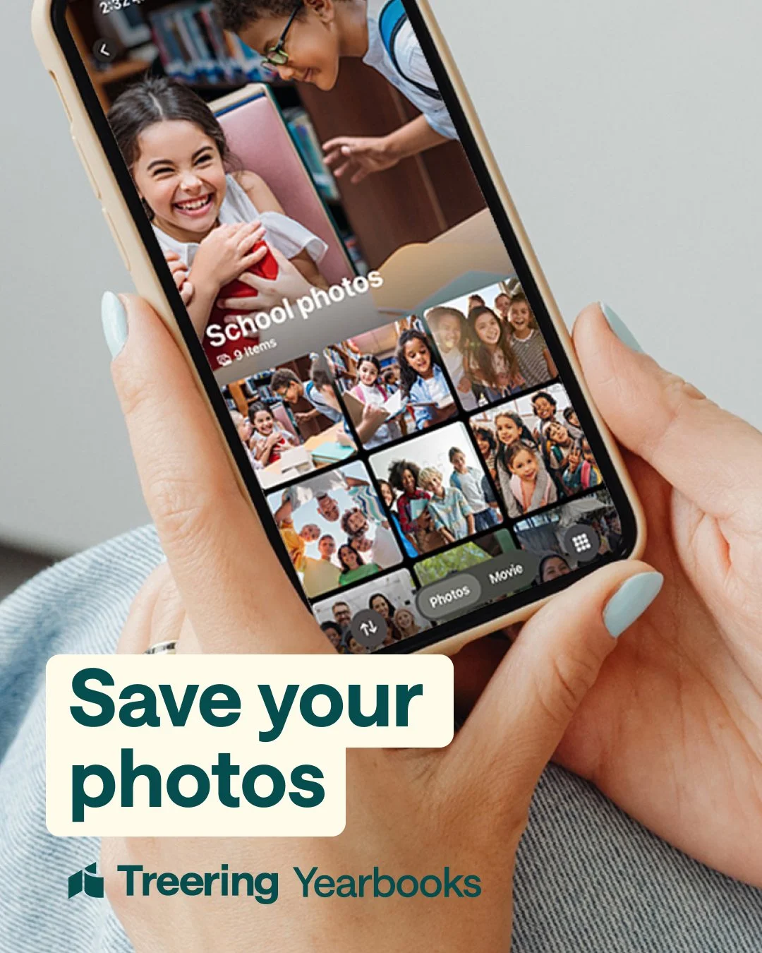
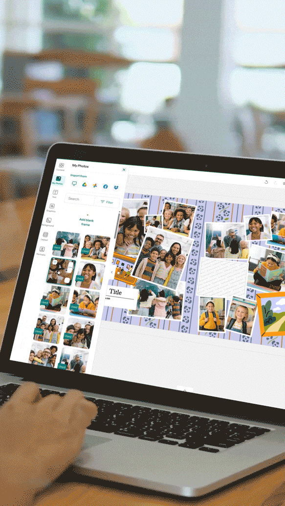
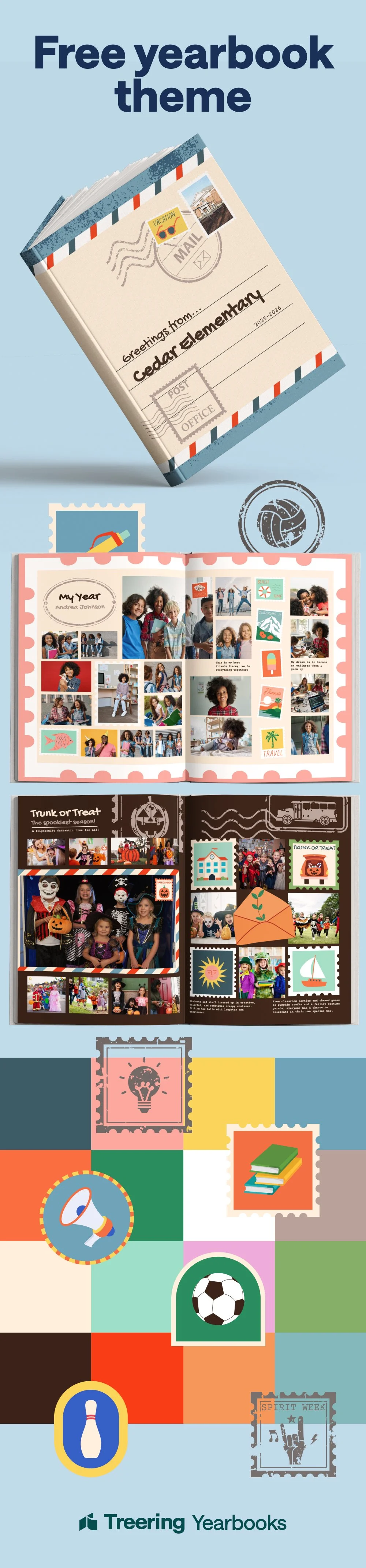
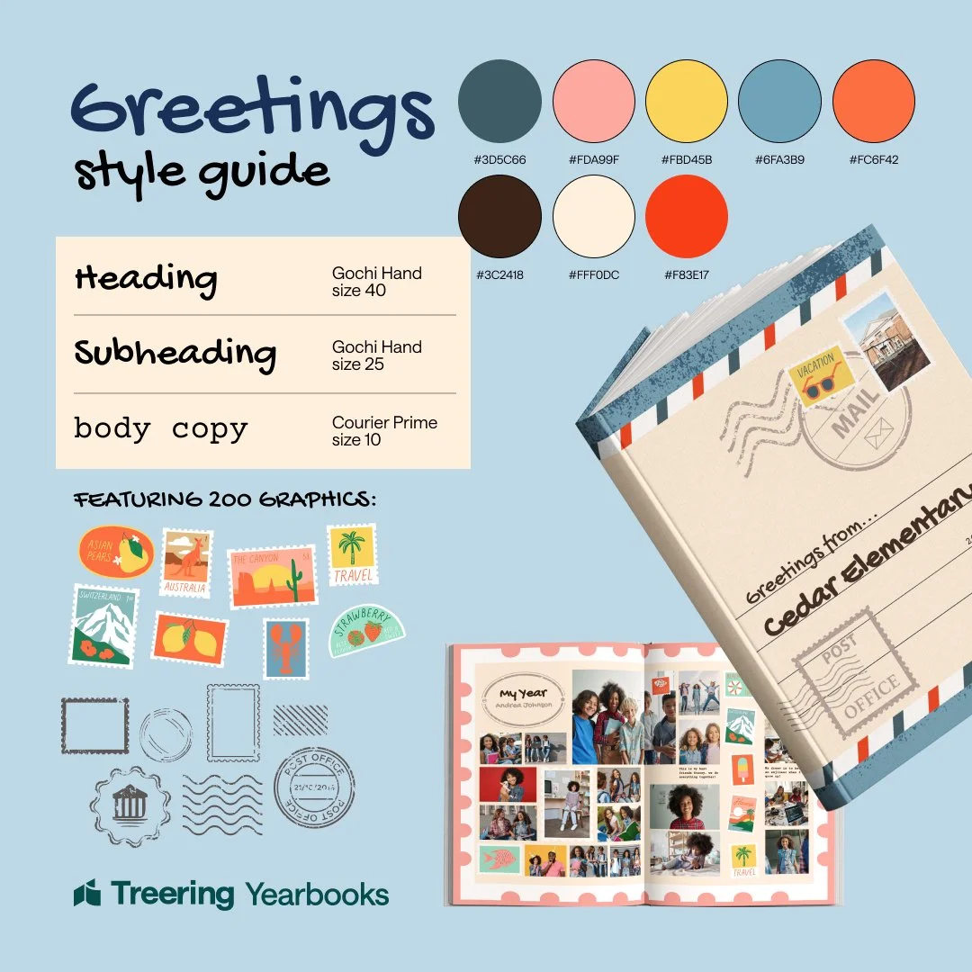
Treering makes it easy for schools to create beautiful, personalized yearbooks, but easy doesn’t always mean obvious. My job was to close that gap: help schools visualize what’s possible, feel confident choosing a theme, and understand the app well enough to actually use it. That meant working across social media, in-app animation, advertising, and mock-up designs. All with the same goal of making a complex product feel approachable and worth trying.

Social Media Content & Brand Launch

The Goal:
Launch Treering's refreshed brand identity on social media and build an Instagram presence that converts curious visitors into confident customers.
The Decision:
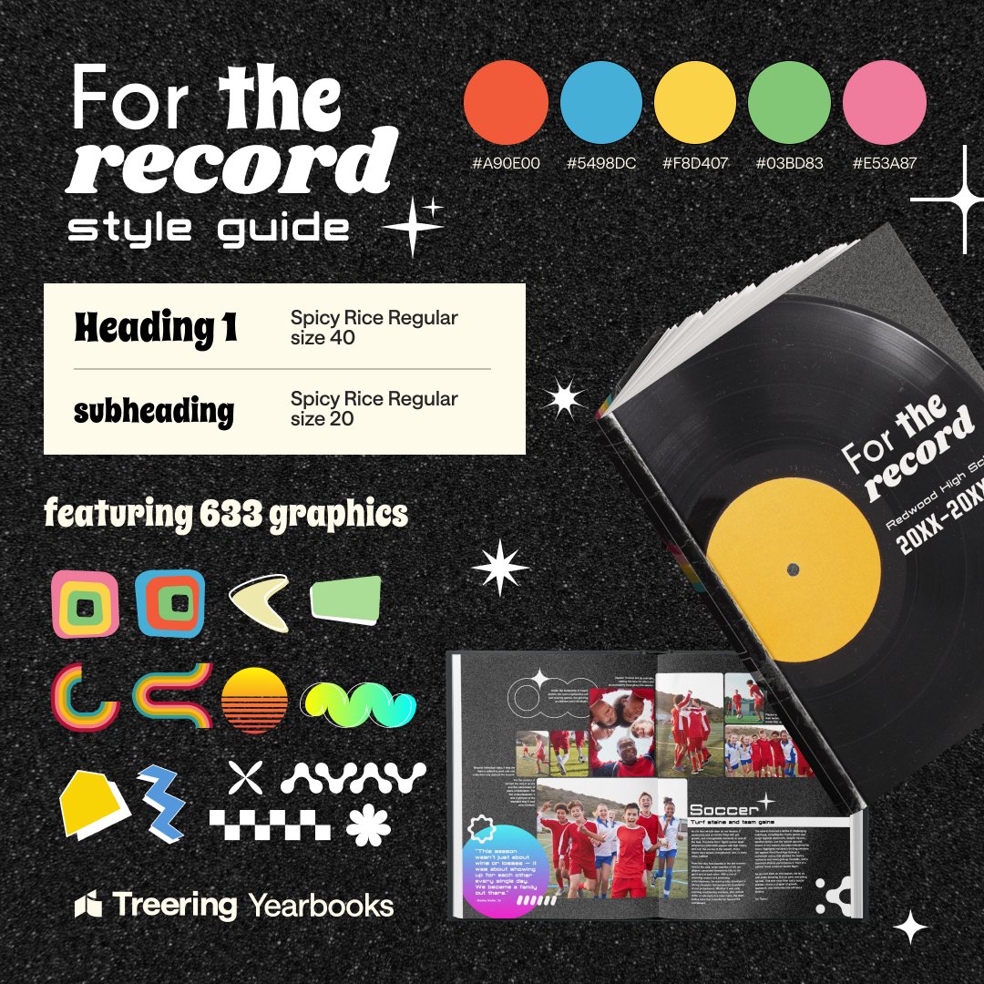
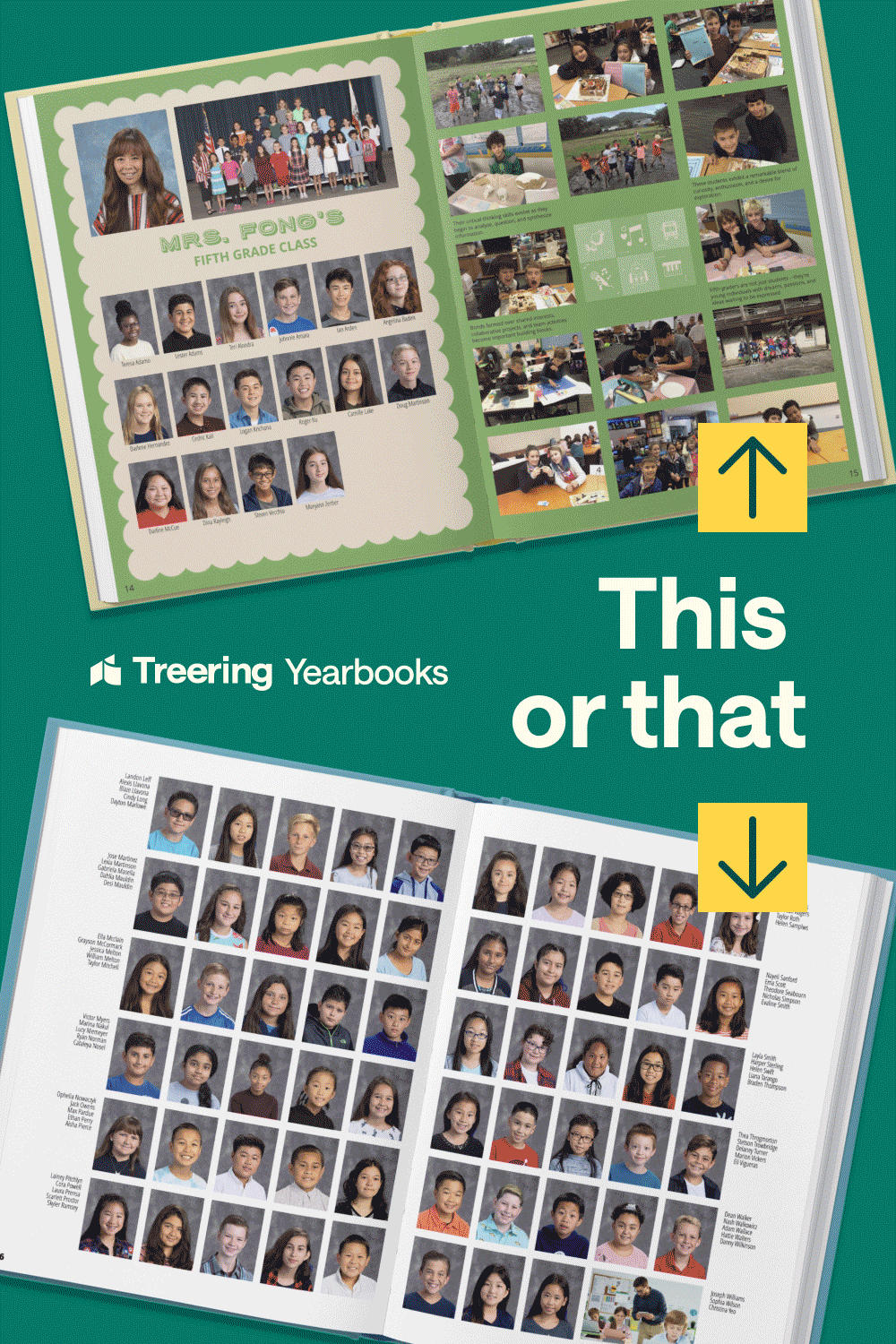
I tested color palettes and content formats to identify what resonated, landing on brighter tones and people-forward imagery. I developed a content rhythm that balanced inspiration (what your yearbook could look like) with education (how to actually make it).

What Happened:
We identified a repeatable formula for posting and a clearer visual identity to grow into.
Treering Memories

The Goal:
Build an Instagram presence for Treering’s AI-powered travel memories product that communicates both the aesthetic and intelligence of the brand quietly, without being loud about the tech.
The Decision:
I leaned into the word ‘quiet.’ Most Instagram stories are watched on mute, so I designed for that reality: gradient micro-animations that feel tech-forward without saying so, paired with ambient sound cues (waves, travel sounds) for viewers who do have audio on. The creative concept I landed on was ‘what if you could only see your vacation? How would you hear it through the site?” I used visuals to trigger the other senses.
What happened:
The formula, gradient motion + sensory storytelling, created a consistent, ownable aesthetic for the account that felt distinct from typical AI-brand content. Viewers got the full travel feeling regardless of how they were watching.


Advertisements
The Goal:
Improve ad conversion rates with more authentic, human-feeling creative.
The Decision:
A/B testing showed that ads featuring people in brighter colors significantly outperformed polished, product-only visuals. I recognized we needed more faces, not just mine, so I asked for volunteers, wrote a brief with filming guidelines, scripted talking points, and directed the recording process remotely.
What Happened:
Ads with real faces and brighter palettes outperformed the control. The UGC brief I created became a reusable system that the team could run without me in the room every time.

