A logo is the beginning of a conversation — it's the first thing someone sees and the thing they'll remember longest. Every logo here started with a question: what does this organization need people to feel the moment they encounter it? The answers are different every time. Here's how I got there.
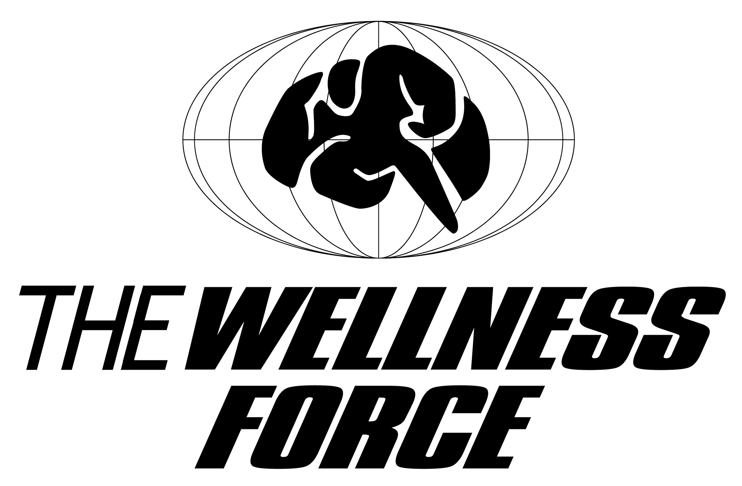
The Next Step: Mission Possible
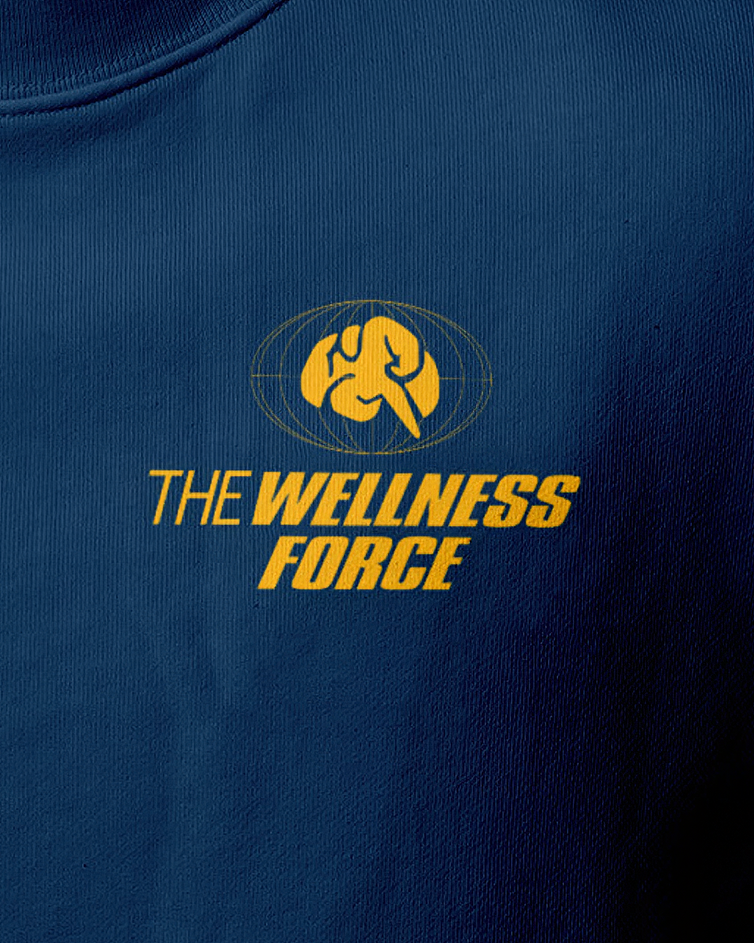
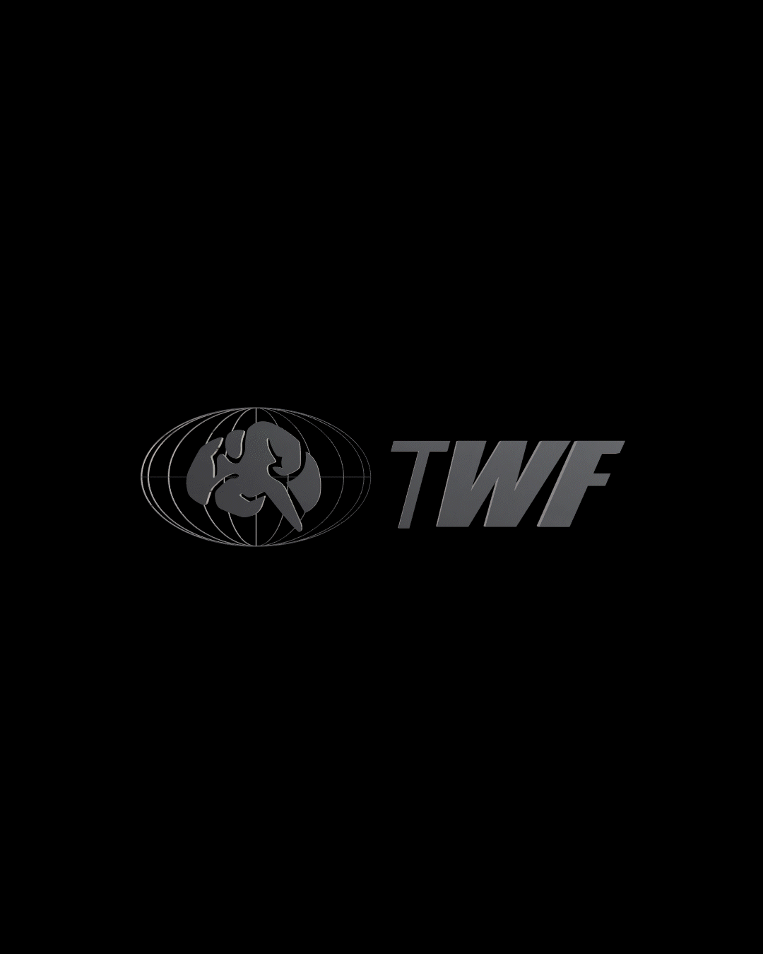
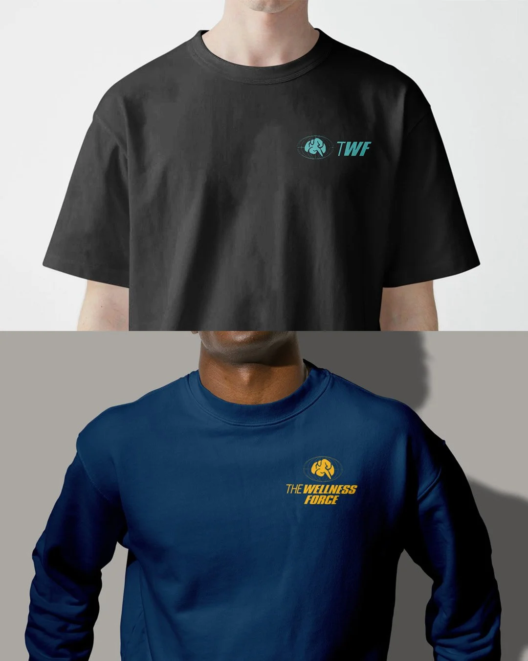
The Goal:
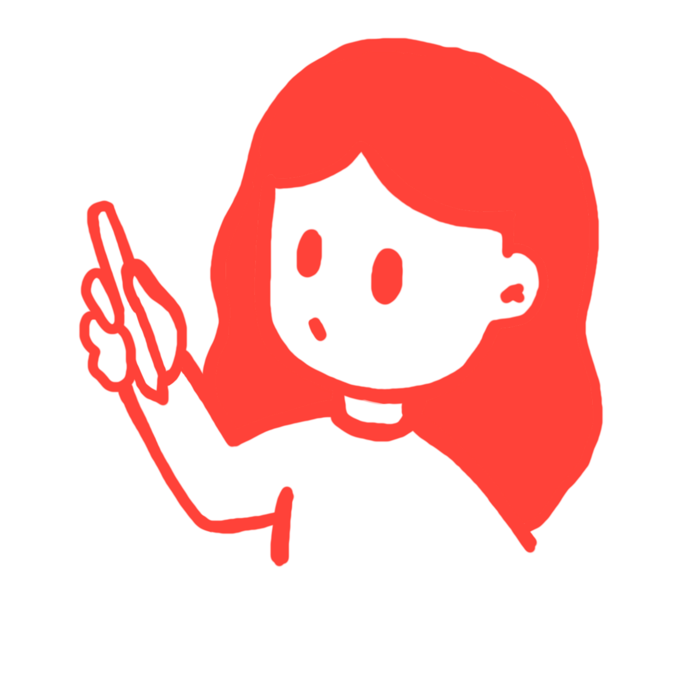
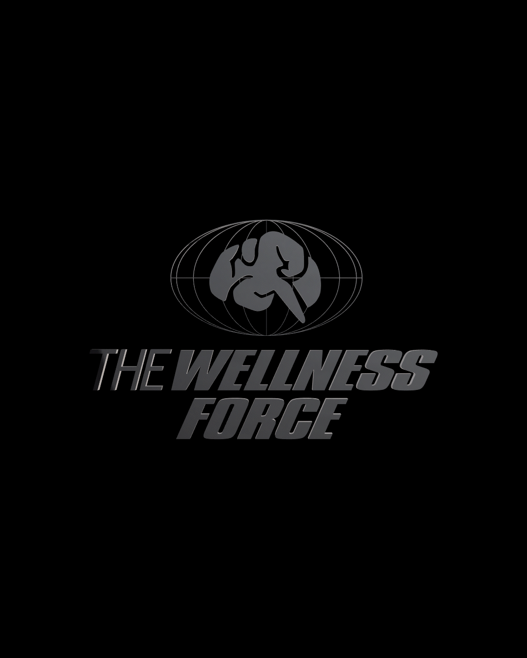
Design an internal team logo for the behavioral health department of a charter school serving youth ages 16–30 earning their GED. The logo needed to feel purposeful and bold. Something the team would actually be proud to wear or display, not just an internal label.
The Decision:
My sister brought me this project and gave me full creative freedom, which I took seriously. I started with the team's mission and landed on 'Mission Possible' as the conceptual anchor: heroic, optimistic, and a little playful. I blended a brain (behavioral health) with a globe (their students' futures) and nodded to Mission Impossible typography to make it feel cinematic and earned, not corporate. Three days, start to finish.
What Happened:
The team had a logo they were genuinely excited about, something that reflected the weight and hope of their work without feeling clinical. It was my first pro bono project, and it reminded me why I do this.
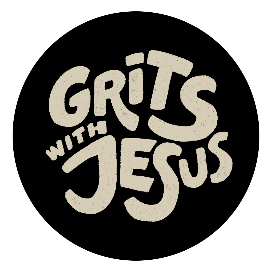
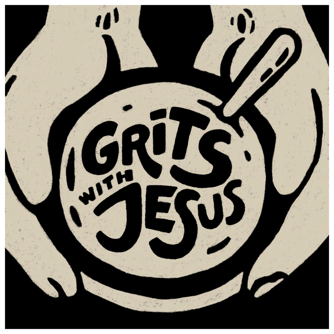
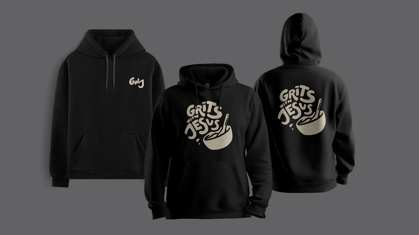
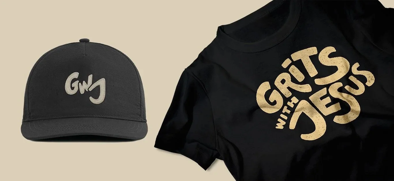
Grits With Jesus
The Goal:
Build a brand identity for a faith-based podcast that needed to feel welcoming and real. A safe space for people exploring faith without political noise or judgment.

The Decision:
The name gave me everything I needed. Grits are humble, Southern, and communal. Sharing a meal with Jesus isn't a grand gesture; it's an intimate one. I leaned into warmth and handmade texture over anything polished or institutional. The identity needed to say: 'come as you are.'
What Happened:
The final brand — logo, color system, and merch — captured the podcast's personality immediately. Listeners and guests could see in the visual identity the same values Paris communicates on the mic: accessible, human, and genuinely welcoming.


Sow and Grow
The Goal:
Create a logo for a bilingual counseling service working with immigrants and their families. The brand needed to communicate safety, trust, and growth, in both English and Spanish, without feeling clinical or corporate.
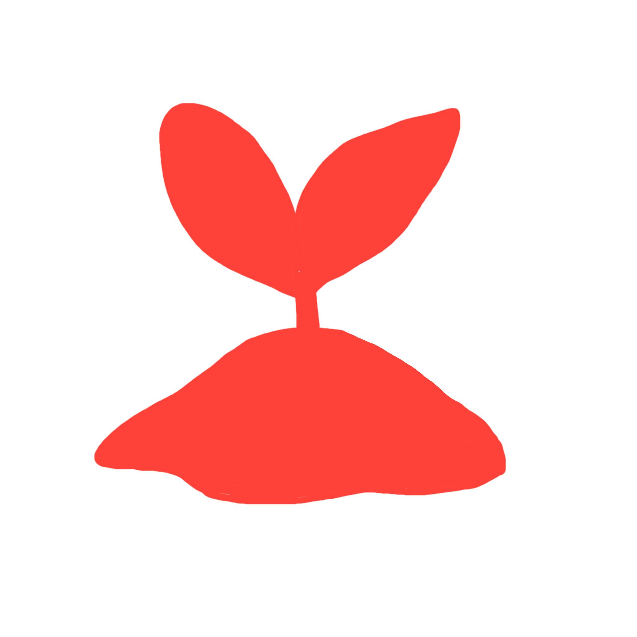
The Decision:
I chose botanical imagery deliberately. Plants grow at their own pace, need care and the right environment, and they're universal, no cultural translation required. The icon system I built around this concept works across languages and contexts, signaling growth and care without relying on words to do it.
What Happened:
The final logo gives Sow and Grow a visual language that meets clients where they are: culturally and emotionally. It's quiet enough to feel safe, and distinctive enough to be remembered.
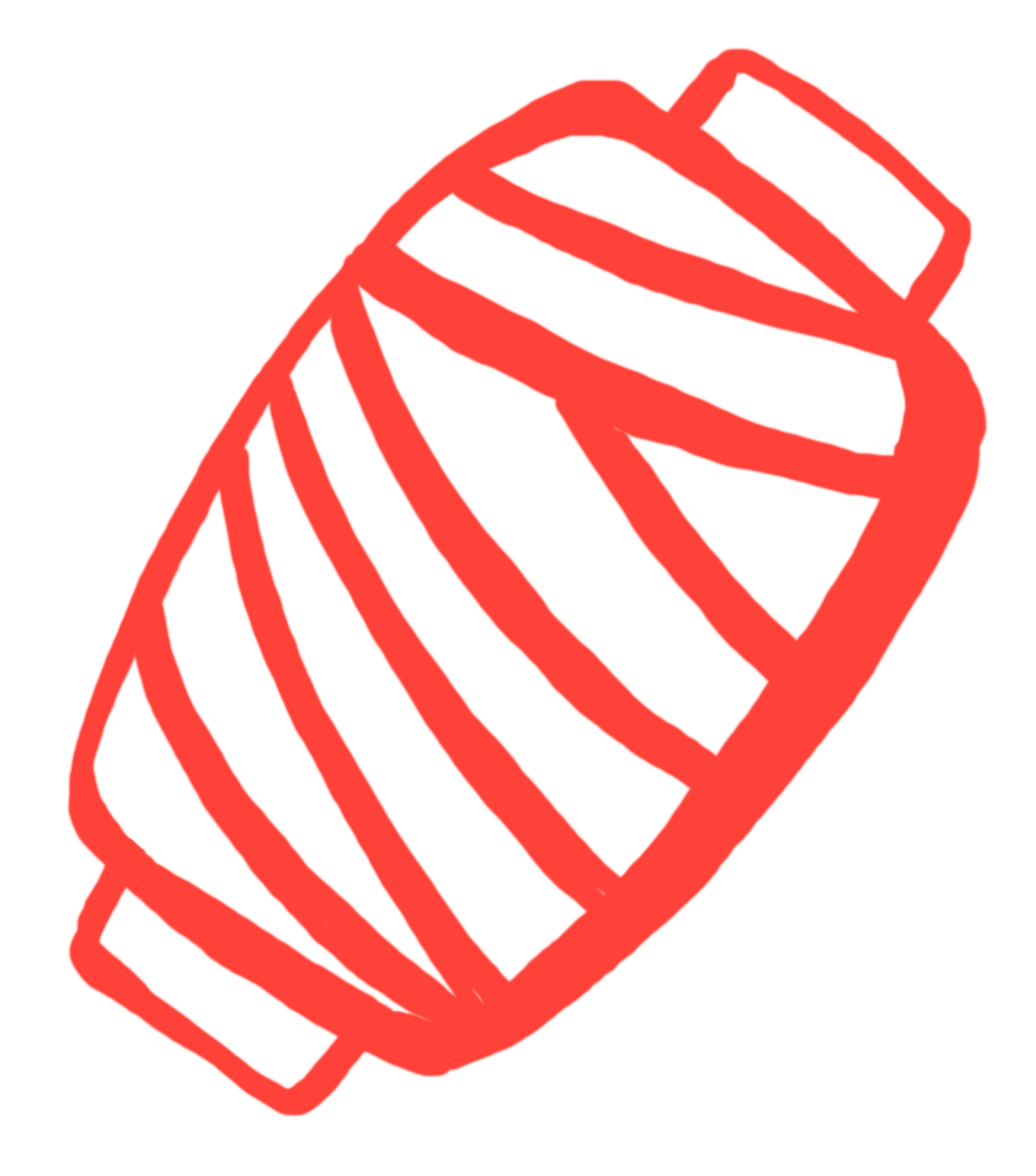
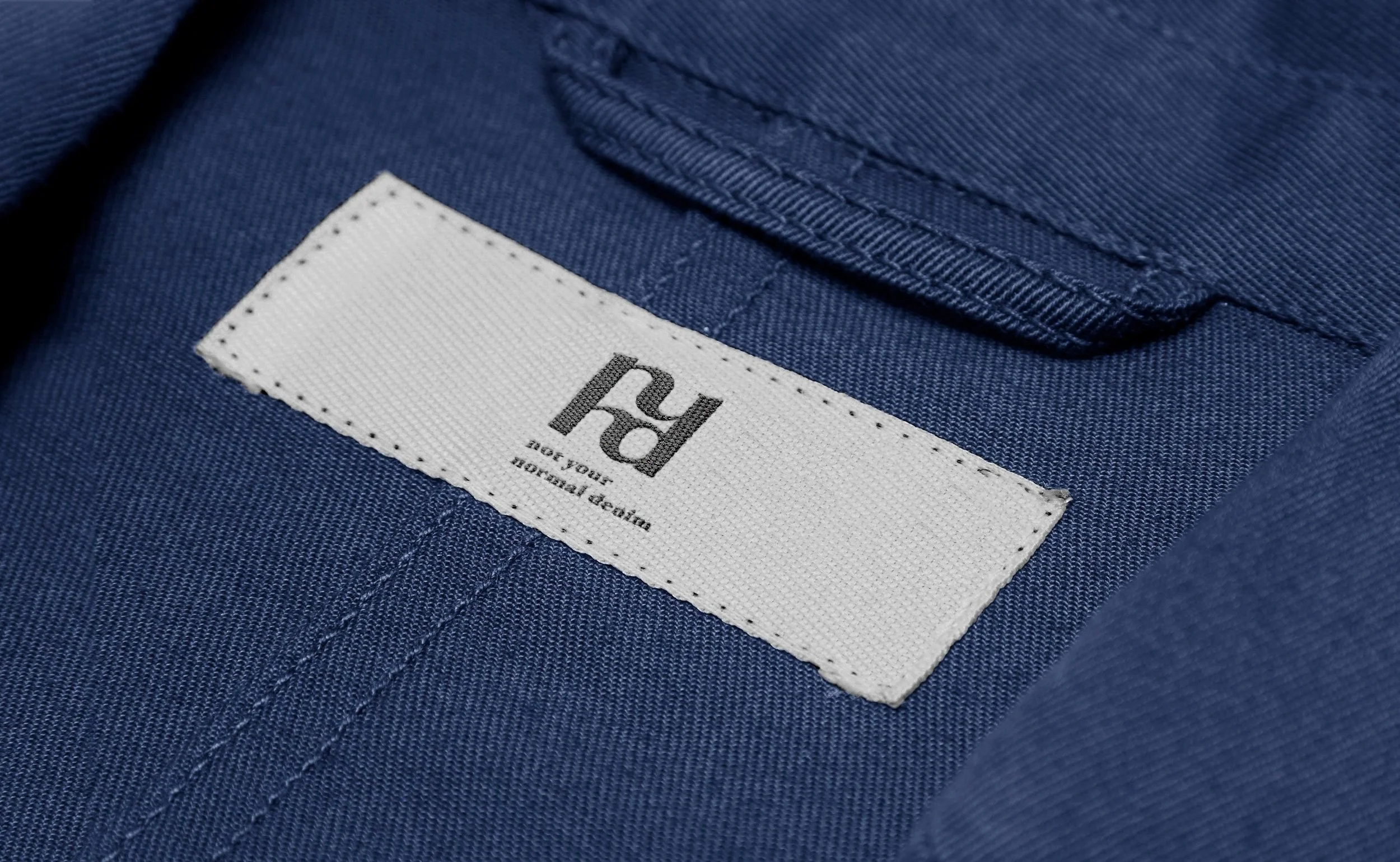
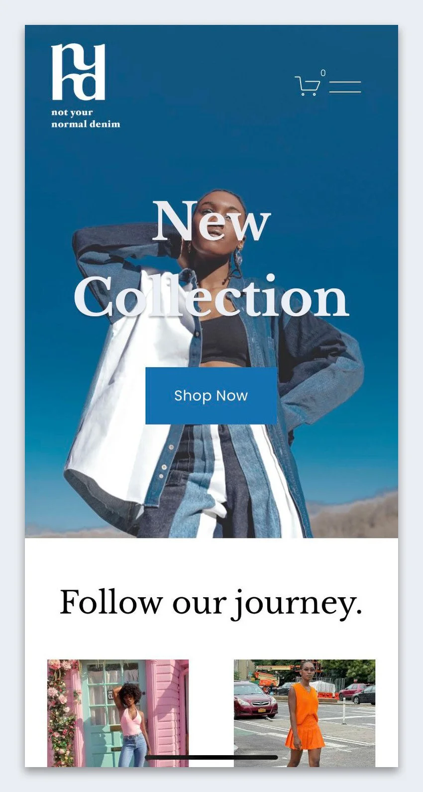
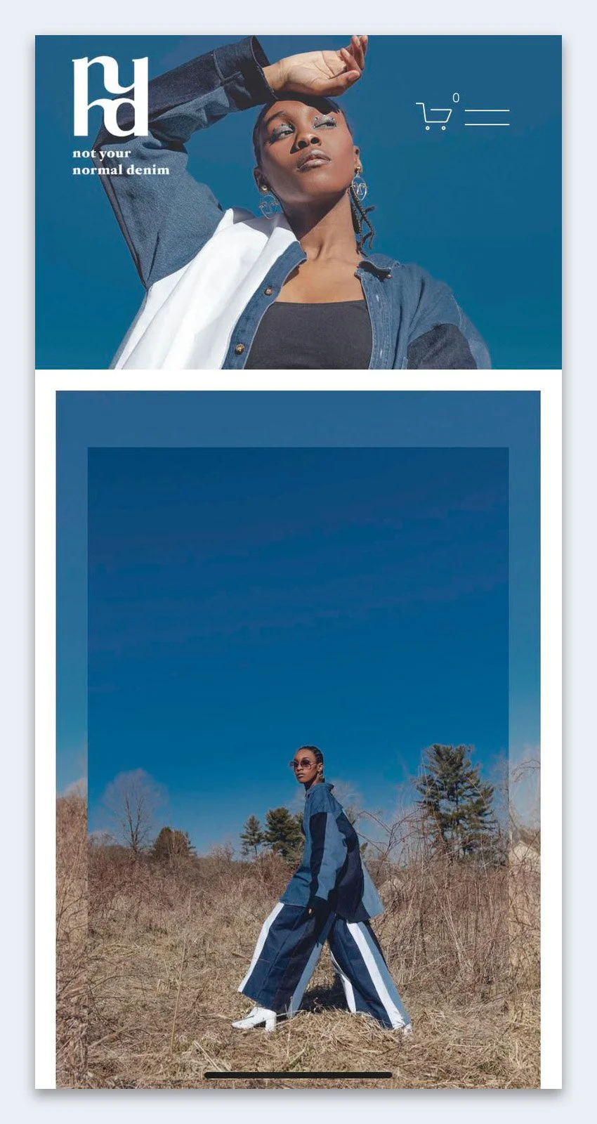
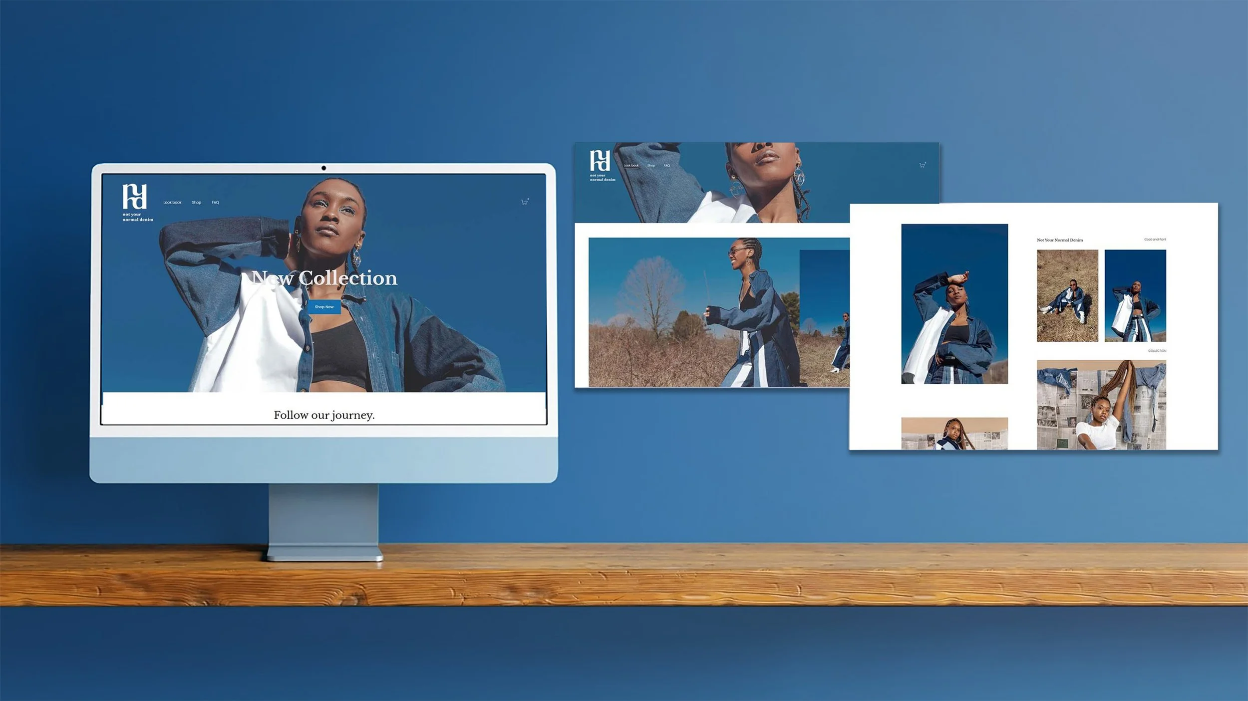
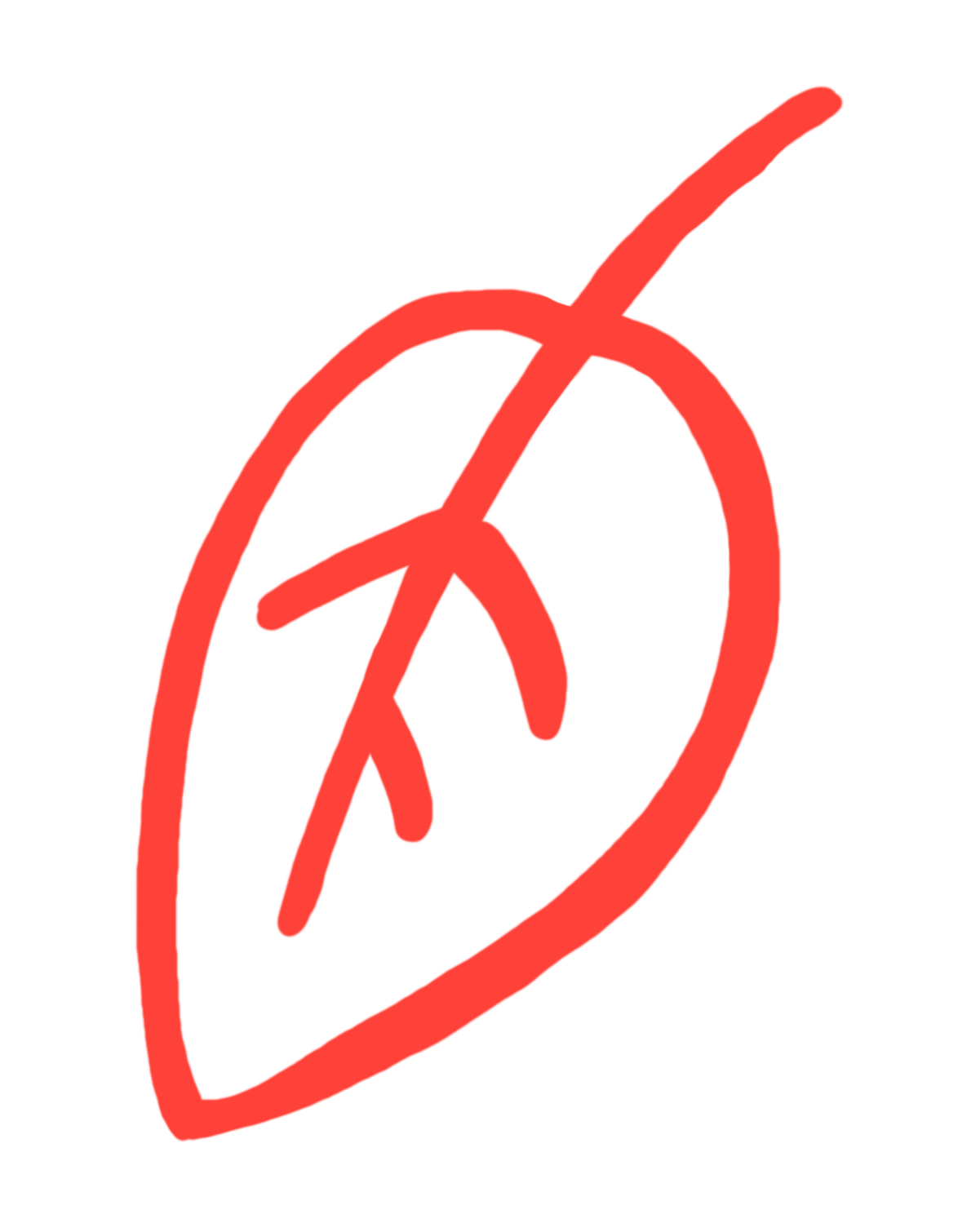
Not Your Normal Denim
The Goal:
Design a logo for an emerging sustainable fashion brand built around upcycled denim. The founder needed something people would recognize, something with an attitude that matched the brand's ethos of doing fashion differently.
The Decision:
Sustainable fashion has a visual clichés problem: too many leaf icons, too much earth-tone minimalism. NYND needed to stand out in that space. I designed a mark that felt fashion-forward first, sustainable second, letting the brand's personality lead and its values show through rather than announce themselves.
The Decision:
NYND has a logo that holds up across apparel, digital, and web. Something a founder can grow into rather than outgrow.