
Athennian
A brand system built for use.
Athennian sells software that gives legal, finance, and tax teams a single source of truth for every entity, fund, and jurisdiction. They already had the right colors and typeface, but they lacked clear rules so anyone on the team could create on-brand materials. I created those rules: a visual language, a text system, and a color system tested on paper, all put into a 57-page guideline that non-designers can use. I tested the system with two ebooks. Since a system keeps evolving after launch, this page also covers what didn’t work when people started using it.
Case study · Brand systems
Client:
Athennian, Governance Ops software
My role:
Freelance brand and graphic designer; worked with the Senior Director of Content & Performance Marketing
Deliverables:
Brand guidelines, text system, color and print specs, ebook design
The Challenge
Athennian had the right colors and the right typeface. It didn't have rules anyone could follow.
Their brand voice is set in the guidelines: foundational, reliable, and trustworthy. The design needed to reflect those qualities subtly. Here’s what I noticed on closer review:
Text sizes in the ebooks followed a ratio, but the weights didn't. Display, H1, and H2 swapped between Regular, Medium, and Semibold from one page to the next.
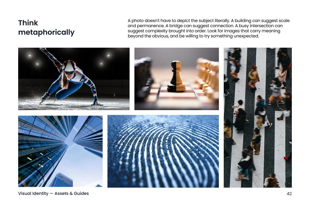
The visuals leaned on stock photography and UI screenshots. They were accurate, but they didn't explain what the product does.
Brand colors existed on screen only. Nobody had checked how they behave in print.
The guideline was going on the public site, so people outside design would use it.
The ebooks are published and won't be revised. So the system has to work alongside them.
Visual Language
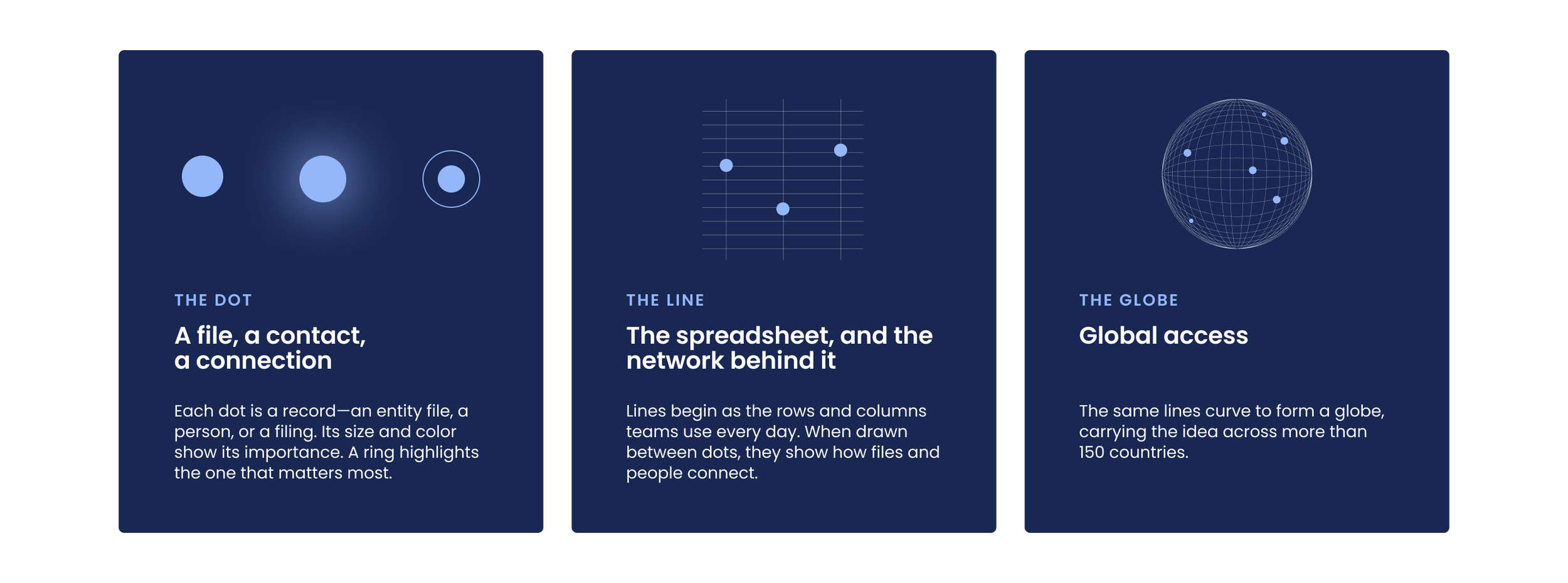
I wanted the brand to show what Athennian does—moving information between people and files. Two simple marks represent this idea, and they develop as the story unfolds.
The dot stands for a file, a contact, or a connection. Each dot is a record—an entity file, a person, or a filing. Its size and color show its importance. A ring highlights the most important one.
The line represents the spreadsheet and the network behind it. Lines begin as the rows and columns teams use every day. When drawn between dots, they show how files and people connect.
The globe stands for global access. The same lines curve to form a globe, carrying the idea across more than 150 countries.
The ebooks
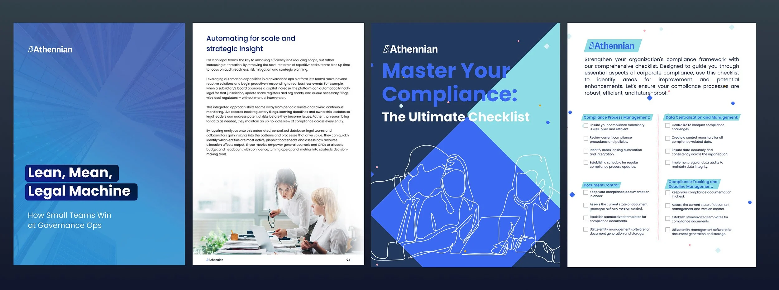
Long-form content is a good way to test a type system. I designed two ebooks with different moods to see where the system worked and where it needed improvement.
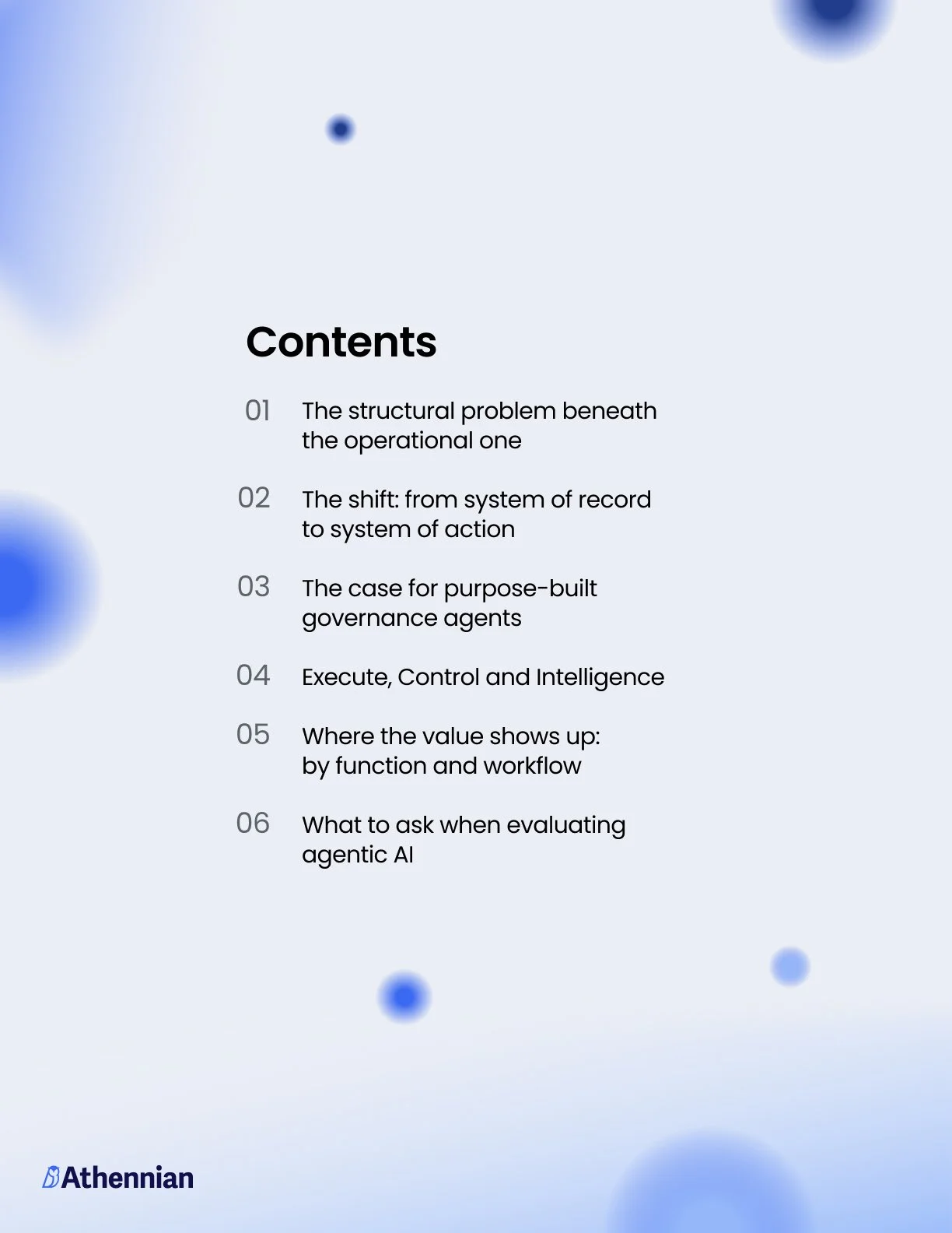
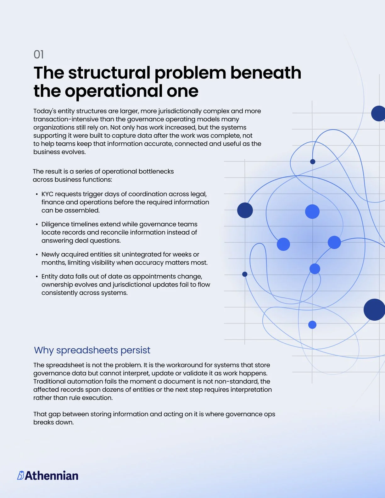
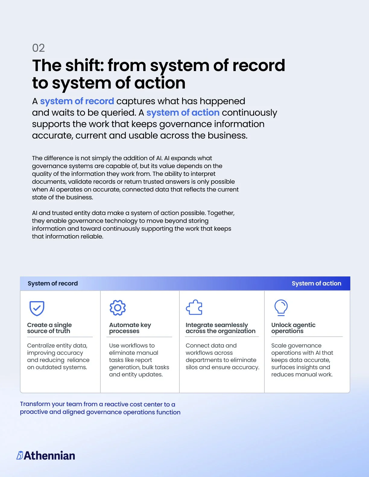
AI Agents in Governance Operations is a light ebook with blue gradients, soft dots, and thin lines. The dots become glowing nodes on the contents page and appear throughout the section openers. The lines form the network diagram next to the problem statement and the table that compares "system of record" with "system of action."
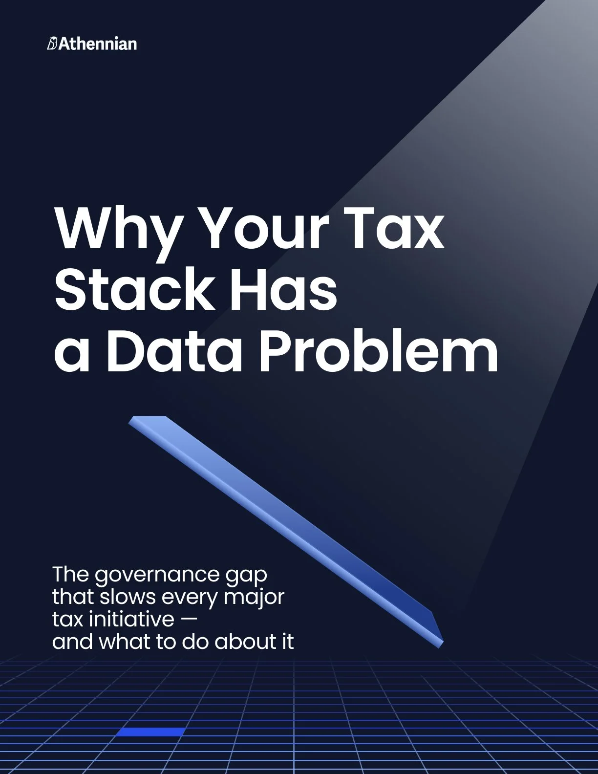
Why Your Tax Stack Has a Data Problem is a dark, midnight-themed ebook. The dot and line are the focus: curved lines connect glowing points over a perspective grid, making the data problem visible before you even read. Regular weight works well at large sizes on dark backgrounds, which is why it’s used on the covers.
Both ebooks are published and won’t be changed. The text system described below is still being developed, and these pages are where we're testing it.

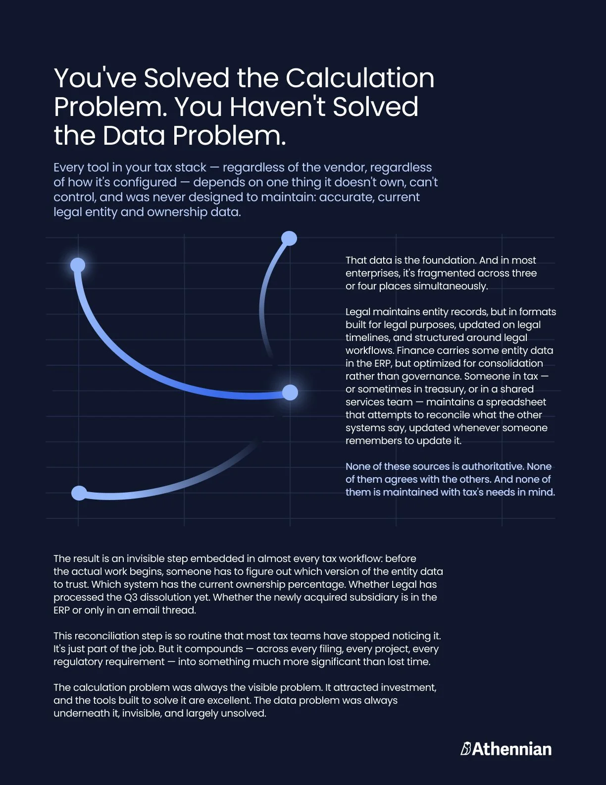
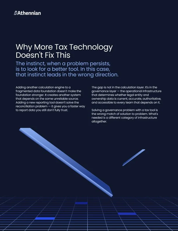
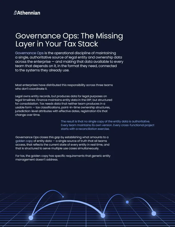
The goal was to create a system that a non-designer can use quickly and a designer can’t easily misuse.
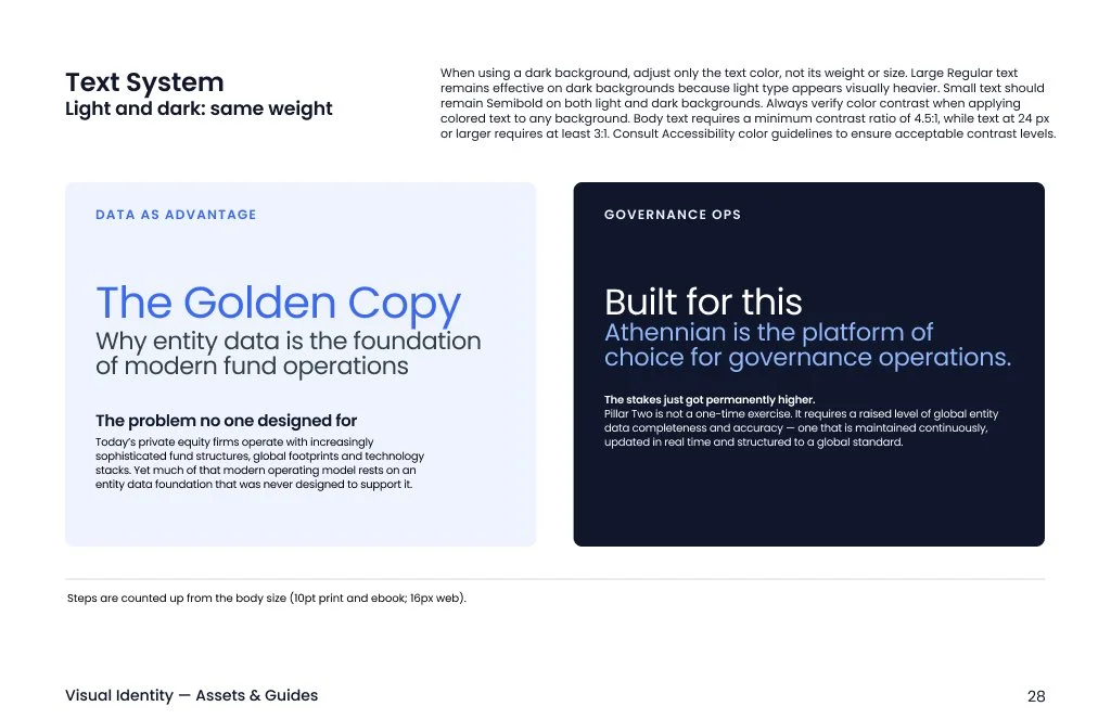
When I reviewed the ebooks, I measured every size. Body text is set at 10pt, with titles at about 105% leading and body at 130%. Every title and heading size follows the same ratio, multiplying by 1.222 each step. The sizes already formed a system, so I documented the steps and named each role.
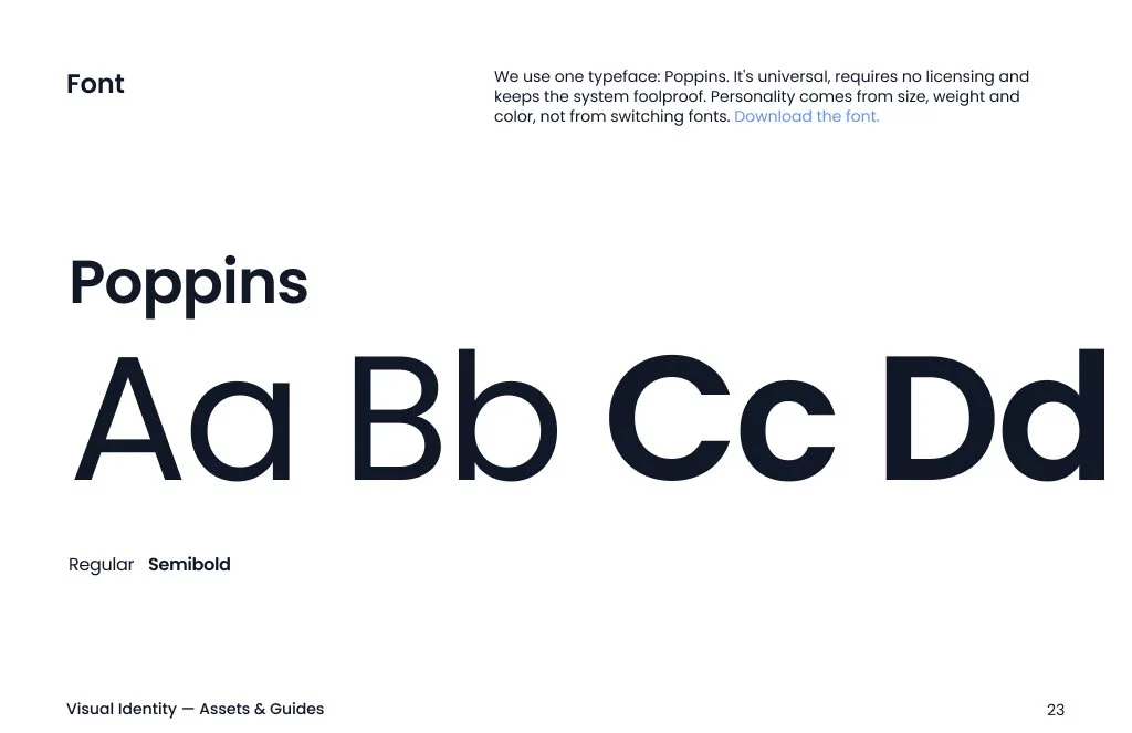
Weight was the main issue. I set a simple rule: weight depends on the job. Large text is always Regular. Small text that labels or introduces uses Semibold. Body text is Regular, with Semibold for one key phrase per paragraph. Medium and Bold are no longer used.
Why this approach? I looked at Apple’s Human Interface Guidelines and Google’s Material 3. Both use a small set of named roles and keep larger sizes light, emphasizing smaller text. This fit the brief for a light, foundational, and reliable system, and matched how the published ebooks already looked.
Text system: one font, one ratio, two weights
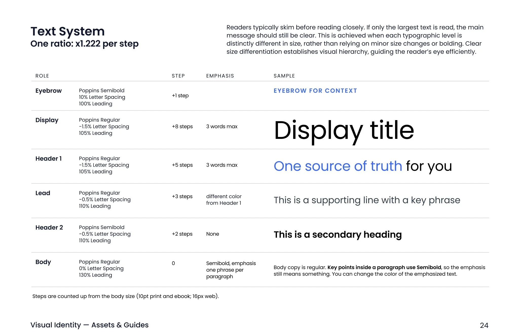
The system is still being updated. I’ve also suggested that Display can be used in Semibold only in ads, social posts, banners, and backdrops where it needs to stand out. Regular remains the default.
Color
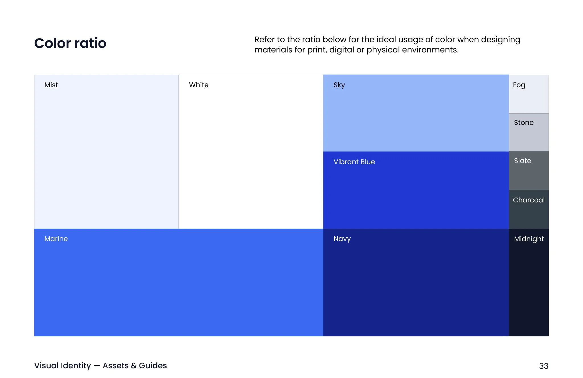
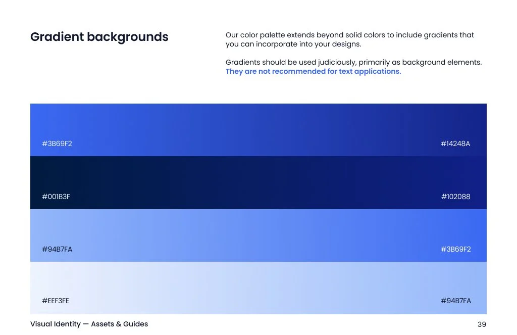
A palette made mostly of blues needs clear rules for proportion, contrast, and production.
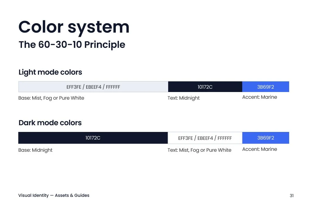
The 60-30-10 rule keeps blue from dominating. Sixty percent is a calm base, usually Mist, Fog, or white, but never Marine. Use thirty percent for text, headings, and structure. Ten percent is for accents, used sparingly to attract attention. The same rule applies in dark mode, with Midnight as the base.
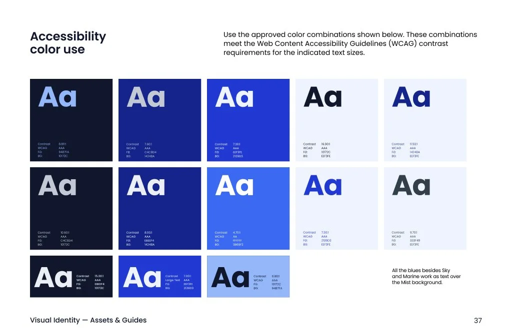
Accessibility first. The guideline pairs each color with approved text colors and WCAG contrast. Marine on white measures 4.68:1. Soft Blue on Midnight measures 8.82:1.
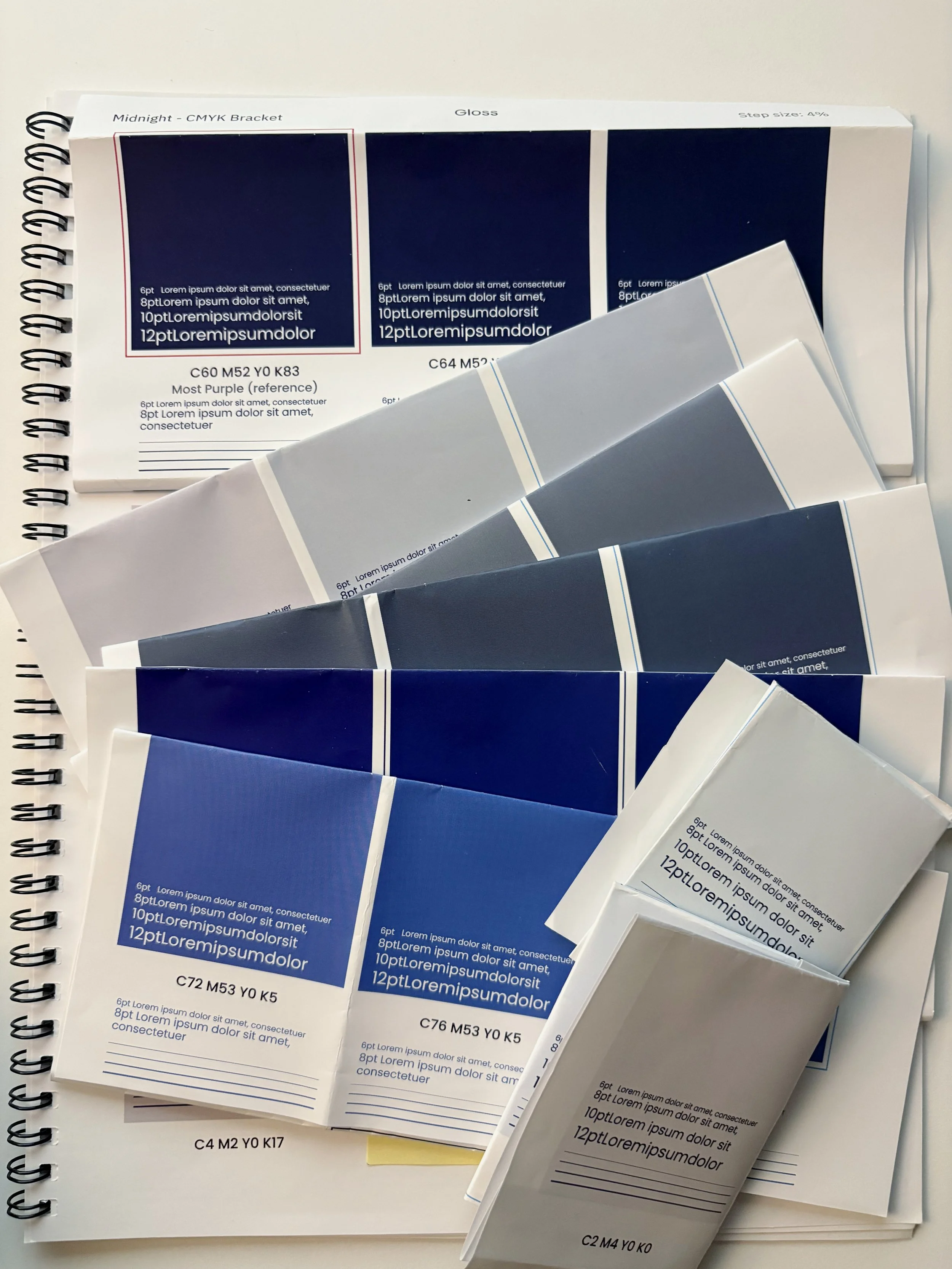
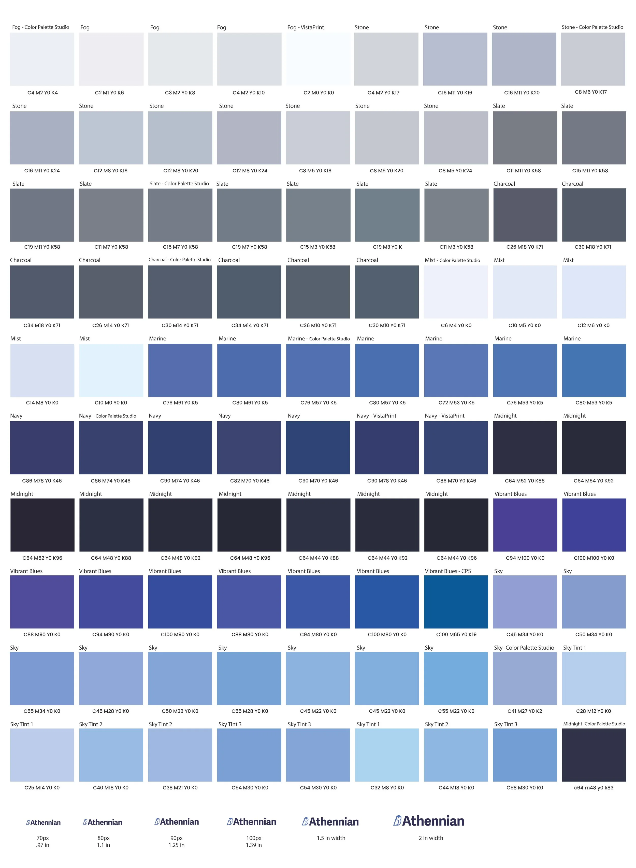
Testing color on paper: The palette was created in RGB, but print uses CMYK. I made test sheets to find CMYK values that look like the screen, checked them with a coated-stock proxy profile, printed them with one vendor, and prepared another round for a second vendor. Here’s what I found:
Midnight needed to be darker and closer to black while keeping its blue-purple hue, so I tested several black levels with the cyan and magenta held steady.
Fog and Mist sat too close together, so I tested pairs against white cards until they read as separate surfaces.
Vibrant Blue falls outside what CMYK can print. I documented the gap and chose the best available match, instead of pretending the screen and print colors matched.
I tested tints of Marine and Soft Blue for dark backgrounds as text, so the light blues stay legible.
The guideline
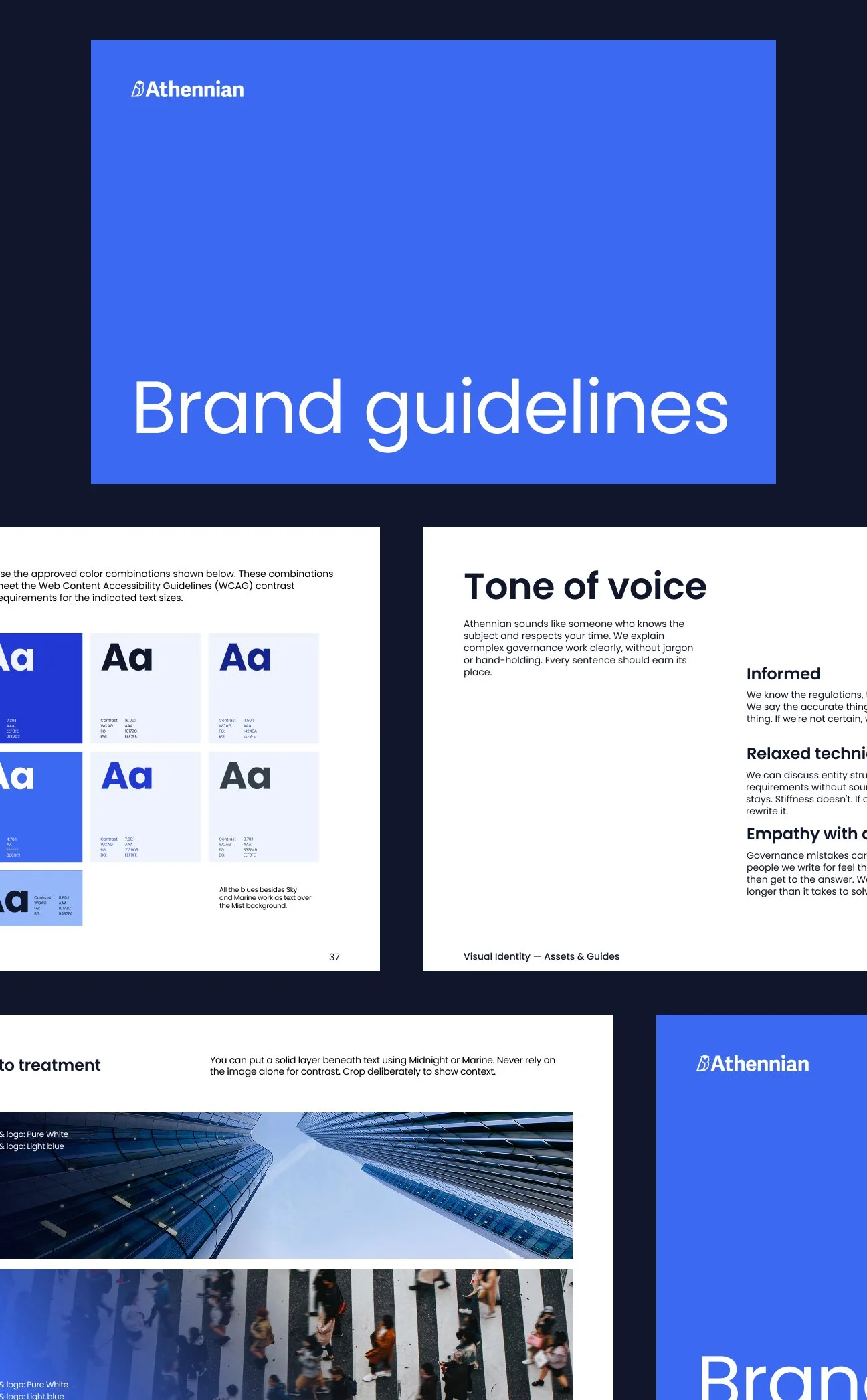
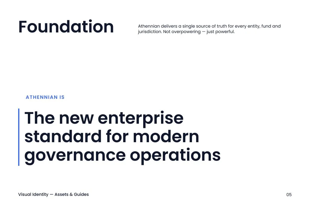
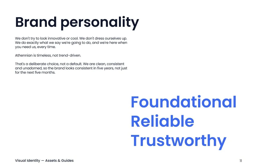
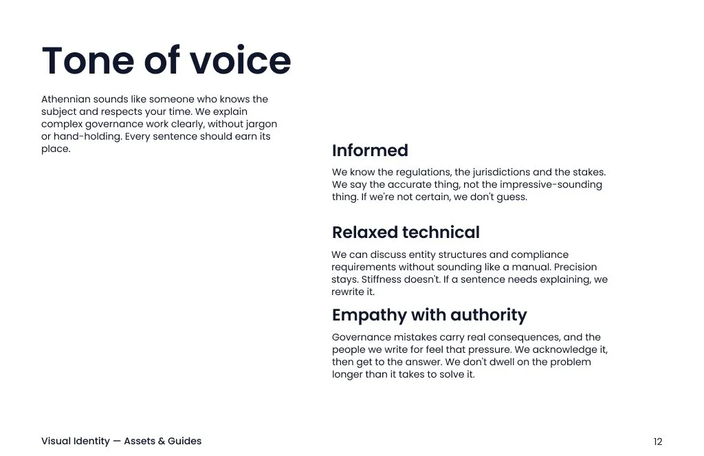
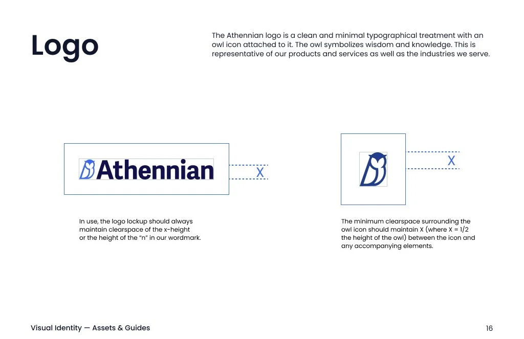
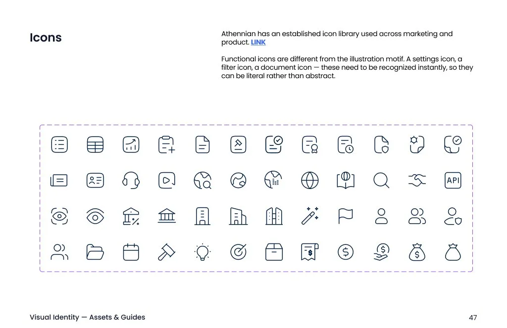
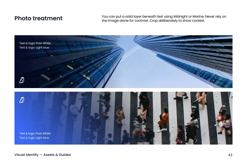
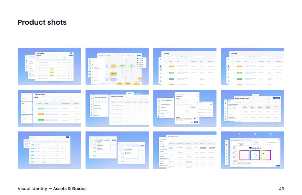
The 57-page guideline covers messaging, style, logo, typography, color, photography, illustration, product visuals, and examples. Each page starts with the rule and shows it in action. The applied section demonstrates the system across ebooks, presentations, web, LinkedIn, print, and signage. I wrote the rules so writers, marketers, and other designers can use them independently.

Outcome
Athennian. A brand with rules, not just a look.
What started as a strong palette and typeface is now a full system: a visual language that explains the product, a type scale with named roles and a single-weight rule, a palette tested on paper, and a 57-page guideline for people outside design. The system is still being tested, and the next version is already underway.
57 pages of guidelines. Each one leads with the rule and shows it working.
10 colors, each paired with approved text colors and WCAG contrast. Marine on white measures 4.68:1.
1 ratio and 2 weights behind the whole text system. Medium and Bold are retired.
The web team found 6 issues when they tested the system. The fixes go into the next version.