


SIGMA / Rise360
eLearning Design, Data Visualization, Brand Extension, Motion Graphics
The fuel and trucking industry runs on expertise that mostly lives in people's heads. SIGMA wanted to change that. They were building a course that could establish their educational credibility, sell to companies looking to train their workforce, and be accessible enough that an individual trucker could buy it on their own. What it needed was a designer who could make it worth learning from.
What arrived in my inbox was a PowerPoint deck. All text. No images, no hierarchy, just the raw material of a course waiting to become one.


Turn a text-heavy PowerPoint into a fully designed eLearning course inside Rise360 that felt credible, engaging, and on-brand while filling in a brand identity that only gave me two colors and a typeface to work with.
The Goal:
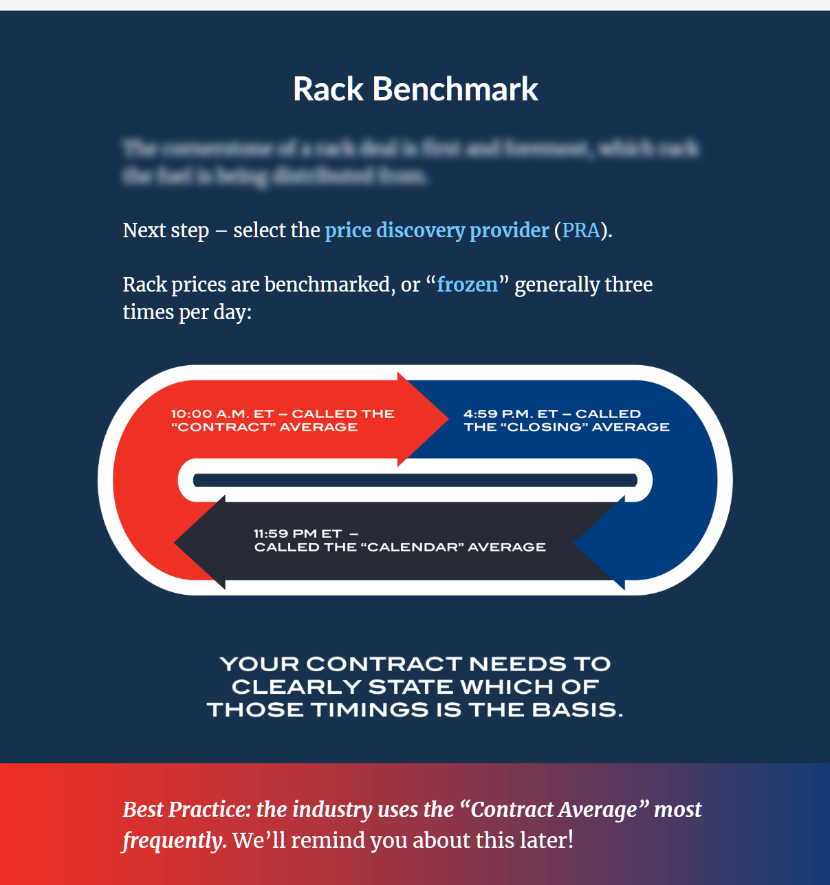
I touched a single slide, and I read through everything. My job wasn't just to make it look better; it was to understand the content well enough to know where a visual would actually help a learner, not just decorate the page.
The brand guidelines gave me little to work with, which meant I had to build the visual language without drifting off-brand. I proposed an extended color palette that stayed within the spirit of SIGMA's existing identity, and developed a consistent way to frame and display images that brought variety to the course without making it feel like a different brand had taken over.
The Decision:
The course sold with very little marketing behind it. The graphics landed well; learners responded to them. The feedback that came back was that the writing needed tightening, which is honest and useful. I'm now working on the second course with SIGMA, this time with that feedback built into the process from the start. That's the version of the work I find most satisfying: when a client trusts you enough to come back, and you get to make it better.
What Happened: