Morning Pointe
Oct 2019-April 2021
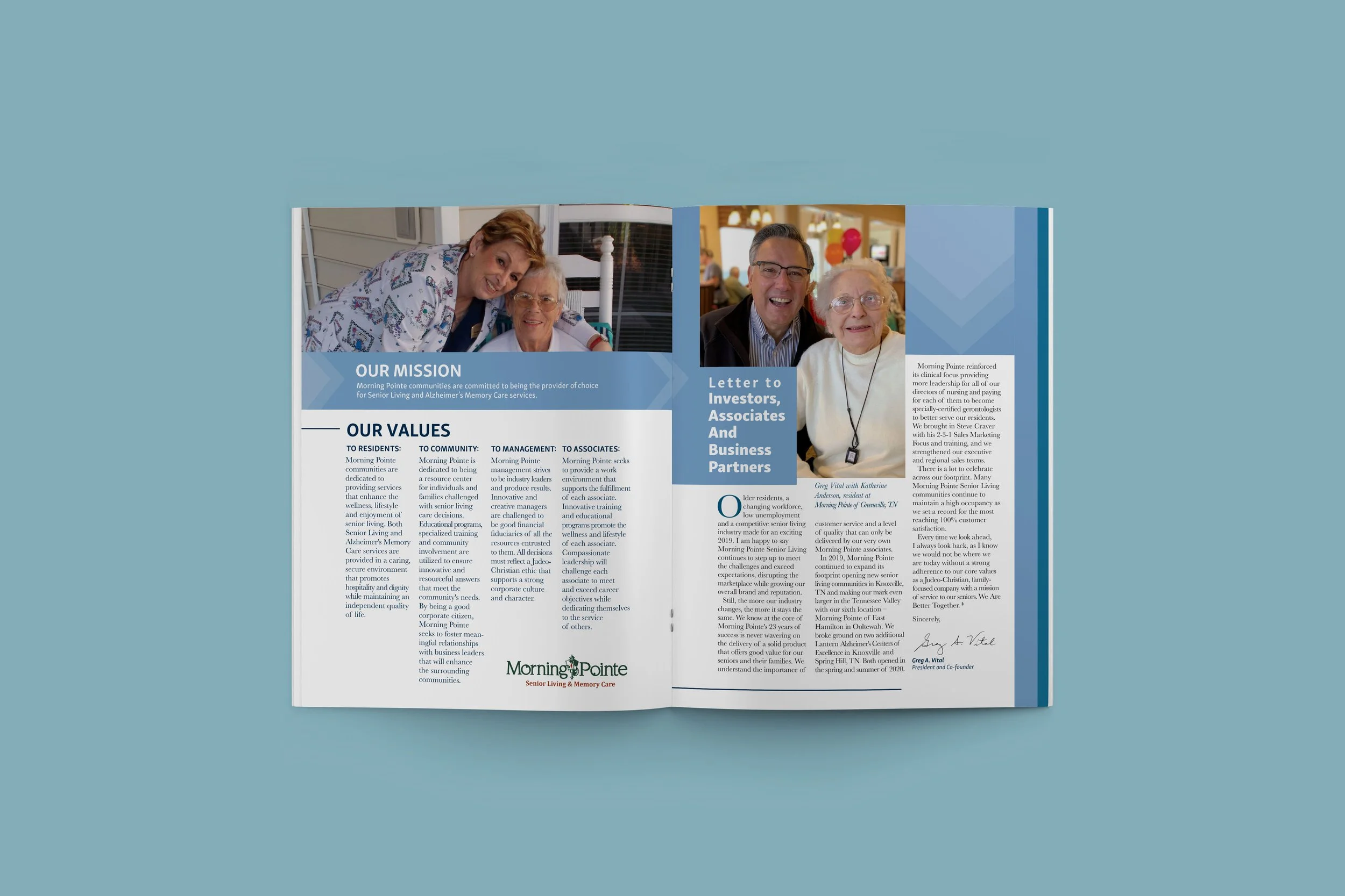
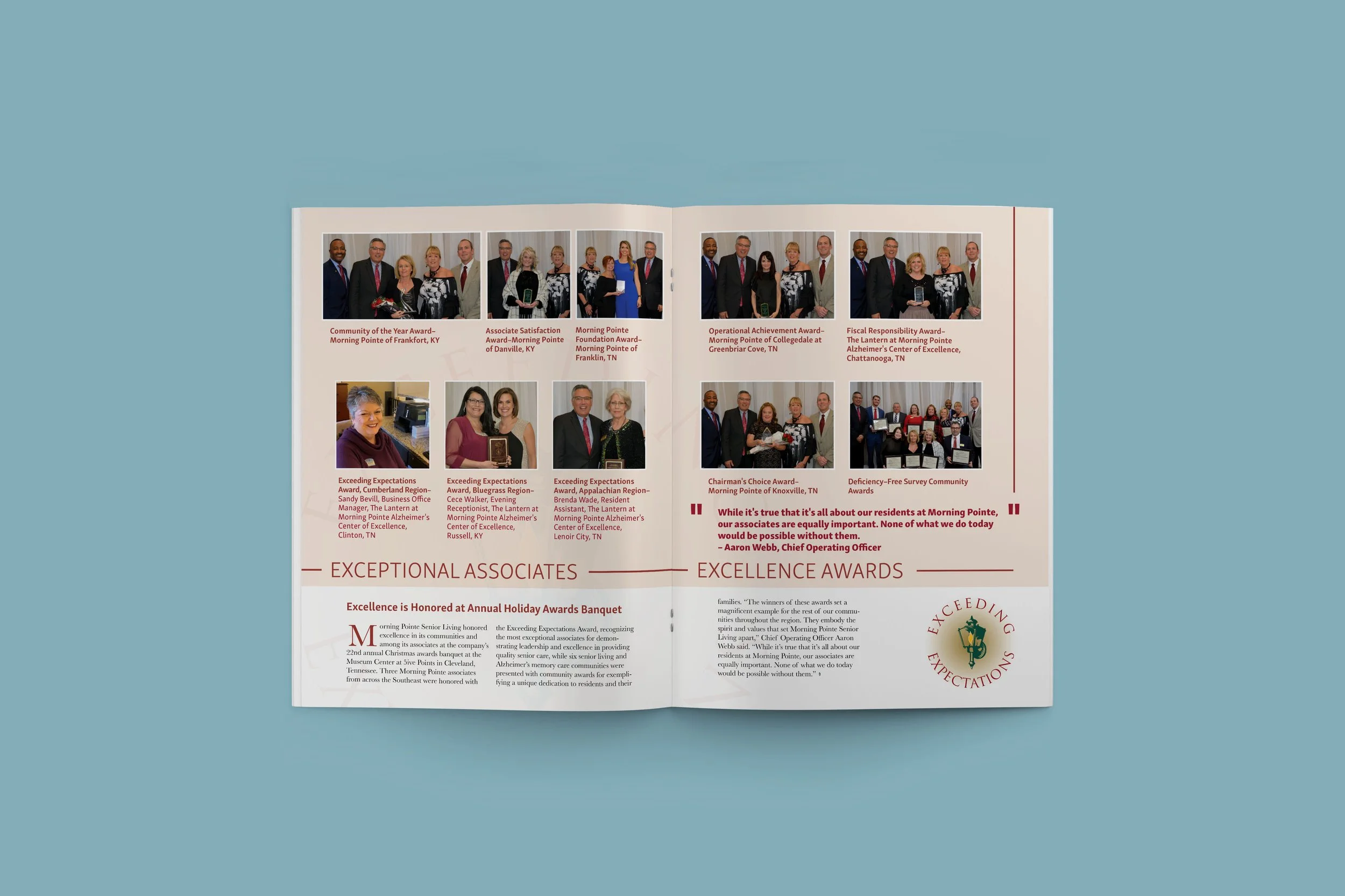
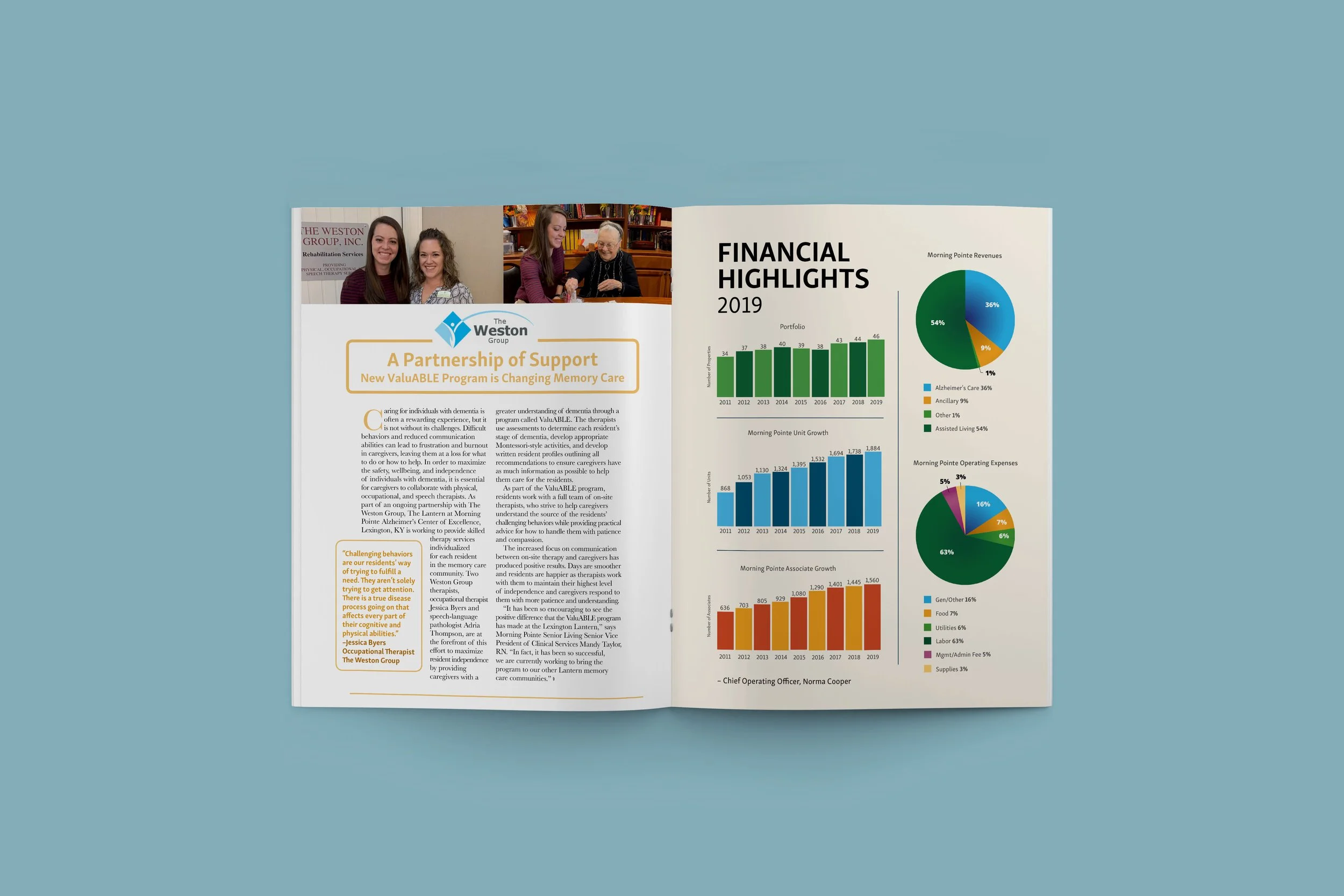
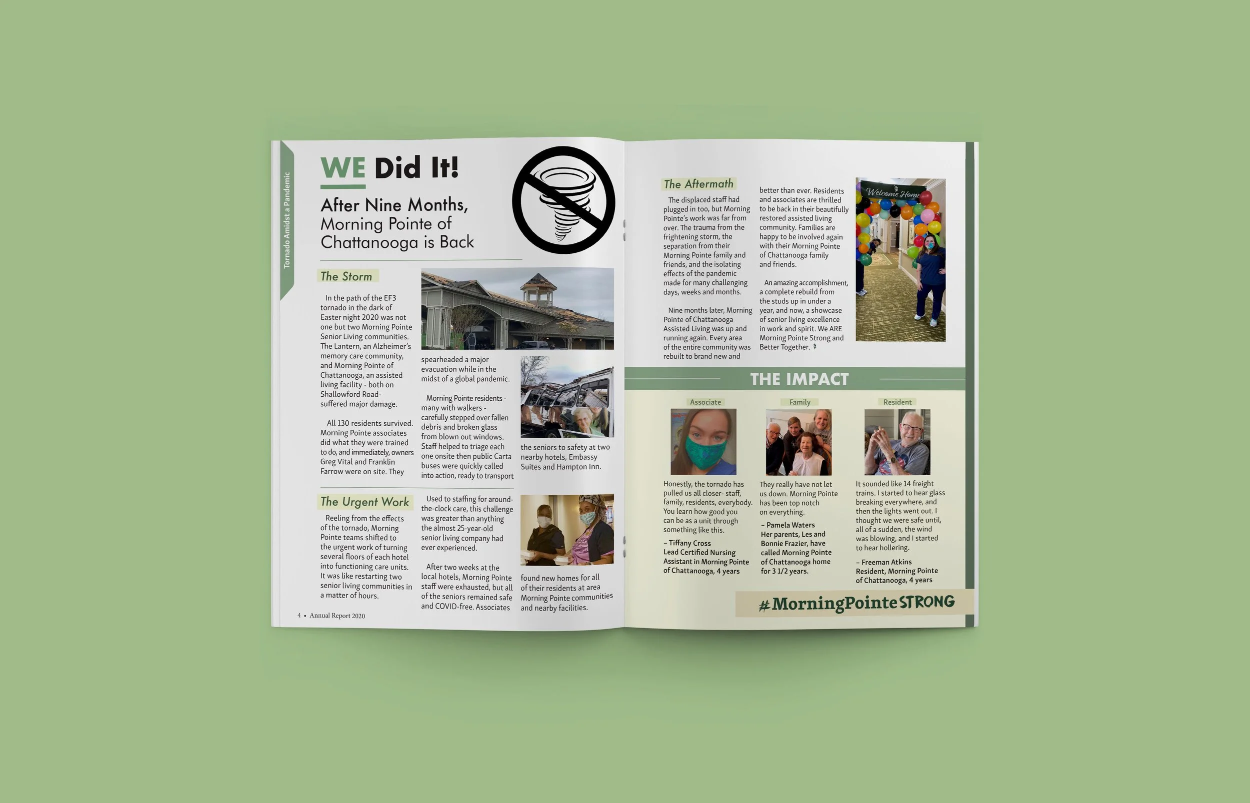
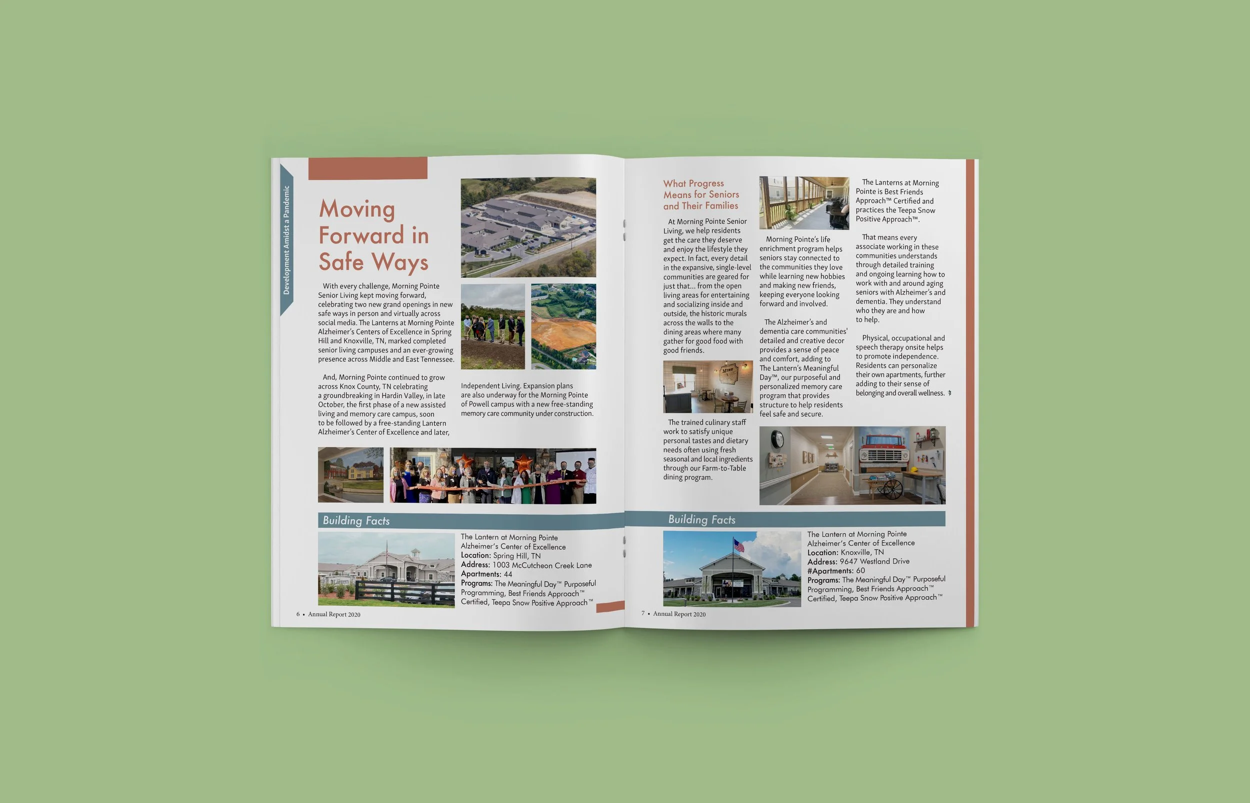
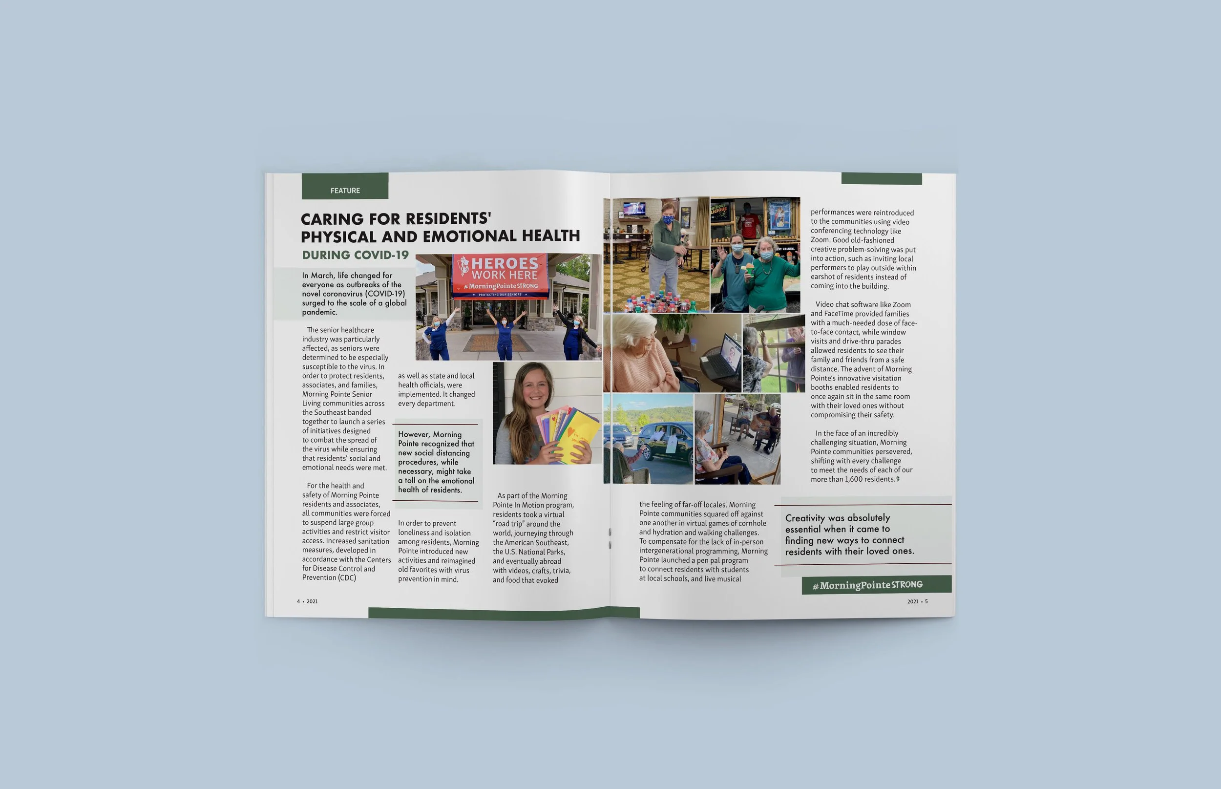
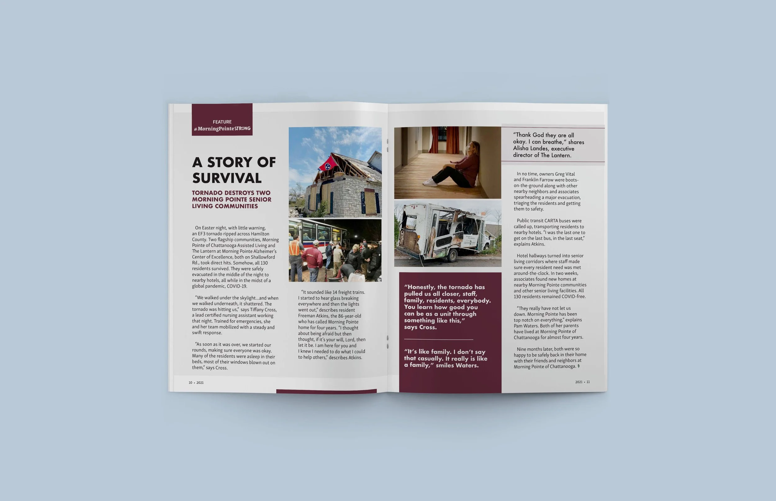
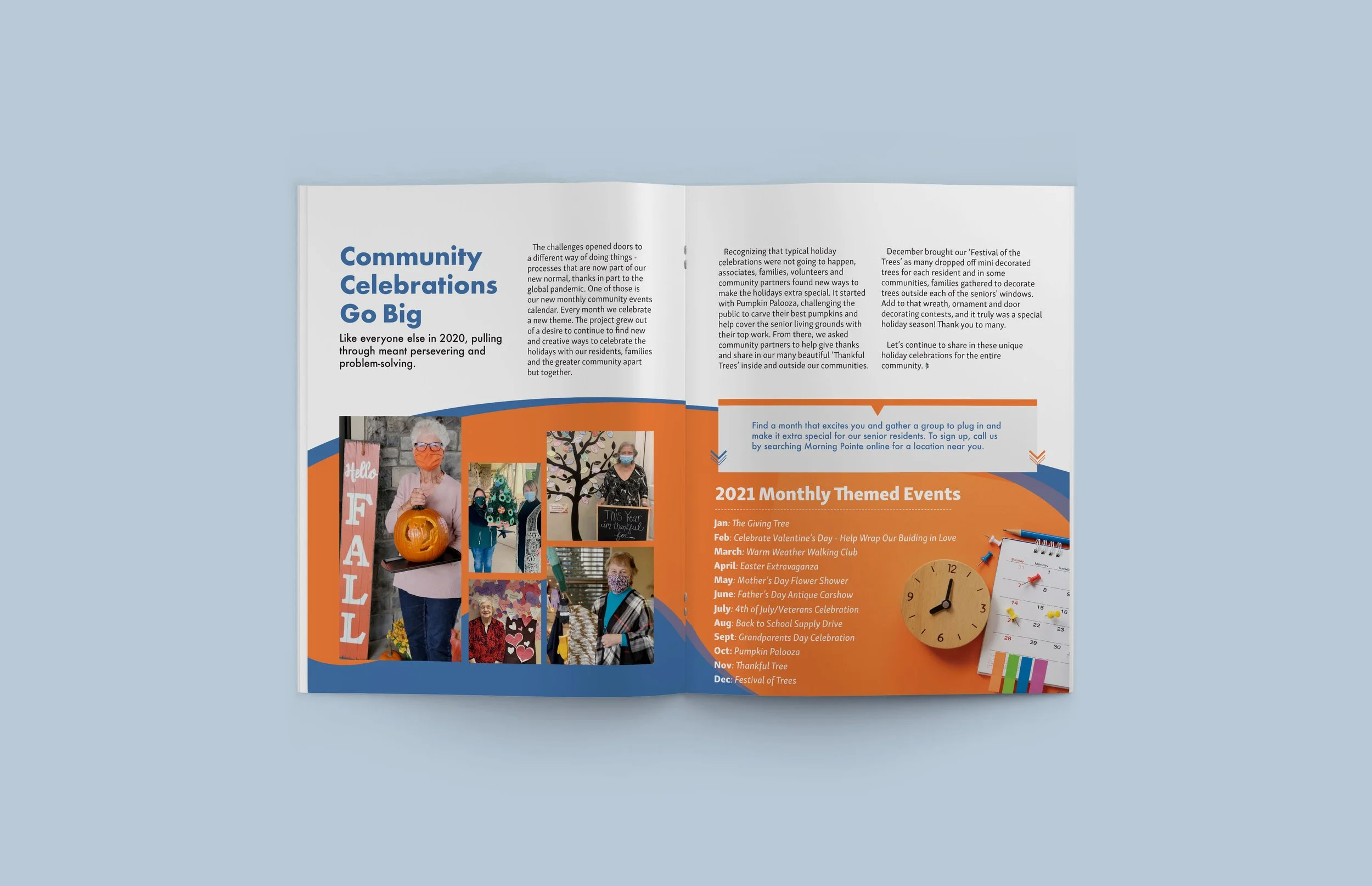
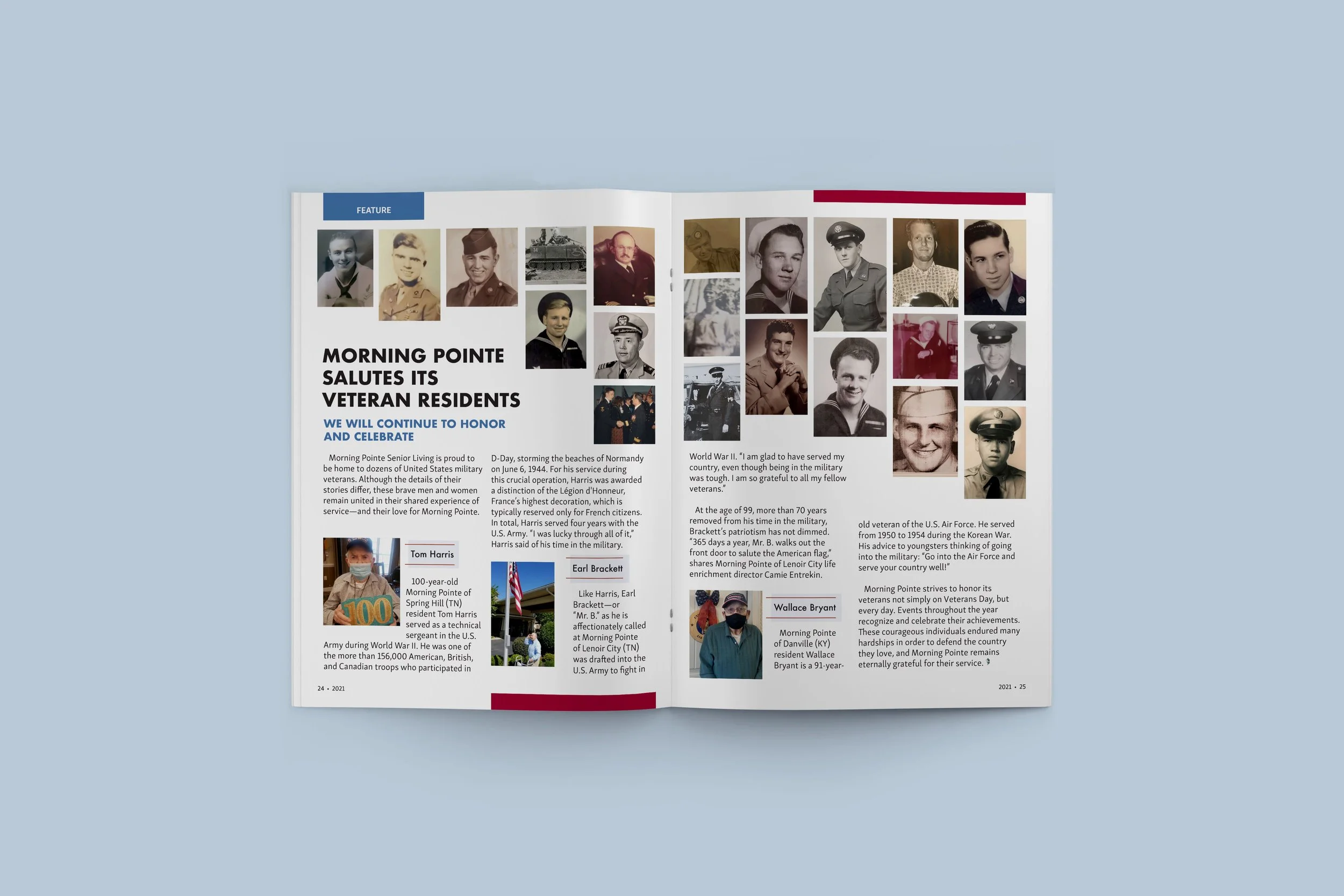
During my time at Morning Pointe, I was given the challenge to make the brand imagery look modern and professional while evoking the warmth and vibrancy our residents enjoy and bring to our communities.
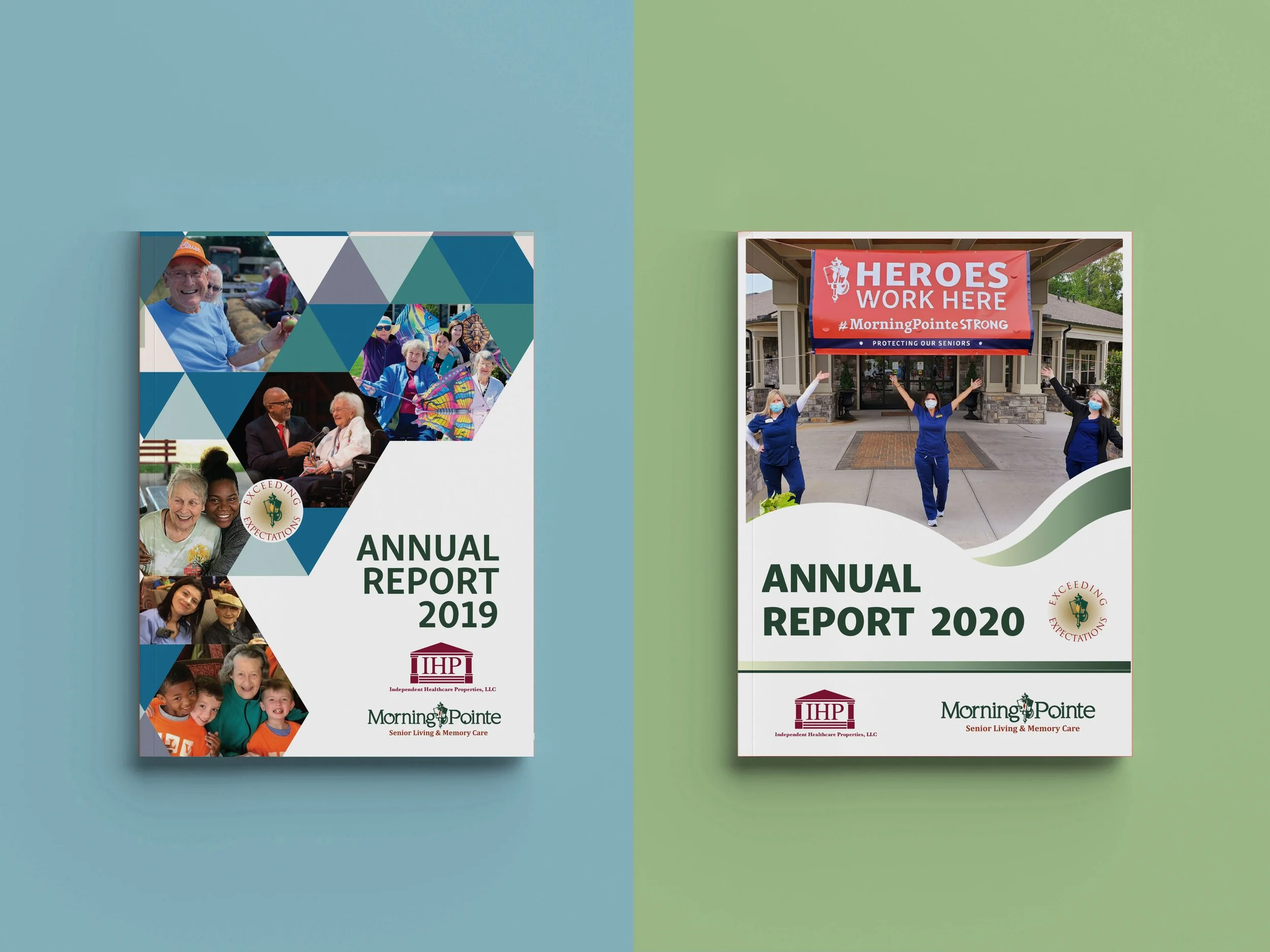
Here is a 2018 annual report for reference in collateral growth.
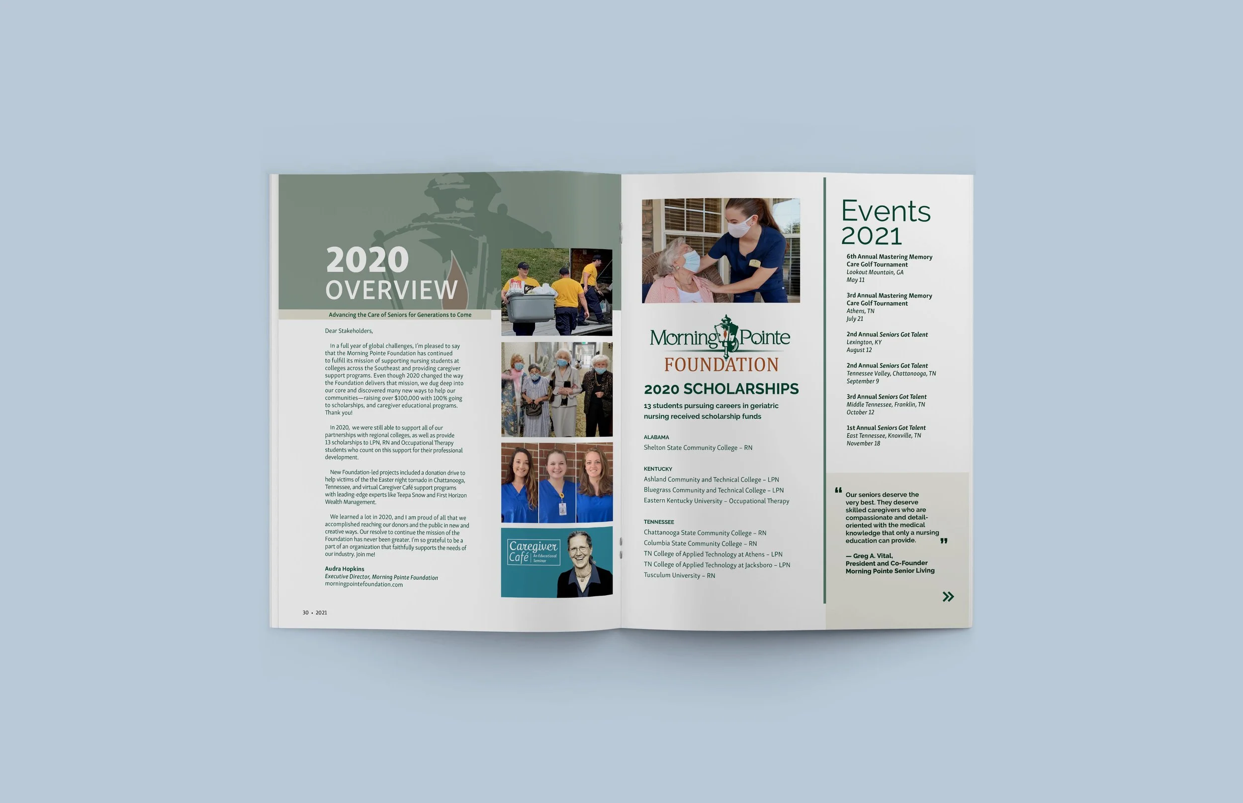
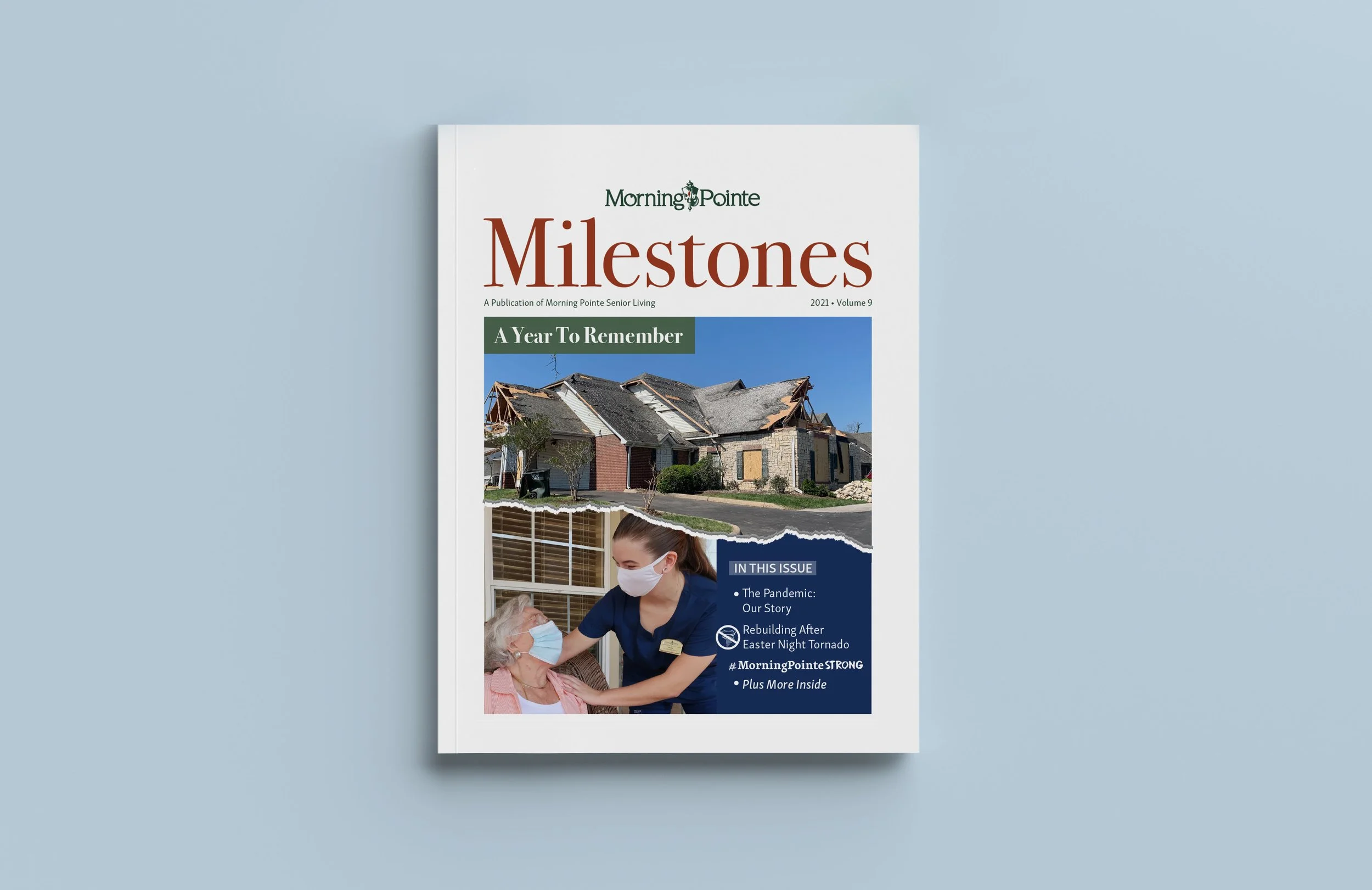
We updated our editorial layout inviting more negative space. A challenge when paired with our required 14 pt font usage.
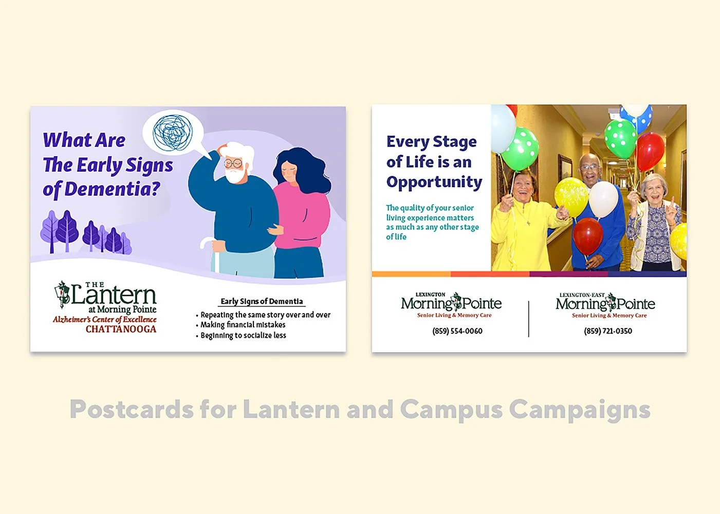
We reinforced and incorporated quality resident photos for our advertisements using less iStock images.
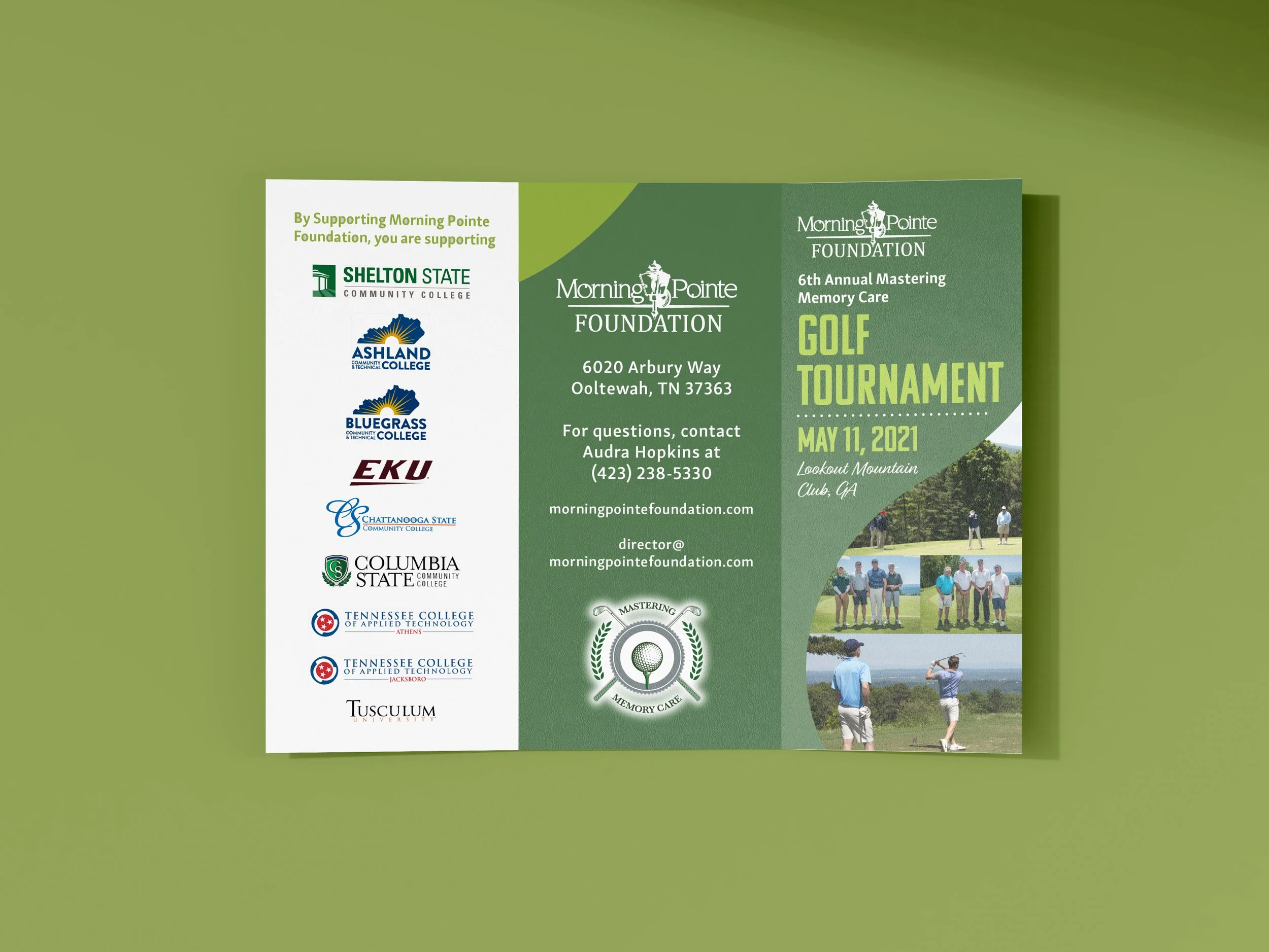
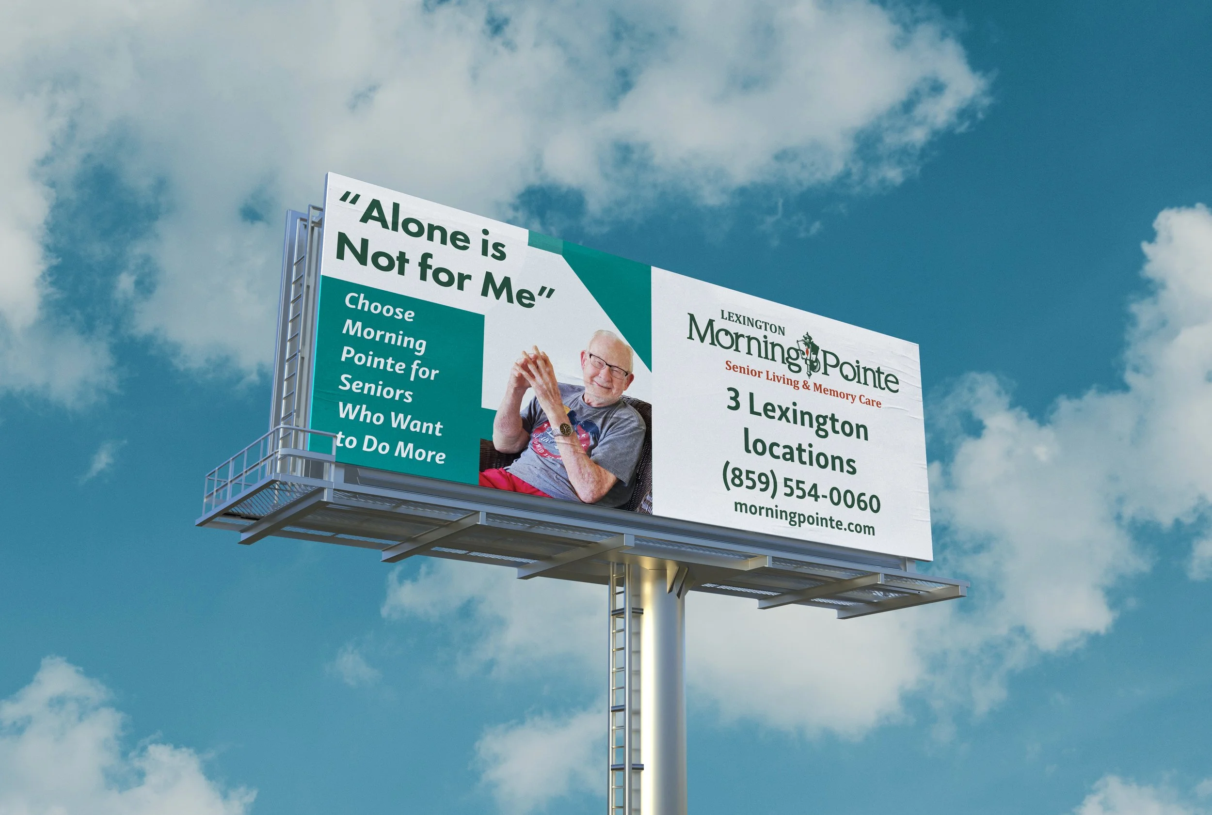
Last but not least, we refreshed our color usage with a combination of soft and vibrant colors, mainly using greens and blues.
We had a lot of ground to cover.